9 Inspiring Ways to Work the 2017 Pantone Color Palettes into Your Home

Pantone released the nine home decor color palettes they expect to trend in 2017, and they’re all kinds of inspiring. Even when you know you could use a home makeover, figuring out where to start is more than a tad overwhelming. What should stay, what should be replaced and what should be hacked are just a few of the design decisions that need to be made. Fortunately, these color palettes have a little something for any style sensibility. Whether you’re into pink and blue dreamy vibes, a mix of eclectic tastes and textures or a nod to past decades of interior design, there’s undoubtedly something here to tickle your fancy.
1. Daydreaming: Picking up from where 2016’s colors of the year left off, this palette is all about light and dreamy. Founded on pastel pinks and blues, the addition of pale yellows and greens makes it more aesthetically intriguing. (via The Design Files)
2. At Ease: This palette is comparable to Daydreaming with its weightless color combinations, but incorporates more grays for added sophistication. Play with textures in varying shades of gray for a compelling look that won’t overwhelm your space. (via Ellos / Domino)
3. Florabundant: This color palette is all about flower power. Inspired by the rich pinks and rosy reds, the colors here are intended to pop with personality. (via HGTV)
4. Forest Bathing: Inspired by the Japanese practice of forest bathing — the idea that a contemplative stroll through nature will restore your spirit and enhance your mood — this palette incorporates colors found in nature. Think greens, teals, purples and refreshing bursts of lime. (via Tyan Borland)
5. Graphic Imprints: Bold colors and exciting patterns are the primary characteristics of this palette. Start with a base of black and white, and add bright shades of yellow, pink, blue and orange to the mix. Use a bit of (faux) animal print for a touch more pizzazz. (via Style at Home)
6. Native Instincts: The blending of different cultural elements, such as Native American textiles and a Turkish kilim rug, are what make this palette unique. Bold colors are paired with softer earth tones for a compelling design. (via Vtwonen)
7. Raw Materials: This one is especially for you, crafty geniuses. Based on natural sustainability, it’s all about reused and repurposed elements alongside natural materials and colors. (via Artis Wall)
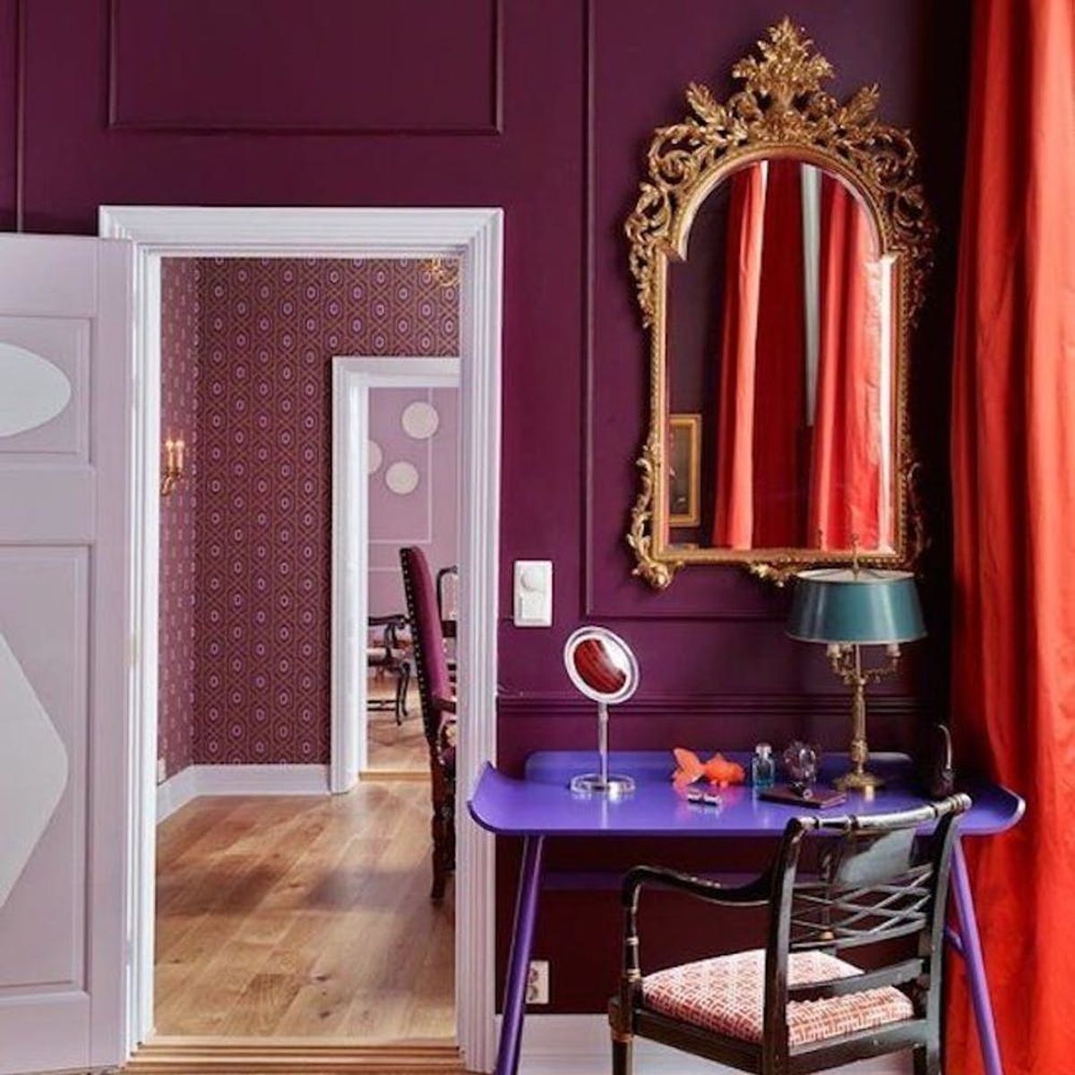
8. Acquired Taste: Think outside the box for this palette. Oranges and golds are blended with purples and melons, and wild textures are paired with soft materials to create a surprisingly luxurious ambiance. (via Bright Bazaar)
9. Reminiscence: As the name implies, this palette incorporates colors of the past with more modern hues. Think of traditional browns and sepia tones combined with olives and pale blues. (via Spacecrafting)
Need more decor-spiration for the future? Follow us on Pinterest to meet your muses.


