7 Interior Design “Rules” You Should Totally Break

Rules are made to be broken — at least when it comes to decor. Whether you’re decorating your first apartment or your forever home, knowing when to break with tradition can take your decor style from predictable to one of a kind. The key to success is picking and choosing where you want to go against the grain and how it’s going to benefit your space. Plus, it’s the perfect excuse for buying that bright, multi-colored woven blanket you’ve been eyeing. (Who knows, it could be the unexpected dose of color your space desperately needs!) Keep reading for a breakdown of the common design tropes we’re throwing out the living room window.
1. Don’t put large furniture in a small space. This is a common thought that feels logical when you’re setting up a small room. But in reality, you could end up simply emphasizing the lack of space when everything is super small. It seems counterintuitive, but often a single large piece (like this sofa above) in a small space will ground the look of the entire room. But as they say, everything in moderation; if you do go for large pieces, make sure to mix in some small-scale furniture for dimension and variety. (Photo via The Every Girl)
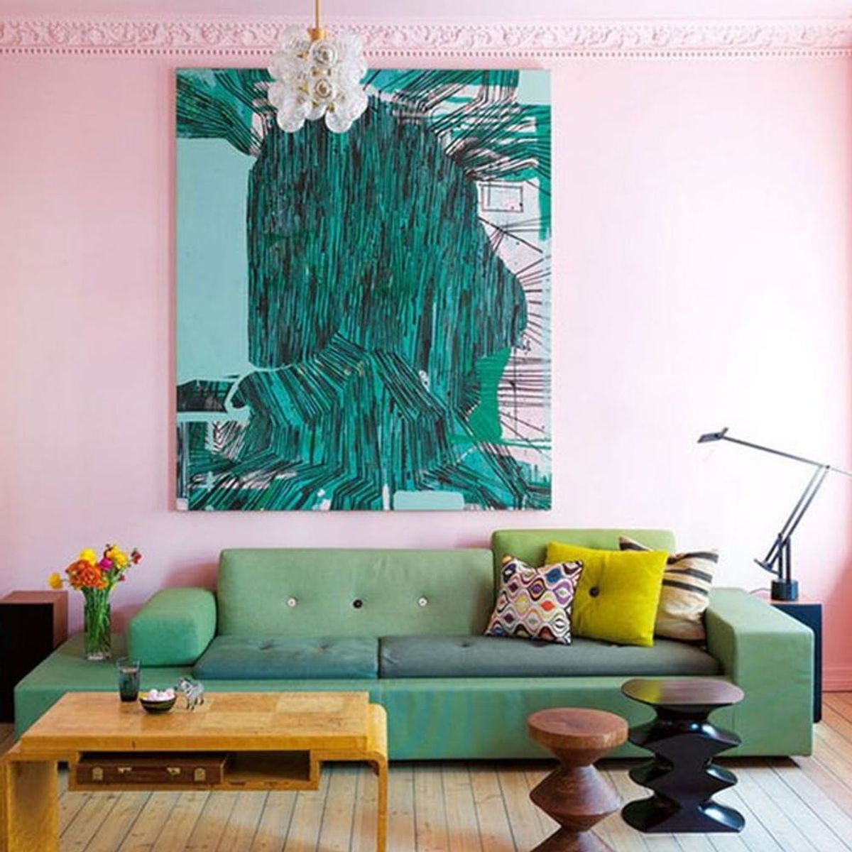
2. Never paint the ceiling. Okay, so this is a big statement no matter what color you choose. But if you’ve dreamed of beautiful soft pink walls and ceilings all your life, don’t let the stuffy interior design powers that be hold you back. This is a great option if you have high ceilings and want to bring the look together with an unexpected statement in a large space. What’s considered too far? We draw the line at scary black ceilings and mismatched wall/ceiling colors. (Photo via Apartment Therapy)
3. Always match your wood tones. If we never see a matching dining-room set again (i.e., your grandma’s coordinating table, chairs, sideboard and china hutch), we’ll be happy. Whoever said all wood tones need to be the same in a single space was just plain wrong. A mix of grains, stains and finishes creates an artfully curated look that feels both natural and welcoming. While mixing and matching is good, there should be some continuity: You don’t necessarily want to be mixing extreme opposites like poplar and walnut, but do go for wood combos like cherry, birch and poplar. Above, a trio of shaker-style chairs completes the look of the space, blending effortlessly with a painted wood table, stained wall paneling and weathered wide plank floors. (Photo via Not a Paper House)
4. Never use faux plants. Fresh flowers will always be considered ideal, and in most cases that’s true. However, there is a time and a place for faux plants and flowers. If you’re too busy to worry about taking care of your plants (or simply incapable of keeping anything alive!), investing in high-quality silk florals can make all the difference. They’re also great for anyone with allergies. Don’t worry, though; the days of your mom’s cheap faux ferns and those plastic ivy plants from the ’90s are long gone. Place a silk orchid in an empty, lonely corner of your apartment or set a low-profile hydrangea arrangement on your bookcase for the ultimate low-maintenance accent. Simply dust occasionally and you’ll never have to pick up sad flower petals and pollen dust again. (Photo via The Zhush)
5. Don’t mix patterns. If you’re a boho-lover at heart, then this one’s a no-brainer. Mixing patterns brings style and flair to any space, as long as it’s done well. When using a mix of patterns in your space, stay within the same color palette for a unified look. Another trick? Try layering different sizes of pattern; there should be a blend of both large-scale patterns and small-scale designs. (Photo via Beautiful Matters)
6. Don’t use dark paint in small spaces. We all know how dark hues can make a small space feel even smaller, but if done right, dark hues can create a sophisticated, moody vibe that’s perfect for a hall bathroom or powder room. It’s really all about balance. In the space above, crisp white bath fixtures and a decadent gold mirror brighten up chic matte black walls. (Photo via Home Bunch)
7. Always match your color tones. There’s an art to monochromatic decorating. Mixing shades of the same hue is essential, especially if you want to avoid a static, one-dimensional look. Aside from the fact that it’s basically impossible to perfectly match a color whenever you buy something new for your space, it’s important to incorporate a range of shades. This will ensure it doesn’t look like you tried to match and failed. A collection of pieces in varying tones will add depth to your space, plus it will bring an eclectic mix of decor together. (Photo via Decorology)
What common design rules did you ignore when decorating your place? Share your thoughts with us in the comments below!


