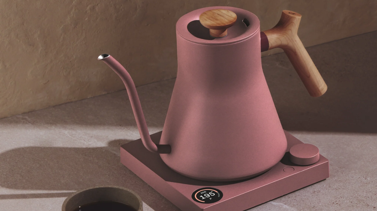
The Brady Bunch would definitely approve.
Pantone’s New Fall Colors Are a ’70s Dream Come True
Break out the station wagon and crank the Led Zeppelin because Pantone’s fall color collection is taking us straight on back to the ’70s. We got a glimpse of the vintage vibe that was to come when Pantone selected Marsala as the color of the year back in December. While we were somewhat on the fence about the unlikely pick at first, we’ve totally warmed up to it since.
While the colors are definitely something of a relic, the mood of the era they’re tied to remains very current. Pantone Color Institute executive director, Leatrice Eiseman tells WWD, “Even though the economy seems to be on the upswing, still there are those who are feeling insecure about significant world events, both politically and ecologically.” She goes on to say, “The Seventies were also a time when the public was emerging from a recession [in the early part of the decade]. There also was a growing interest in the preservation of nature. Utilizing earth tones gives people a sense of rootedness and grounding, similar to what people were feeling the need for in the Seventies.”
Cultural relevance aside, let’s chat just about the colors for a sec. There are ten shades in total: two greens, one pink, three blues, one orange, one yellow and of course, one very popular marsala. Here’s what Pantone has to say about each of the selected colors you’re bound to see all over the place in the year to come.
1. Dried Herb: “An olive green shade once thought of as strictly safari or military, Dried Herb has been elevated into a color we now perceive as sophisticated and chic. Closely related to nature, Dried Herb is an organic shade redolent of nature’s earthy fragrances.”
2. Desert Sage: “A cool and soothing greenish gray, Desert Sage is the ideal neutral. Timeless and unobtrusive yet at the same time stylishly powerful enough to make an impactful statement on its own, Desert Sage speaks to this feeling of naturally inspired colors that remind us of things that are real and not invented.”
3. Stormy Weather: “Reminiscent of the sky on a gray, overcast day, Stormy Weather is dependable, cool and above all, constant. Implying quality and luxury, Stormy Weather is a powerful blue gray shade that is strong, protective and enduring.”
4. Oak Buff: “Just as the sun comes out after stormy weather to bring us cheer and a glimmer of hope, Oak Buff is a mellow, comforting and warming shade that brings good feelings. Another one of nature’s illustrious shades, the golden yellow Oak Buff acts to nurture and comfort.”
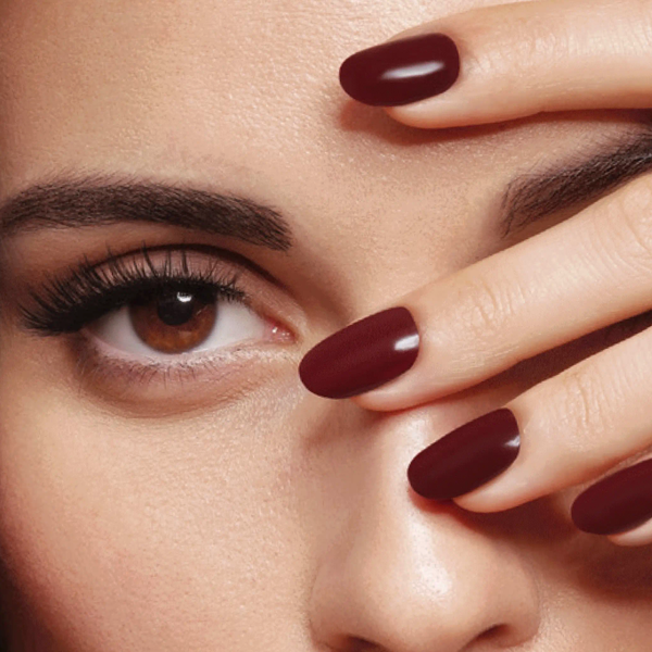
5. Marsala: “Interesting on its own and a wonderful contrast for other hues, Marsala is a winey red-brown that adds finesse and savoir faire. Rich and robust, Marsala incorporates the warmth and richness of a tastefully fulfilling meal, while its grounding red-brown roots point to a sophisticated, natural earthiness.”
6. Biscay Bay: “A lush and elegant teal, Biscay Bay splashes up against more heated tones with its cool touch. Combining the serene qualities of blue with the invigorating aspects of green, the cool and confident Biscay Bay inspires thoughts of soothing, tropical waters, taking us to a place that is pleasant and inviting.”
7. Reflecting Pond: “Thoughtful, contemplative and composed, Reflecting Pond is a cooling blue with a lot of depth. Conveying a message of credibility, Reflecting Pond is a serious shade that speaks to our need for stability and security.”
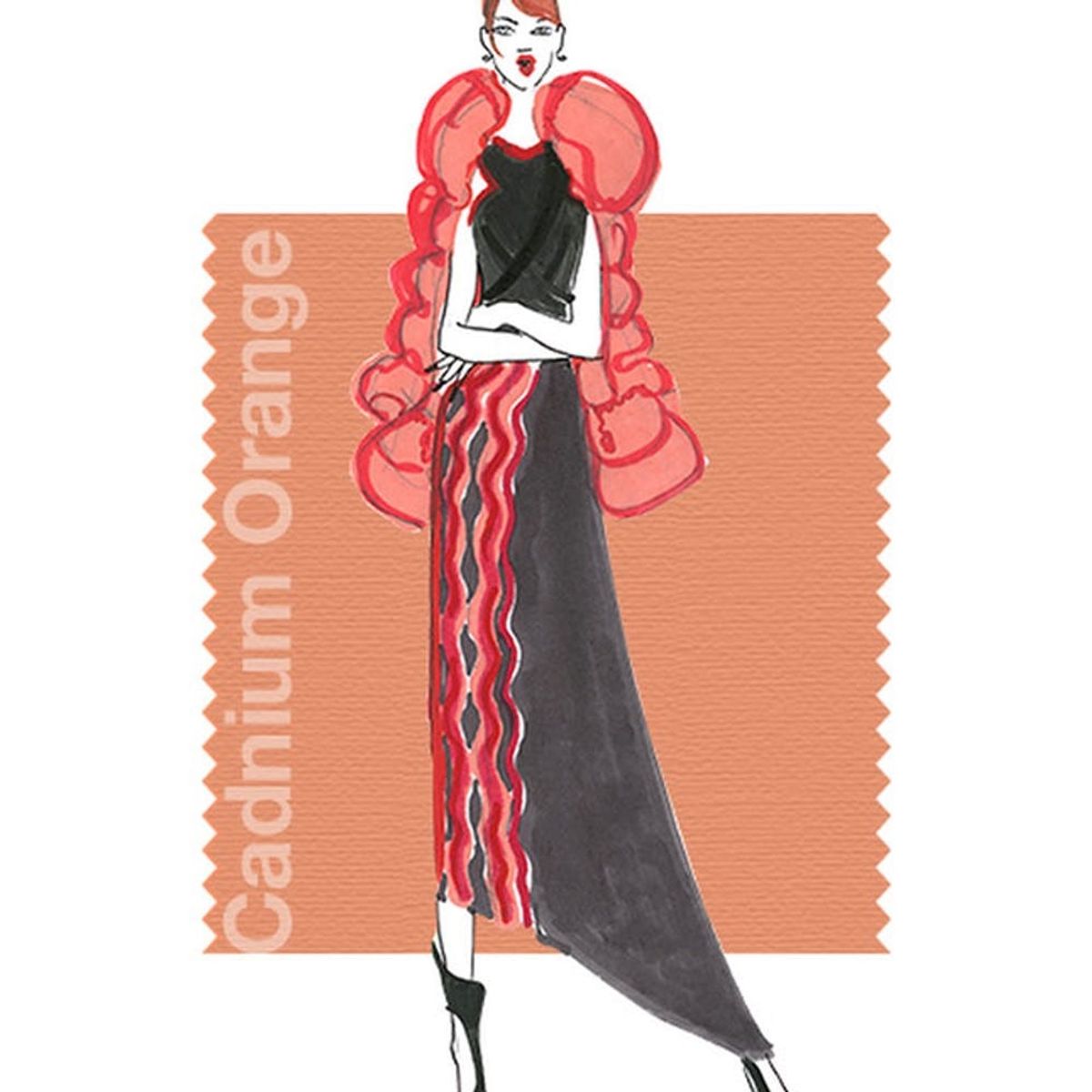
8. Cadmium Orange: “A nod to the ’60s and ’70s, Cadmium Orange evokes a sentiment of optimism, fun and fantasy. Both playful and sophisticated in its appeal, Cadmium Orange is a warm, welcoming and subtly dramatic orange shade that is striking enough to stand on its own or act as a bold contrast.”
9. Cashmere Rose: “A play on the ’60s with a twist of today, Cashmere Rose is a tactile and soft pink hue that renders exactly what it promises. Cultivated in its richness, Cashmere Rose is a gentle and composed pink that is more upscale than downtown.”
10. Amethyst Orchid: “Indicative of our affection for color, Amethyst Orchid is the jewel in the crown.Intriguing, vibrant and somewhat sensual, the enigmatic Amethyst Orchid is an extraordinary hue that is unique, bold, creative and exciting.”
Which color is your favorite from the new collection? Share with us in the comments below.
(photos via Pantone)


