Twenty-thirteen, you taught us what the Harlem Shake was, that Ryan Gosling wouldn’t eat his cereal, and that infographics can take care of teaching us everything else we need to know in the universe. From social media stats to more than we ever needed to know about beer, we’ve gathered two small handfuls of some of our faves from the past year.
An Infographic Education: What We Learned in 2013

Twenty-thirteen, you taught us what the Harlem Shake was, that Ryan Gosling wouldn’t eat his cereal, and that infographics can take care of teaching us everything else we need to know in the universe. From social media stats to more than we ever needed to know about beer, we’ve gathered two small handfuls of some of our faves from the past year.
1. Social Media Statistics: This is kind of the granddaddy of infographics when it comes to what we were doing while we were riding the bus, waiting for a friend at the bar, or taking a very extended break at work. (via Spare Foot)
2. State Of Mobile: Most of this isn’t surprising: Mobile is soon to be king. But what is shocking is that there are officially more mobile devices on earth than there are humans. The bots have officially won, and we’re okay with that. (via Super Monitoring)
3. Bloomberg’s Billionaires: Oh the Daddy Warbucks of the world. We are fascinated and intrigued by you… and a little bit annoyed with you as well. Nevertheless, Bloomberg’s continually evolving info graph and sketches of your faces amuse us. (via Bloomberg)
4. Feltron Annual Report: Can we all agree that we can hardly wait for Feltron 2013… and that it’s kind of creepy that we’re all so interested in one man’s day-to-day activities? It all comes down to the beauty of his graphics. The man is an info-artiste. (via Feltron)
5. 50 Years 50 Toys: Come on, guys. We know you’re digging these ‘90s kickbacks. Abby Ryan Designs in Philadelphia made some lovely visuals celebrating toys from the past 50 years. It was too soon for 2013’s results, so you won’t find the Flutterbye Flying Fairy Doll. But you can get a copy of the graphics for a mere $15 on Etsy. (via Abby Ryan Design)
6. Visual Design Trends For 2014: Looking to the future –– we’re always anxious to do it. And it’s all about hands-on dads, beards, and… strangely enough, witches. (via iStock)
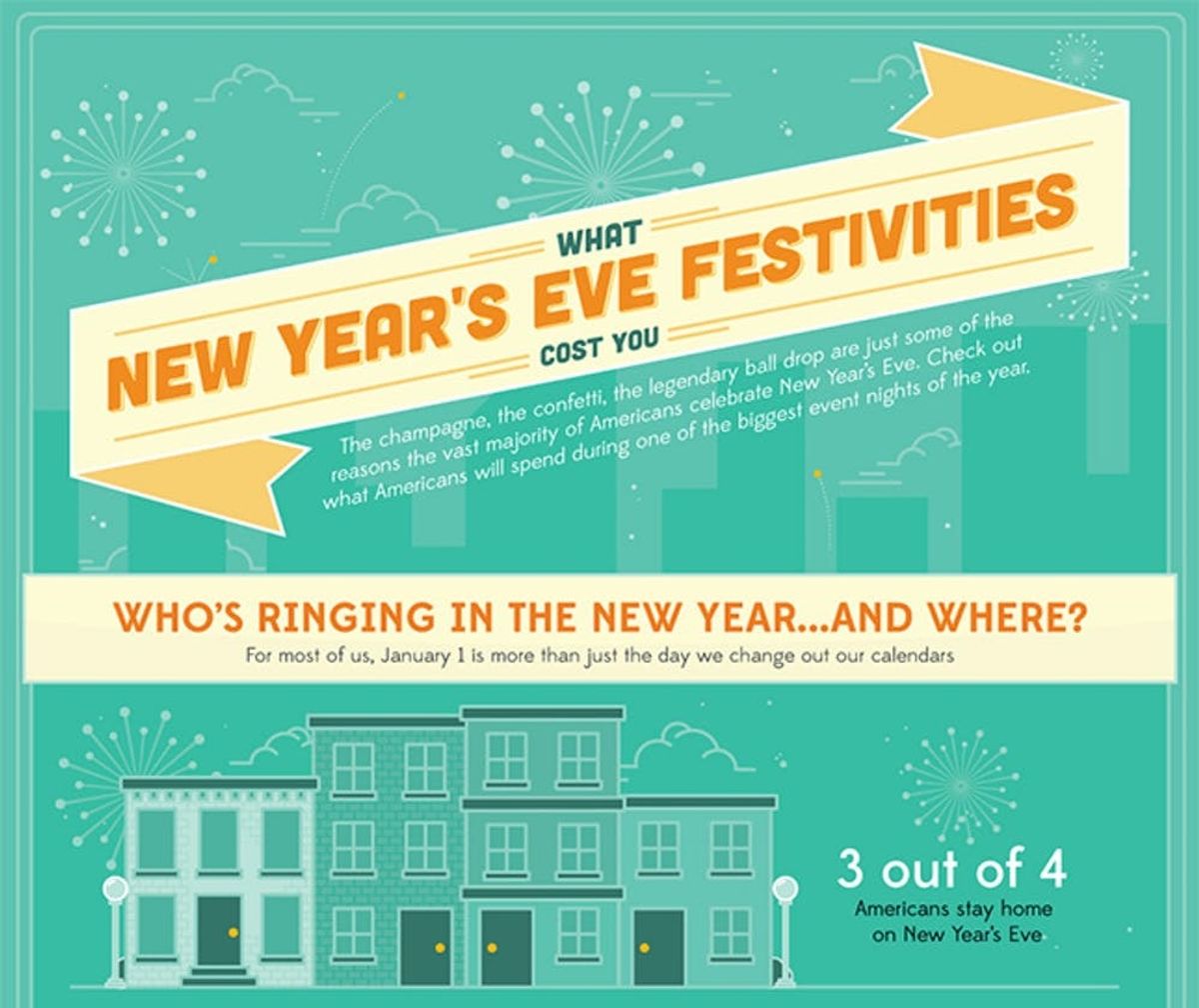
7. New Year’s Eve Festivities: You already know what you did for NYE (fabulous things, no doubt), but if you’re curious what the rest of the U.S. did, let’s just say we collectively broke out nearly 40 million bottles of bubbly. Cheers to us. (via Mint Life)
8. Food & Wine Pairing: Yes, beef gets paired with red, and fish gets paired with white, but get this: Starches go with sparkling wine. So stir up them mash potaters and pop those champs on the double!
9. Porn Vs. Real Sex, Explained With Food: Please tell us you’ve seen this. It not, hit “Play” ASAP and let the LOL’ing and sighs of relief begin. 2013 really was an educational year, wasn’t it?
10. The Magnificent Multitude of Beer: Why did we deem this hoppy imagery as one of the best infographics of 2013? Well, firstly, it’s about beer. Secondly, over 500 beers are listed. Thirdly, it’s over five feet long and can be purchased for your home. Bottoms up. (via Pop Chart Lab)
11. Postmortem Of A Video Crave: And to loop back to where we started, an infograph explaining how we all decided to spend over 2,700 years watching Harlem Shake videos. Let’s all try to be more discriminatory with our video watching in 2014, shall we? (via YouTube Downloader)
Got your PhD in graphic info? Let us know some of your favorites in the comments section below!


