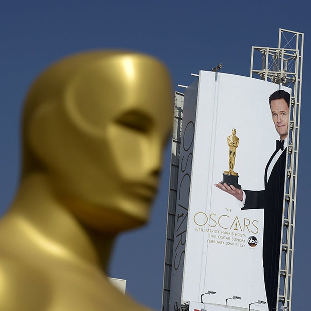
And the award for “Best Oscar Infographic” goes to…
8 Infographics to Get You Ready for the Oscars

It’s hard to believe awards season is already winding down — it seems like we were just watching the Golden Globes. When the parties and fashion kept chugging along for the SAG Awards + Grammys, we thought for a minute we’d be getting an awards ceremony every weekend of 2015. Sadly, the last big event for awhile is hitting us Sunday night (which we’re a *little* excited about, FYI). That event is the belle of the awards ball, so to speak — The Academy Awards.
While we know all the basics: Neil Patrick Harris as host (GL beating the selfie, dude!), the nominees for each category and style predictions, there are a lot of things we have no idea about when it comes to the Oscars. So grab a tub of popcorn + your fave party cocktail and indulge in some in-depth Academy Award infographics below to guarantee you’ll be the go-to pop culture source come Sunday.
1. “Best Actress Oscar Dresses”: Remember how much more you loved the dress of the winner of Best Actress every year? Now you can have a complete timeline — from 1929! — of every single gown worn to the podium. We’ve got one request: Can we get a Best Supporting Actress version, because we need that Nairobi blue Lupita gown in illustration form. (via The Big Group)
2. “Best Picture Nominees as Pie Charts”: Yep, Vulture broke down all eight Best Picture nominees into pie charts to better examine them (naturally). So much analysis, even more color. Who knew Whiplash was so similar to Ratatouille? See all eight charts here. (via Vulture)
3. “The Academy Awards by the Numbers”: We know you’ve always been curious about the anatomy of the actual award, the change in length of the ceremony (15 minutes vs. 3+ hours!) and just how many nominations Meryl Streep actually has. Thanks to Fandango, all the essential fun facts are provided in this info-efficient graphic. You go, Meryl! (via Fandango)
4. “Book-to-Movie Adaptations”: Six adaptations are up for Oscars this weekend, and they’ve all got rich backstories (and box offices). We’ll have to wait until Sunday’s ceremony to see which literary-based film comes out on top of the book pile. (via BookBub)
5. “Oscars by the Numbers”: This infographic is filled with box office receipts for the year’s highest- and lowest-grossing Best Picture nominees, a sad fact about BTS noms for women (WTF, zero?!), how many nominations superhero movies captured this year and an amusing age comparison between Meryl Streep (aka Queen of the Oscars) and Emma Stone. (via MTV News)
6. “Oscars Fun Facts: Nominations + Hosts”: How much does an Oscar Statuette weigh? When did the sealed envelopes become a thing? How much edible gold is consumed? Which films hold the record for most nominations ever? Who has won the most Oscars? Who has hosted the most? These are just some of the hard-hitting questions this informative chart highlights. (via Astro Awani)
7. “Career Highs + Lows for Oscar Nominees'”: It’s always interesting to see the trajectory of a movie star’s career before and after they are nominated for (and sometimes win) an Oscar. They’re always hit + miss, and that’s exactly what these graphics highlight for this year’s Best Actor nominees + Best Actress nominees. We’re not alone when we say we kinda loved Mamma Mia, right? (via CTV News)
8. “Figuring Out the Oscars”: A major studio shells out an estimated $15 million for a Best Picture campaign, a 30-second commercial during the ceremony costs $1.65 million, the red carpet is 500 feet x 33 feet. These are the facts you’ll learn from this infographic, and they’re kinda making our jaws drop. (via Metro.co.uk)
Confident you’re filled with Oscar knowledge ahead of this Sunday’s ceremony now? Let us know the fact(s) you’ll be sharing in the comments.
(Feature photo via Kevork Djansezian/Getty)


