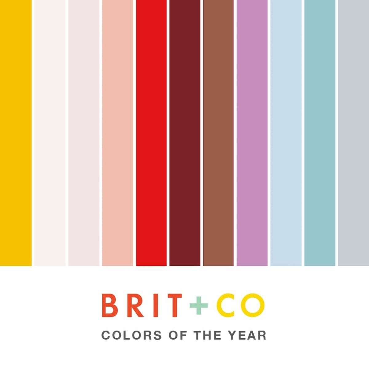
11 Pantone Colors That Almost Beat Out Marsala

We don’t have anything against Pantone’s Color of the Year for 2015. Marsala is, you know, nice. It’s like an earthy maroon that can hang out as a shade of brown on some days and a shade of red on others. It’s versatile. Subdued, but not easily ignored. It’s a neutral you can wear on everything from your denim to your lipstick. And while we’re not on Pantone’s official board of color pickers, if we were, these are some of the finest shades that we think would have made great alternatives to Pantone’s Color of the Year.
1. Meringue Pink: Pastel colors lasted from spring to winter in 2014, and it made us dream of cupcakes, frosting and cookies. To spread our love of all things pastel, our first nomination for an alternative Color of the Year is Meringue Pink — a color sure to grace everything from your manicure to your ‘do.
2. Almost Orchid: Radiant Orchid, we have to admit that it’s hard to say goodbye to you, so we figured we just wouldn’t. With purple locks in full force, we think a faded version of the hue could make a gradient-like evolution from “radiant” to perhaps “earthy.” Okay, okay fine. Maybe we’ll just let it go with dignity. (photo via Kelly Osbourne)
3. Deep Berry: The ’90s called, and they’re letting us keep their lipstick. Deep reds were all the rage, and while Pantone’s Marsala is almost there, it’s not quite saturated enough to leave that lasting pop of color. A richer tone gives you the option of going subtle or statement depending on how you use it. (photo via Kalei Lagunero)
4. Solange Ivory: A white dress? That’s so cliché. After Solange showed us that ivory bridal is the way to go, we kind of wondered why everyone wasn’t rocking an off-white jumper + cape combo down the aisle. Ivory is a more natural non-stuffy alternative to white, and it’s one of our new favorite neutrals. (illustration via Niki’s Groove)
5. “Break the Internet” Rust: In all the hubbub over this controversial cover (and nudie photo spread) in Paper Magazine, everyone glossed right over that perfect barely rust shade on the backdrop. It’s like a rusty chocolate, and we want to put it everywhere from our pouts to the powder room.
6. Rose Gold: Talk about an all-star metallic. While gold was over here trying to make a comeback, rose gold came out of the attic and found its way right into our homes and jewelry boxes. Its blushing shine is a great balance of vintage and feminine and even if in its matte form, we’re kind of in love. (photo via Houzz)
7. Chambray Blue: Chambray, you’re just swell. Perfect from business to casual, this is a fabric that just won’t quit… so why should we? We’d love to pull swatches of chambray into our everyday from painted walls to kitchen tile.
8. Annie Red: It’s the rebirth of a classic in which cherry red is basically one of the starring characters. Sure, we’re not going to go and paint our bedroom this color tomorrow or anything, but a classic red is perfect for tying a room together with accents or even a great statement wall. (photo via Annie)
9. Elsa Teal: Saying Frozen took the world by storm is the understatement of the year… well of last year. From “Let it Go” on your radio to icy teal wedding dresses on the runway, this tale of sisters made a major impact on all kinds of art this year. Why not pay tribute with a swatch? (photo via Elie Saab)
10. “Happy” Yellow: Because every time we see this color, we think of the song and can’t stop smiling. “Happy” yellow would make a perfect interior accent color or pop in your wardrobe palette. It’s also a little “Moonrise Kingdom,” no?
11. Gorgeous Gray: Going gray no longer has anything to do with age. Now, gray hair is super hot, and with the scale of blue to purple undertones, it’s no wonder. We think a solid, dynamic steely gray is just what the world needs in the ways of new neutrals. (photo via Lux and Laune)
What hue would you like to see as Pantone’s Color of the Year? Let us know in the comments!


