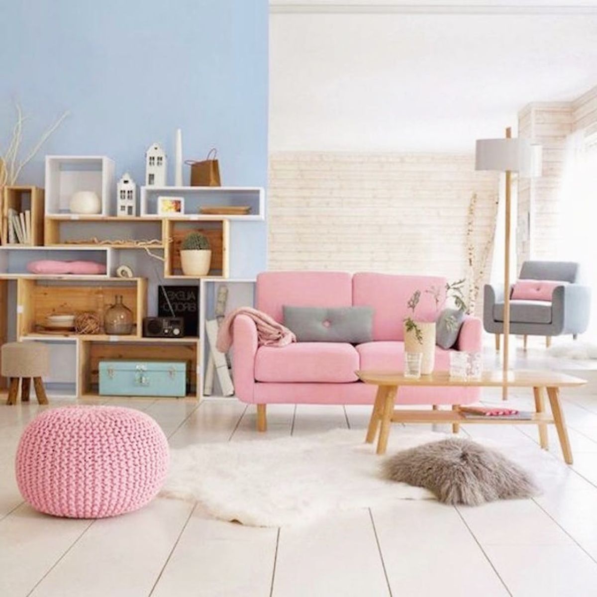
Rose Quartz + Serenity never looked so good.
15 Ways to Use Pantone’s Colors of the Year in Your Living Room

Pantone’s 2016 colors took us a bit by surprise, but we are falling madly in love with the Rose Quartz and Serenity color combination, both on our bods and in our favorite stores. Our home is the next natural place to incorporate the hues, so we are taking to the living room for a little pastel + Pantone decor porn. Get inspired by these pastel-chic spaces and spruce up your living room just in time for the new year.
1. Serenity-Heavy: This design goes heavy on the blue, accented with splashes of pink and other lighter, feminine colors. The end result feels equal parts fresh, feminine and timeless. (via House to Home)
2. Lofty Goals: Everything goes with white, and pastel pink + blue are no exception. Juxtapose furry fabrics with stoneware for a look that’s seriously divine. (via Benjamin Moore)
3. Up the Saturation: Darker versions of Pantone’s colors of the year are perfect if you want something bolder. A statement piece of mirrored art is the icing on the cake. (via Cape Cod Collegiate)
4. Ladylike and Lavender: Going a bit more lavender than violet will make your rose quartz feel super feminine. Ooh la la. (via Oh My Dear Blog)
5. Black + Blue + Pink: On the other hand, black accents make rose quartz and serenity look more modern and minimalistic, especially when everything is as sleek and streamlined as the pieces in this space. (via SF Girl by Bay)
6. Warm It Up: Without rose quartz, this place would look almost too cool for school, color-wise. The dash of pink warms it right up. (via Laurel + Wolf)
7. Glam Lamp: We had to include this dining room to show that you only need a small pop of rose quartz to transform an entire space. Bonus points if you add some metallic copper to complement the shade. (via Townsend-London)
8. Fresh and Clean: Baby pink walls aren’t just for nurseries. This room proves how modern, fresh and surprisingly gender neutral it can be. (via Nordic Design)
9. It’s Hall Good: You can even update a hallway, entryway or other nook in your home with Pantone’s top colors – just check out these two chairs. (via Resource Furniture)
10. Mantel of the Moment: White = boring. Switch things up and paint your mantel warm pink for a fireplace that pops. (via Muffy Takes Manhattan)
11. Renter’s Paradise: Good news, renters: You don’t have to paint walls or woodwork to incorporate color. Instead, hang a picture in one hue and reupholster your couch in another, and voilà! You’re done in a single DIY weekend. (via Lonny)
12. Let There Be Light Pink: Rose quartz lights up a space on its own, but pairing it with natural light makes a room feel airy + bright. Add weight with darker serenity-hued furniture. (via Decoholic)
13. Pink Is the New Neutral: The subdued rose quartz on these walls serves as a warm, blushing backdrop to everything else in the room. (via Nordic Design)
14. New Rainbow: Rose quartz and serenity go together better than PB + J, but they also go with other unique colors like chartreuse, salmon and dark teal – play around and punch it up. (via Stefanie Luxat)
15. Reupholstered in Rose: This vintage chair got a 2016 update with new upholstery. If you’re feeling crafty, you can do the same to that funky old armchair in your attic or basement. (via My Paradise)
How will you use Pantone’s top colors? Show us your space by tagging us on Instagram!


