Get tips from pro illustrator Kristin Berry!
4 Elements of Typography You Should Consider When Designing (+ a Pet Birthday Invitation Template Inside!)

It doesn’t matter if you’re an experienced art director or trying your hand at graphic design for the first time; typography can be a tricky part of the equation. Often times the graphic elements of a design, like photography or illustration, can get the most attention, and type gets added on as an afterthought. However, when type is treated with the right attention and thought, it can not only enhance the graphic elements of the design but become a beautiful component of the design in its own right.
Whether you’re designing a simple birthday invitation or laying out a whole magazine spread, if you can get the basics of type design down, you can make your copy look beautiful without breaking a sweat. Here are four elements of a typographic design that need to be considered when starting any type of design.
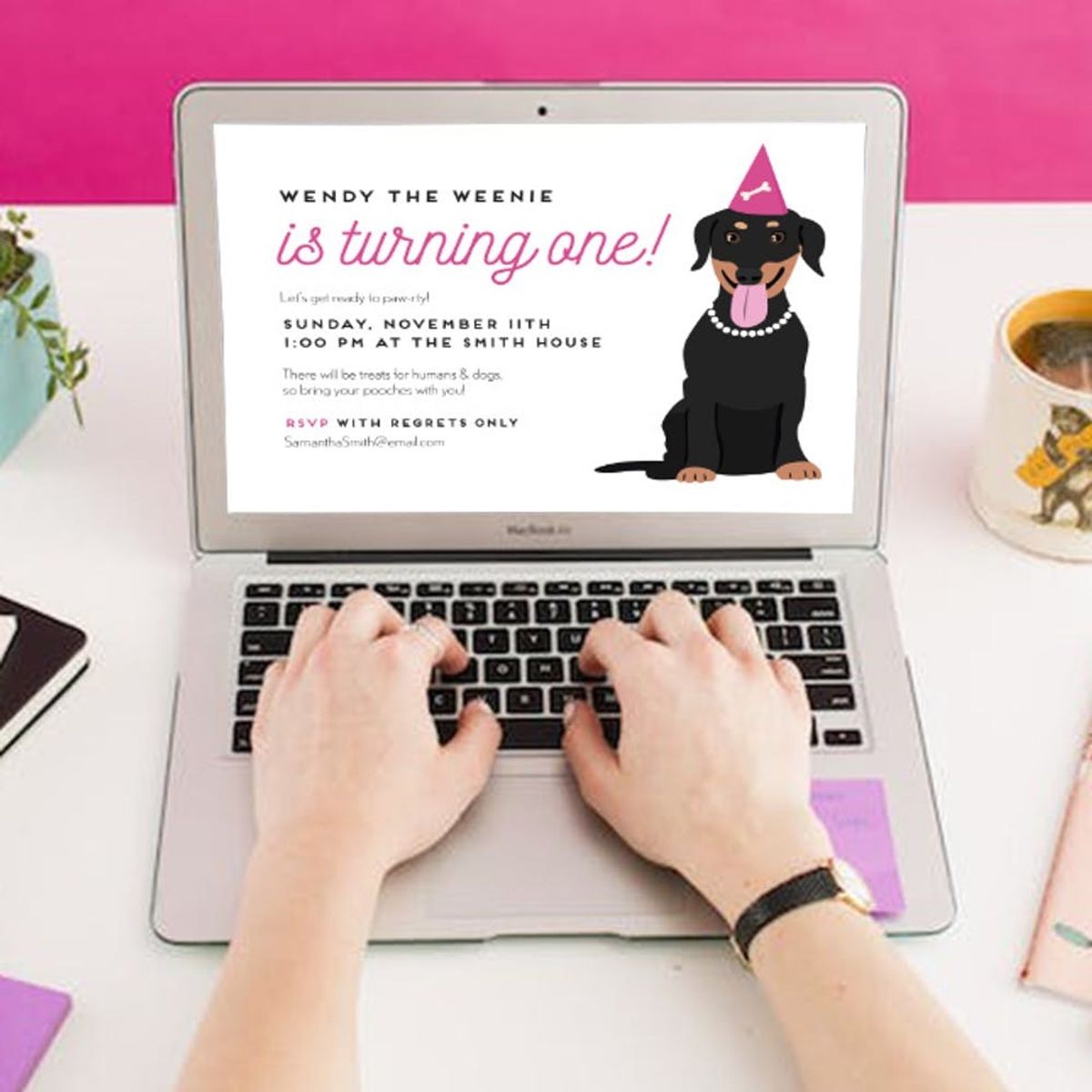
To help illustrate the points, let’s use the example of creating a birthday invitation for your dog as our project.
Placement and Hierarchy
The first thing you’ll need to figure out is the placement of your text. What copy do you need to include, and what order is it going in? I often lay out all of my text first, just in the default size/type, so that I can visualize all of the copy I have to work with.

Next, you need to start creating the hierarchy.
Text that is most important, or needs to stand out, should be emphasized by either:
- The size of the text
- The weight of the text
- Bolding one line of type, or even a word or phrase, can help bring prominence to specific information

Choosing Fonts
There are three basic styles of text — script, serif, and sans serif.
- Script fonts have characters that join together, and often look cursive or handwritten.
- Serif fonts have serifs on the characters, which look like little feet. These fonts can tend to have more variation in the width and height of letters.
- Sans serif fonts are more modern and streamlined, with no serifs and generally have less variation in letter height and weight between letters.
Usually, a mix of two of these styles ends up making a good font pairing. Whole paragraphs of copy should never be written in a script font, and it should only be used for prominent things like names, etc. If you choose to mix a serif and sans serif font, make sure there is enough difference in the two fonts to make it clear they are two different fonts — this is explained more in the next section!
Keep in mind that after you change fonts, you will often need to continue to adjust sizing until it is just right.
Contrast + Variation
In order for a piece to look visually appealing and to be easily readable, the contrast between fonts and type size is key. Try to select fonts that complement each other, such as heavier and lighter, script and sans-serif, or handmade and structured.
Another important thing to remember is that you do not want to choose two fonts that will compete visually. If you choose a beautiful, flowing script font with lots of variation between letters, then make sure that the next font you use is more understated, maybe a sans-serif font that has even line weights and character sizes.

Fine tuning
Once your type has been laid out, fonts have been chosen, and you have created contrast and variation, you are ready to go back through and fine-tune your work! Below are a couple of things you can look out for as you go back through your text.
At this point, you can go in and adjust the sizing and placement of other graphic elements, to fit with the sizing of your finalized type.
- Leading is the space between the lines of type. You do not ever want your lines of type to be butting up against each other, which can make it hard to read. You also do not want there to be large spaces between lines, resulting in a “striping” effect visually.
- Glyphs are the additional characters for a typeface that can be accessed via “glyphs” in the type menu. You can use swashes (especially in script fonts) to make the type even more special, but you just have to be thoughtful in the placement and usage. Like anything else, moderation is key.
- Justification is how you set your text alignment. Aligning text to the right or left can create interesting juxtapositions, and aligning center can be used to highlight higher-level text like titles or names.
- Color is another way that you can make final adjustments to your type. Just make sure that not all of the type is in bright colors, as that can be visually overwhelming, and end up detracting from the other graphic elements on the design. Also, note that lighter fonts might be difficult to read.
Miscellaneous other little rules to keep in mind:
- No single words (called orphans) should be on their own line at the end of a paragraph.
- Try to avoid hyphenation whenever possible.
Now that you have mastered the basics of type design, what will you do with your newfound skills? Try practicing your new type skills on some simple projects and keep trying more complex designs as you get the hang of it.

Oh, by the way, are you loving that dog illustration? Take your design skills to the next level be enrolling in my upcoming Digital Pet Illustration online class with Brit + Co. You’ll learn how I create awesome pieces like this Pet Birthday illustration. You can pre-register for the class HERE.
Pet lovers, commence.


