Beautiful, bold, and breaking the mold.
17 Home Decor Lessons We Learned From Black Interior Designers
Theresa Gonzalez is a content creator based in San Francisco and the author of Sunday Sews. She's a lover of all things design and spends most of her days raising her daughter Matilda.
Diversity in design brings unique perspectives that only drive the industry forward, making it more innovative, forward-thinking, creative and bold. Yet only 2.3 percent of interior designers are Black, according to data from the job search company Zippia. Orgs like the Black Interior Designers Network have put their energy toward amplifying marginalized design voices and have helped uplift Black designers in media, books, magazines, blogs, and TV – and we are grateful for it. Personally, as a passionate decor enthusiast and writer on the topic, I discovered several designers through the network and have been inspired by their unique points of view ever since. Here are 17 lessons we learned from some of our favorite Black interior designers, none of whom fit a mold but instead dare to break it with every design they create.
Lesson #1: Trust Your Instincts
We can sometimes love a bold idea but are afraid to make the investment on taking a chance. What I found and what I learned from many of these designers is that the boldest ideas are often the best ideas so Trust. Your. Instincts! In my own home, my favorite design choices are the ones where I didn't follow what I saw on social or what was trending but what truly gave me a creative spark.
Lesson #2: Flaws Are Beautiful And Worthy
Love this lesson from Jungalow creator Justina Blakeney – perfection is so overrated. Imperfections in art, which interior design really is, are what make it beautiful and unique.
Lesson # 3: Layering In What You Love Can Lead To Happy Accidents
"Sometimes palettes just build from the ground up. Bed, then nightstands, then pillows, and done. I remember being bowled over by the light fixtures and thrilled to feature my friend @jlagarrigue artwork above the bed to tie it all together. I wish I could say there's a formula to successful interiors...but so much of design consists of back to back happy accidents," says designer-we-love Dani Colding.
Lesson #4: People Are The Key To Good Design
Design is about people, right? It's all about how you will use the space and how it will make you and the ones you love feel in it. What kind of experiences do you want to create through your design?
"Some of our clients have a younger family and need maximum storage and space for everyone. Other clients are in their forever home and want to focus on an aging in place type of design. My first step in design is to find out what clients' needs are and present a design that makes their home life better than before they hired me, " says April Gandy, Founder and Principal Designer, Alluring Designs Chicago.
Love this idea from celeb designer Brigette Romanek to bring in lounge sofas around a dining table – we want to be invited to that dinner party, so cozy yet elegant!
Lesson #5: Corners Create Opportunities
The smallest spaces can be the most fun to design because you can make an impact with a smaller budget and less time commitment. Make them shine with wallpaper, bold art, vintage furniture or anything personalized.
"A thoughtfully designed space can dramatically improve the lives of the people who live in it," says Texas-based designer Sherrell Neal. "I love layering color, texture, and light combinations that achieve timeless and livable interiors. For 2023, I'm using more bold paint colors and wallpaper on the 5th wall (ceiling)!"
Lesson #6: Make It Warm + Cozy But Unconventional Too
The warm and cozy part serves the people living in the space while the unconventional part serves your creative soul.
Lesson #7: Use Color Strategically For Bigger Impact
The neutral trend is lovely but a pop of color surprises and delights. Color is everything in these designs.
Lesson #8: Make It Wild But Serene
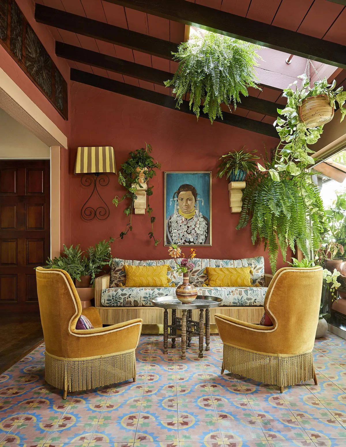
So much of design is about balance. Sure, you can bring in a tropical wallpaper with a bold tile and mix in some gold accents and colorful art but balancing the color and tone and texture of the space is key to not being too extra.
Lesson #9: Elegance + Drama = Intrigue
That lamp, the tile, the wall treatment, oh my swoon!
Lesson #10: Play!
If there is any lesson you can take away from this @forbesmasters design is that it's all about having fun with it. If you feel good about it you'll bring that energy to a space too.
Lesson #11: Enhance Architectural Details With Paint
Love how HGTV designer Tiffany Brooks uses paint to highlight the molding here.
Lesson #12: Metallics Make Neutrals Pop
They really do in this gorgeous bedroom designed by Colding.
Lesson # 13: You Can Never Have Too Much Art
Art completes a space and adds a bit of soul -- share art you love and your space will feel like you.
Lesson #14: Have A Clear Point Of View
Blakeney's branding tips can apply to any design – you want consistency and a clear direction to get a cohesive look.
Lesson #16: Heritage Details Create A Sense of Place
Colding perfectly articulates why having heirlooms and nostalgic items bring a sense of soul to a place. "This dresser vignette is like a road map through my life...So many special meaningful items paired with things I was able to purchase as an adult. My Bed Stuy apartment was such a place of healing after the death of my mother. Spaces can truly be a refuge during trying times," she says in her post.
Lesson #17: Support small, minority-owned businesses.
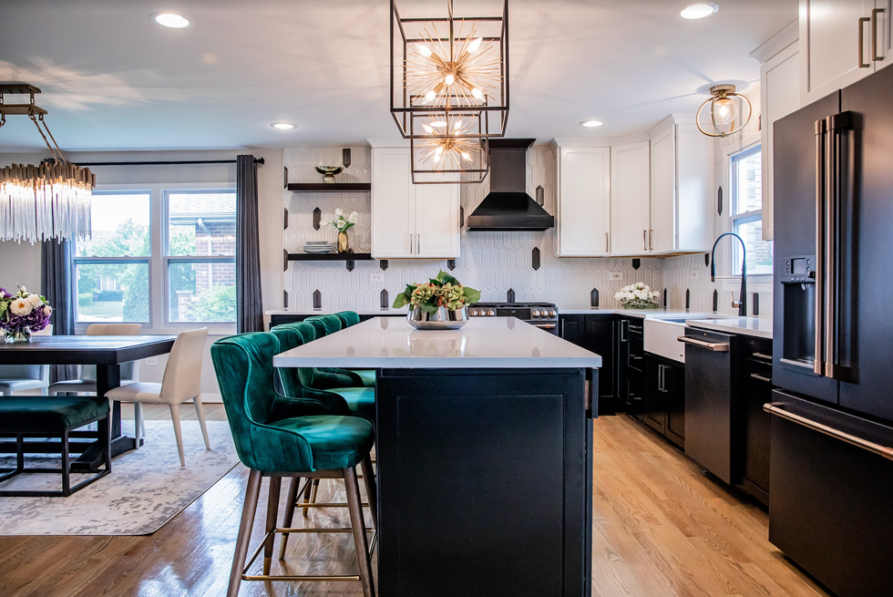
"I’ve learned I do a better job of staging a space once I can see it put together in person instead of having it all figured out before we get started," says Gandy. "I have also enjoyed meeting and partnering with new local small businesses, especially minority owned businesses. It gives me a sense of pride to know I’m contributing to their success," which brings us to our final lesson #17: Shop small. Finding unique pieces you won't find in mass quantities will inspire a space that feels personal, special, and one-of-a-kind.

