From rags to riches.
10 Design Mistakes That Will Make Your Home Look Cheap

Theresa Gonzalez is a content creator based in San Francisco and the author of Sunday Sews. She's a lover of all things design and spends most of her days raising her daughter Matilda.
For those of us who are passionate about design and decorating, of course, we want our homes to look stylish and put-together, but sometimes life gets in the way and our homes start to look a little neglected. I bought my home four years ago and I'm starting to notice smudges on the walls (lots of 'em), furniture that could use an upgrade, clutter where I never intended, and a lack of cohesion from room to room. This is all to say, no shame if you're guilty of making a few home decor mistakes – we've all been there! But if you're looking to make a few upgrades, here's where you can start, without spending a ton of money. Lighting, maintenance, and just clearing up clutter can make a huge difference in how your home looks, from rags to riches.;)
Home Decor Mistakes Making Your Space Look Cheap
Dated Lighting
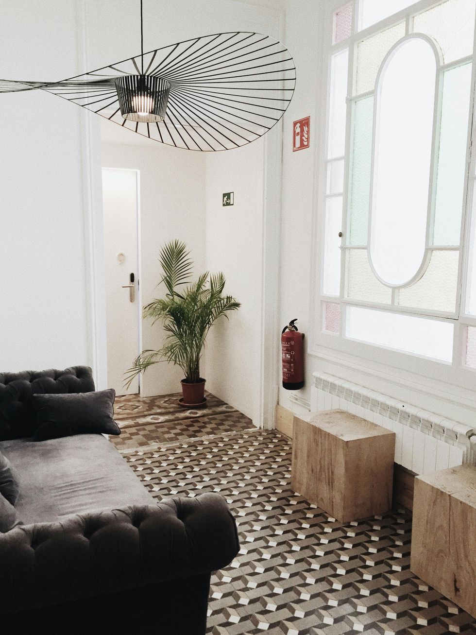
Photo by Lina Kivaka
Instead: Look For Sculptural Lighting
Let's start from the top. Sometimes a simple upgrade like new lighting can make such an impact in the room, instantly giving it a more upscale look. Statement lighting in sculptural shapes are on trend and timeless. Think in levels too -- from ceiling to table lamps to create ambience. Too harsh or too dim can make a room feel uninviting and drab too so pay attention to lighting in a room before you completely overhaul it.
Cramped, Cluttered Spaces
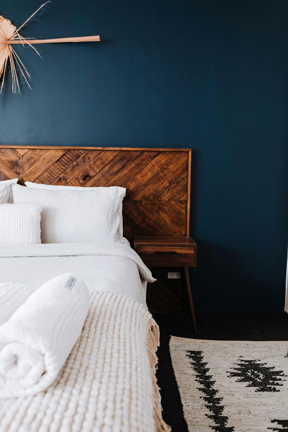
Photo by Rachel Claire
Instead: Be Selective With Furniture And Decor
Less is more when it comes to looking elegant, and frankly, not cheap. Remove anything that doesn't feel right in a space (you may find a better spot for it later) and start with the bare minimum. Now start to fill it with furniture and decor that fits the space well and looks like they pair well. Overfilled rooms can make them look cramped and chaotic, and too much decor or mess can create visual clutter, which is not inviting.
Mismatched Styles
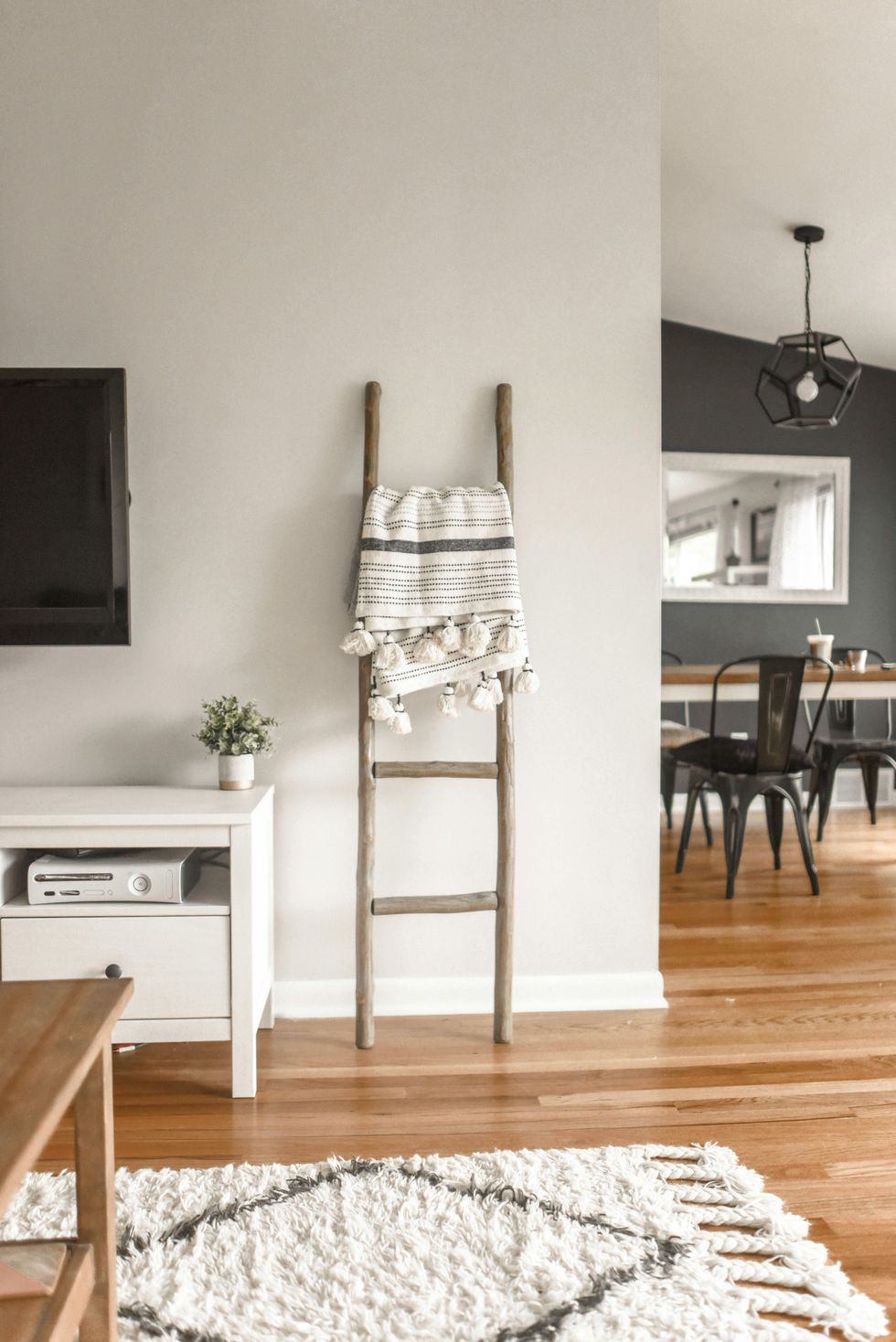
Photo by Element5 Digital
Instead: Create A Point Of View
As a home decor enthusiast, I love almost all of it: art deco, modern, vintage, all the trends. Not to say, these trends can't all go together – they totally can! But create a space where they all work together so it feels cohesive. Make sure furniture works well with each other (even ask design advice from retailers). If you add art deco elements to a modern space, keep that thread going throughout the home with similar shapes, materials and textures (without going overboard). Start with an idea, pair down to the necessities, and slowly add what feels right.
Old Paint, Broken Anything
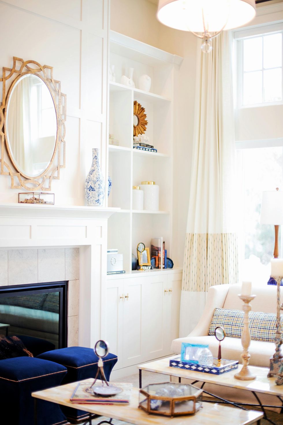
Photo by Pixabay
Instead: Keep Up With Repairs
Walls with chipped or peeling paint can make a home look neglected so a fresh coat is always a good idea after three or so years. Fix broken fixtures too like light switches, faucets, or doorknobs to keep your home from looking old and unkempt.
Cheap Materials
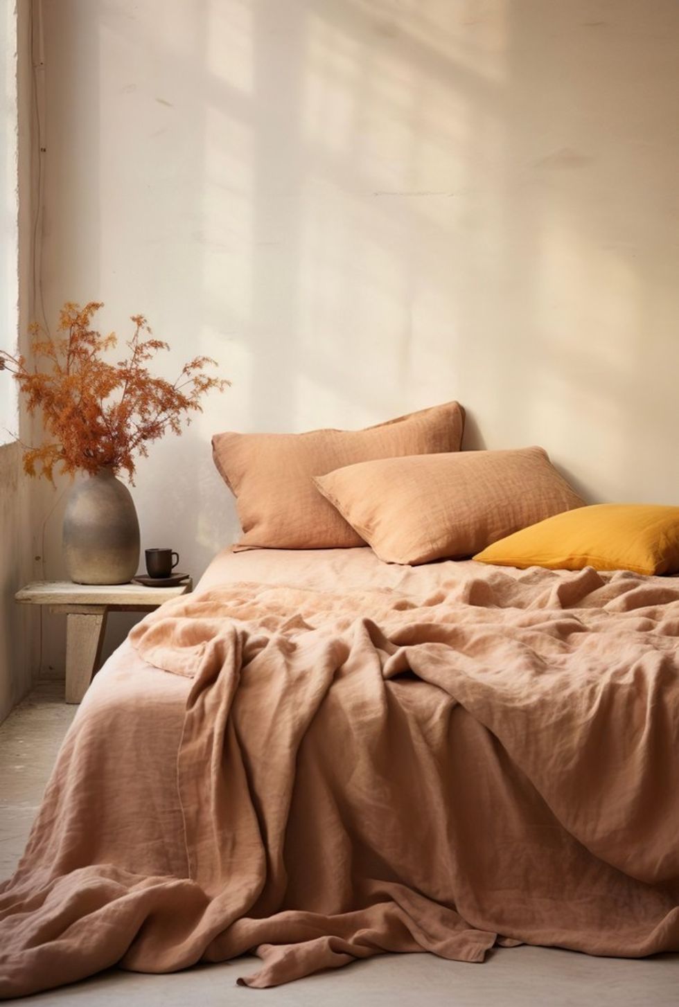
Photo: Shutterstock
Instead: Opt For Natural Materials
Synthetic materials like polyester and nylon can appear low-end so use them sparingly. Of course, there are sometimes budget concerns but opting for a few quality linens, upholstery, or real wood furniture can elevate your home.
Dated Fixtures
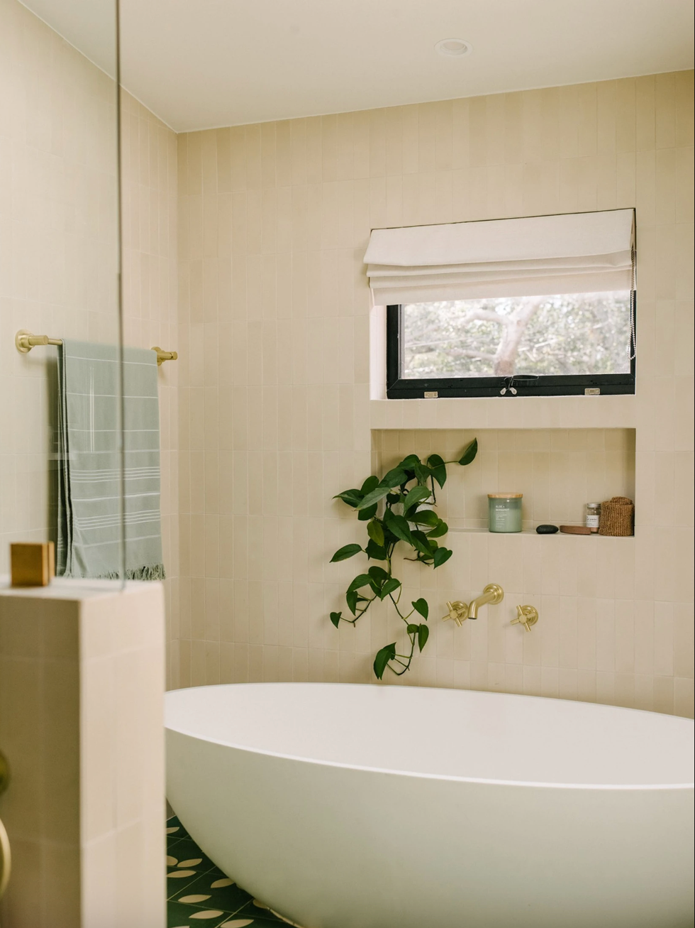
Photography by Joao Canziani | Design: Arterberry Cooke,
Instead: Upgrade faucets, knobs, and handles
My mom was ready to remodel her whole bathroom until I told her that it was fine — she just needed to upgrade her faucet. She did and was so happy with the results. Something as small as a new bathroom faucet, kitchen handles, or new doorknobs can bring your home on trend and help eliminate embarrassing home decor mistakes.
Rental Blinds
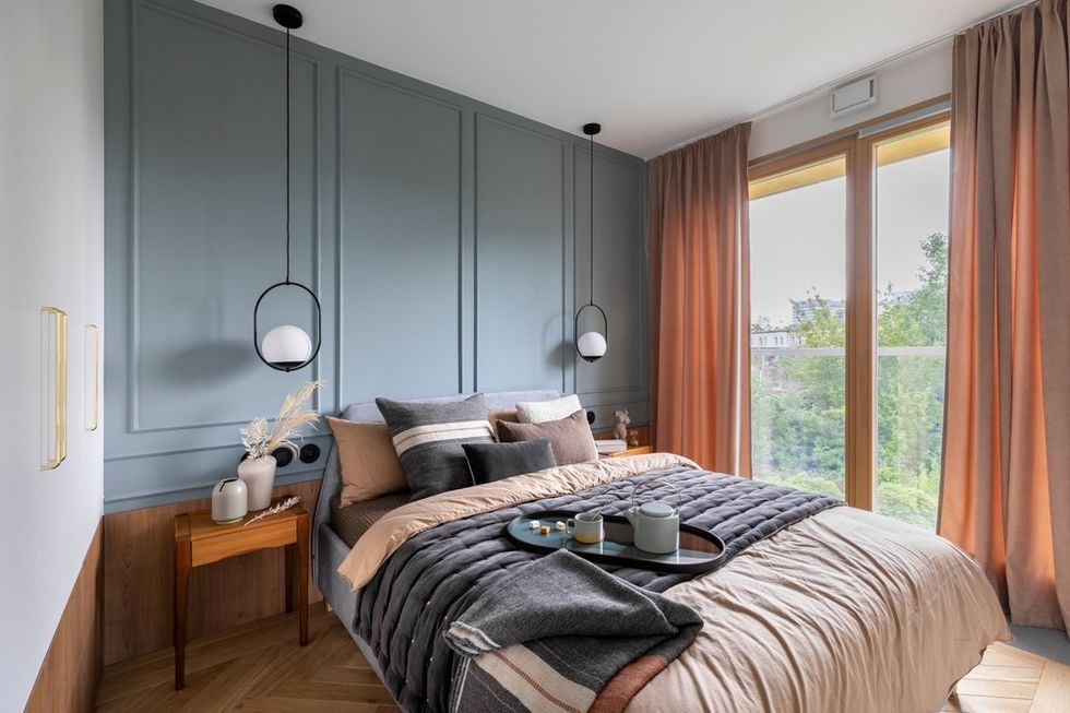
Shutterstock
Instead: Don't Treat Windows As An Afterthought
While I do love the bare window look, it can sometimes make a room feel unfinished, especially if the windows are not new. As a renter, I couldn't stand the look of cheap rental blinds too. I'd remove them, make my own shades, and reinstall them when I moved out. Using flimsy or outdated blinds can ruin a perfectly beautiful room. It's like the final accessory to complete the look!
Lack of Scale And Proportion
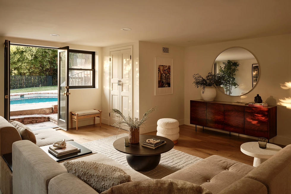
Photo: Nils Timm
Instead: Create Balance
Area rugs should extend beyond the sofa and not be too small compared to the size of the room. Find furniture that fits the space and hang artwork that balances the room vs. puts it off kilter. This room by L.A. design firm House of Rolison feels harmonious and complete.
Generic Decor
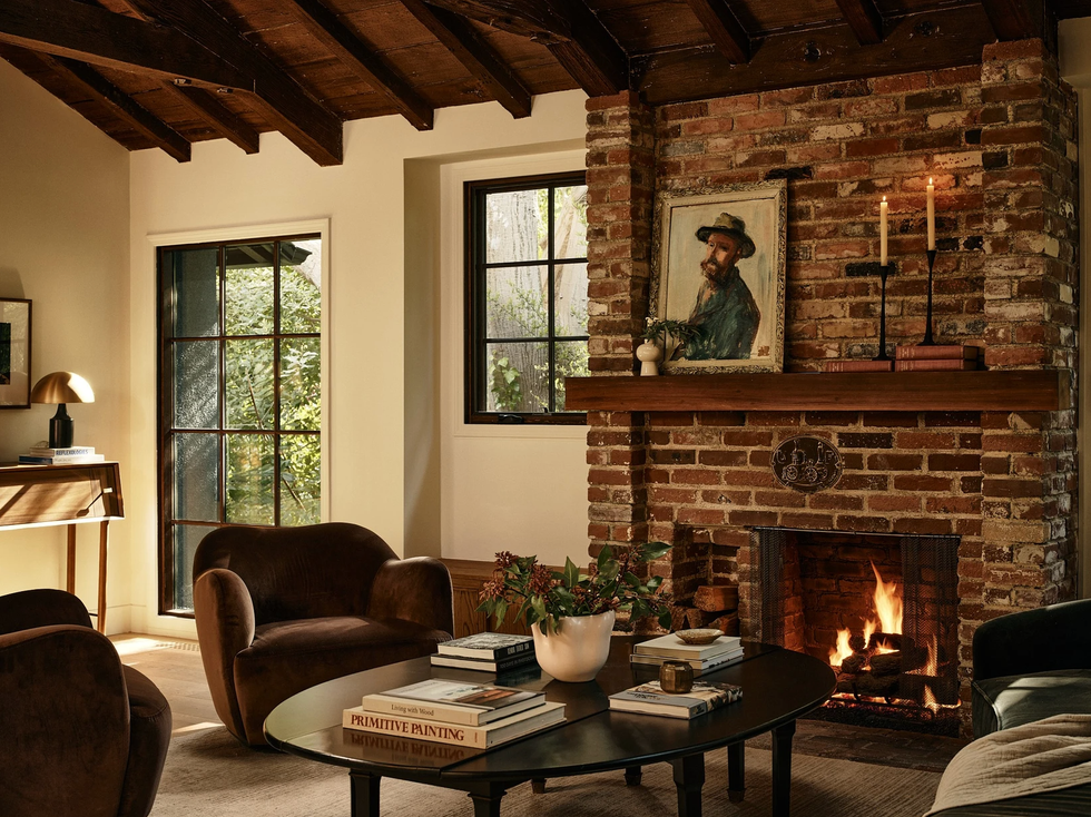
Photo: Nils Timm | Design: House of Rolison
Instead: Add Personal Touches
Using generic, mass-produced decor items can make a home feel impersonal and bland. Create a sense of space and character by incorporating personal touches, such as family photos or unique decor and art pieces.
Overly Themed Rooms
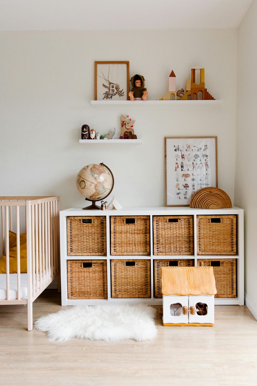
Photo by Tatiana Syrikova
Instead: Scale Back On Thematic Pieces
Overdoing a specific theme, such as nautical or rustic, can feel kitschy and less sophisticated. Instead, use elements of a theme sparingly, like this woodland-themed kids room that features an animal print and little trinkets on a shelf for an adorable touch.
Main Photo by Rachel Claire
Find more home decor inspiration on our Home Decor page and subscribe to our email newsletter for all our home decor tips.


