16 Ways to Incorporate Pantone’s “Resourceful” Palette into Your Home

When Pantone looked into their crystal ball of home decor and pulled out their decor trends for 2018, all the palettes were bold, intense, and beautiful. The Resourceful Palette combines warm and cool tones of blue and orange for such a mesmerizing effect that, according to Pantone, “You just can’t avoid looking at it.” Whether you’re going for a few bold accessories or you’re ready to pop open those paint cans, scroll on for 16 inspiring ways to bring these vivid colors into your own home.

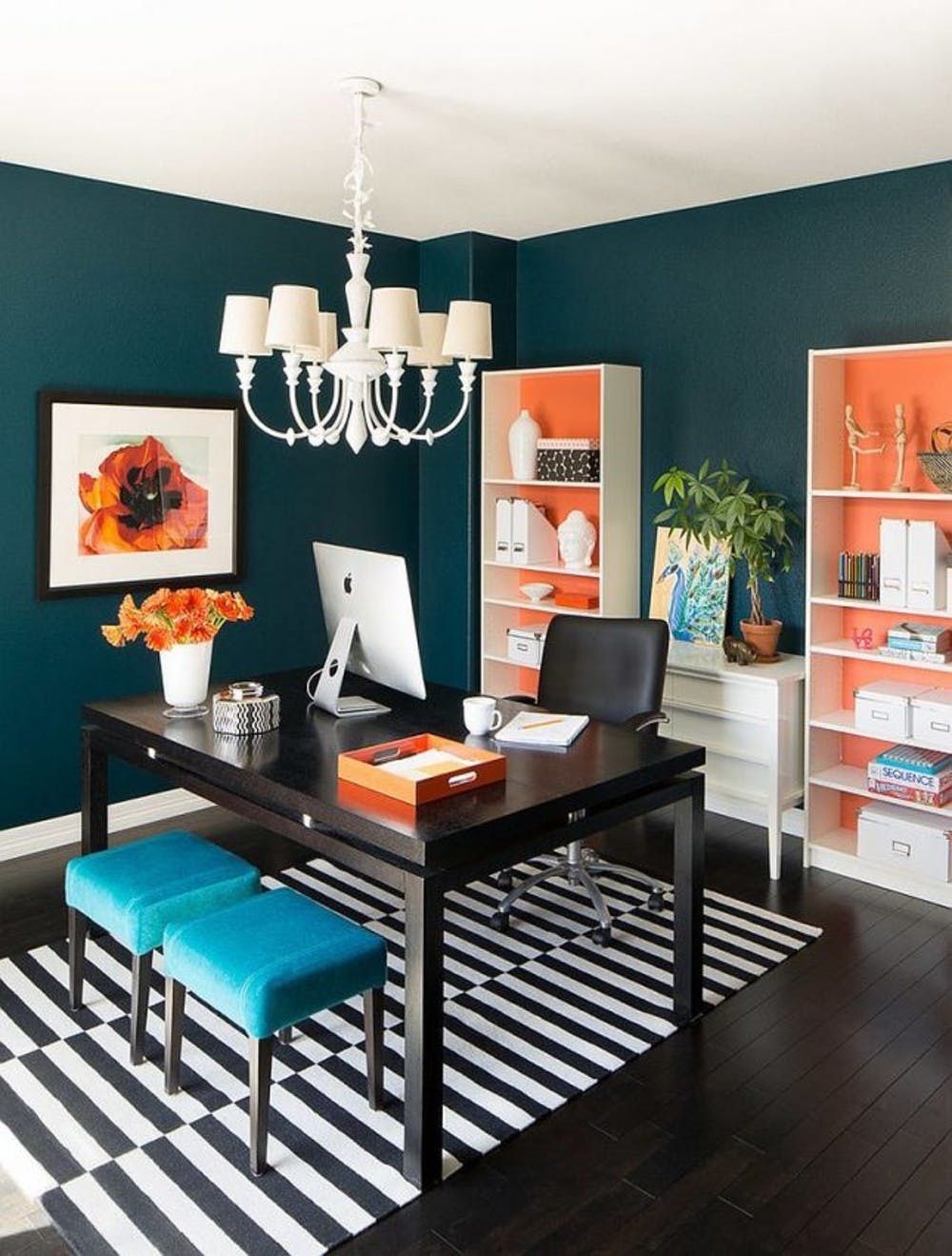
1. Orange Crush: Orange can stimulate activity and add a burst of energy to any space, making it ideal for a home office. Kick-start your work day with pops of orange accessories, wall art, and maybe even paint in the shelves. (via IBA Design Associates)

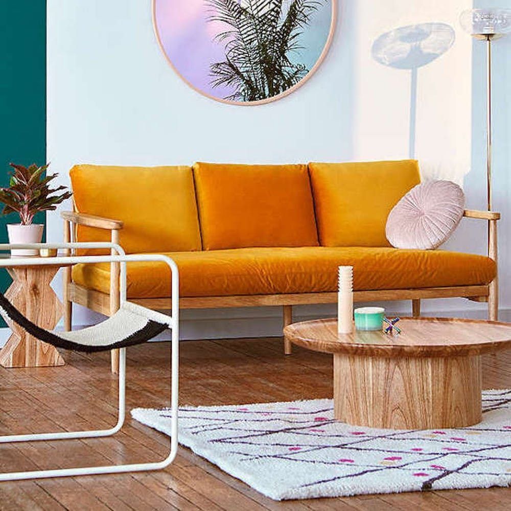
2. Retro Vibes: Blue and orange look lovely together, but you don’t have to go with the boldest paint possible. A soft sky blue is surprisingly elegant and modern when paired with an orange sofa, pastel pink pillows, and lots of rustic texture. (via Urban Outfitters)

3. Nautical Touches: The blue pom-poms on these sweet, simple, and sophisticated nursery curtains are *everything.* Placing an orange chair against bold graphic patterns keeps the decor lively and ready to inspire your next great reading session. (via Design Dazzle)

4. Opposites Attract: It’s totally okay to embrace this color palette in tiny ways. After all, Pantone comes out with new palettes every year. If you’re still rocking last year’s pastels, bring in a quick refresh with blue and orange throw pillows. (via BHG)

5. Gorgeous Graphics: Major pattern points go to this bold AF couch. The orange ikat, quirky koi fish patterns, and blue chevron couch come together in a way that totally works. (via The Glam Pad)

6. Boho Accessories: While you’re busy bringing in blue and orange accents, incorporate another modern trend — boho textures — with wooden furniture and handmade ceramics. Blue walls will make those textures pop in a majorly good way. (via Target)

7. Graphic Patterns: Pastels look hip and trendy with punchy accents like blue and orange. Anchor the space with neutral furniture and go crazy with cartoon-like patterns. (via BHG)

8. Minimalist Colors: This modern bedroom is a beautiful example of how versatile the Resourceful Palette is. A blue half wall is *the* perfect complement to an orange task lamp and white bedding. We’re loving how the end result is almost nautical but in a totally fresh and trendy way. (via INT2 Architecture)

9. Sneaky Accents: Forget painting the walls. The easiest way to experiment with a new color palette is to pull out the spray paint and dress up a thrifted bench or stool. (via Decouvrir Design)

10. Country Living: The different shades of blue in this room are totally on point, but it’s that orange sofa that really brings the whole space together. Pair bold chairs with white walls and graphic throw pillows and you’ve got a seating arrangement guests will never want to leave. (via Vintage Revivals)

11. Big Blue: This bold kid’s room is wearing those bright shades in the best way possible. And who would’ve thought matching the wall paint to the headboard would look so chic? (via Elle Decor)

12. Pull Up a Seat: Ah yes, a blue velvet armchair in your reading breakfast nook ensures you never have a bad morning. Whether you’re settling down with a glass of wine or a mug of coffee, this bright and cheerful corner comes together beautifully with luxe textures and an orange throw blanket. (via Livet Hemma)

13. Stripes Ahoy: Well that settles it; striped ceilings are officially the coolest thing ever. Take a cue from this kiddo’s nursery and pair soft teal walls with playful orange accessories for all the happy feels. (via In Jackie’s Shoes)

14. Jungle Glam: Monkey wallpaper, blue cushions, and an orange desk chair make this space look positively luxurious. Plus, who can resist a blue daybed piled high with matching pillows? (via House of Hackney)

15. Tangerine and Cerulean: The bright blue bedding in this guest room earns its clout when paired with a citrusy punch of orange. The pops of color also add a ton of personality to an otherwise cool-toned bedroom. (via Domino)

Need more color palette ideas for your next home makeover? Follow us on Pinterest for more inspiration.

Finally — a Pantone Color of the Year that I can totally get on board with. PANTONE 17-1230 Mocha Mousse is a deliciously warm brown that blends two of my favorite things: coffee and chocolate. This cozy, yet refined hue is the ultimate neutral for anyone embracing the earthy tones that make your home decor feel grounded, organic, and effortlessly elevated. It's rich without being overpowering, with a muted sophistication (think: coffee with a splash of cream) that instantly warms up a space. Pantone describes it as the color of comfort, and I couldn’t agree more.

“Mocha Mousse is the perfect choice for 2025," says designer Ashely Stark. "Mocha Mousse offers endless possibilities for decorating, whether it’s through a plush rug, a soothing carpet, or as a base for bold pops of color like deep jewel tones or metallics. This versatile shade opens up a world of design options, making it a timeless and adaptable addition to any space." Ready to infuse your home with a Mocha Mousse aesthetic? Here are 15 easy ways to embrace the look for 2025.

See how to decorate with Pantone's Color of the Year, Mocha Mousse, here!

Mocha Mousse Soft Goods: Bedding + Pillows + Throws + Rugs

Anthropologie

Anthropologie Lustered Velvet Alastair Quilt

Velvet is making everything cozy for 2025 and this lovely set with mocha tones will instantly refresh your bed for the season.

McGee & Co.

McGee & Co. Polly Pillow Cover

This plaid pillow in 100% linen is luxe yet approachable for that sophisticated McGee vibe, mocha style!

McGee & Co.

McGee & Co. x Loeffler Randall Gardenia Pillow Cover

This warm plaid pattern, designed in collab with Loeffler Randall, is a perfect pairing for your mocha decor.

Lulu and Georgia

Lulu and Georgia Behren Wool Rug

This handwoven rug feels organic, fresh and modern with a literal grounding palette.

Pottery Barn

Pottery Barn Faux Fur Mink Throw

This luxe faux mink fur in deep brown and creamy tones is the throw we want to cozy up with all winter.

Statement Mocha Mousse Accents

Lights and Lamps

Avero Concrete Table Lamp

The mocha cast in this concrete lamp is stunning in a bedroom or living room.

Minted

Minted Earthy Cascade I

This abstract print of a mountain and river landscape is earthy and modern and perfect for your wall decor. Pair it with Earthy Cascade II.

Pottery Barn

Pottery Barn Artisan Studio Handcrafted Ceramic Collection

Ceramics have a way of making a home feel less sterile. The organic shape and rustic finish of these vessels are gorgeous in any mocha decor.

CB2

Regine Brown Glass Vase by goop

Inspired by midcentury Murano glass, this handblown brown glass vase by goop transitions from clear to earthy brown and looks lovely with a dried or fresh bouquet.

Mocha Mousse Furniture

Lulu and Georgia

Lulu and Georgia Baird Accent Chair

Let the overstuffed arms hug you while you read a book in this inviting accent chair.

Joybird

Joybird Denna Sectional

Get cozy in this dreamy oversized sectional with so many pillows, perfect for your winter weekend Netflix binge!

Mocha Mousse Paint

Sherwin Williams

Sherwin Williams SW 6067 Mocha

This muted chocolate neutral is perfect in a home office or living room. Try it as an accent wall or go full color drenching.

Benjamin Moore

Benjamin Moore Whipped Mocha CSP-350CSP-350

This color literally looks like a whipped mocha delivered straight from your favorite barista.

Graham & Brown

Graham & Brown Hot Mocha

This mocha leans into the warmer side, bringing a warm, inviting and luxe feel to a room.

Pair Mocha Mousse With These Colors

Wayfair

Chris Loves Julia x Loloi Matilda Collection

Lean into natural colors like creamy whites, beige, and taupe for a sophisticated mocha vibe. Olive, greige, and burgundy reds with a smidge of gold will also bring out the mocha warmth for 2025!

Be sure to sign up for our weekly email newsletter for more home decor inspiration!

Brit + Co may at times use affiliate links to promote products sold by others, but always offers genuine editorial recommendations.
Amid Blake Lively & Justin Baldoni's legal battle, their It Ends With Us costars have stayed relatively quiet, but on February 17, Brandon Sklenar (who played Atlas opposite Blake's Lily and Justin's Ryle) was straight-up asked if he's Team Blake or Team Justin. The question shocked me a little, TBH, given the internet's discussion around whether the PR for the movie trivialized its themes of domestic violence, but Brandon handled the q like a champ.

Here's what Brandon Sklenar said about being Team Blake Lively or Team Justin Baldoni amid the It Ends With Us legal battle.

Brandon Sklenar wants audiences to "remember why we made" 'It Ends With Us.'

In a conversation ahead of 1923 season 2, which drops on Paramount+ February 23, Brandon revealed that he just wants "people to remember why we made the movie in the first place and what it stands for, and just keeping the focus on that."

The film follows Lily Bloom, who finds herself in the middle of a very complex and dangerous relationship. "That movie meant so much to me, and I have someone very, very close to me in my life who's gone through what Lily's going through for a long time and I've been on the front lines helping her navigate that space," Brandon continues. "Me doing that film gave her the strength to change her life...It's unfortunate that things get taken away from what the ethos of [the movie] is and gets convoluted, and I just want to remind people of why that thing exists in the first place."

But is he Team Blake or Team Justin? "I'm Team It Ends With Us," Brandon tells CBS Mornings co-host Gayle King.

And it's not the first time Brandon Sklenar has spoken up.

This isn't the first time Brandon Sklenar has spoken on the feud between Blake Lively and Justin Baldoni. After Blake's legal team published a story in the New York Times in December 2024, alleging that Justin has sexually harassed her and orchestrated a smear campaign against her, the 1923 actor shared the link on his Instagram story on December 23, telling his followers, "For the love of god read this," alongside a red heart and Blake Lively's Instagram handle.

Brandon also took to his Instagram stories after the movie premiered in August 2024, saying "What may or may not have happened behind the scenes does not and hopefully should not detract from what our intentions were in making this film."

"There isn't a single person involved in the making of this film that was not aware of the responsibility we had in making this," he continues, adding that "villifying" the women involved in bringing the story to life "detracts what this film is about."

"Colleen and the women of this cast stand for hope, perseverance, and for women choosing a better life for themselves," he says.

Check out what Brandon Sklenar had to say about an It Starts With Us movie, and read the latest news on his new rowing biopic, The Olympian.

In our eyes, color is never a bad idea, and though the moments where you get stuck in a wardrobe rut and reach for boring (yet dependable) all-black attire can be all too common, there are ways to work your way out of it. Trends often cycle through the seasons, so welcoming this next one means a brand new set of colors to play with – even beyond your wardrobe. Check out 6 trending colors that fit right into your summer color palette below!

1. Barbie Pink

Image via Brit + Co.

There’s no doubt that the anticipation for Barbie to hit theaters has crept into every area of our lives. Barbie pink is back in a big way this summer, adorning our clothes, accessories, beverages, and even our interiors.

TikTok’s “Miamicore” (all about the bright and the bold) interior design trend is a testament to Barbie pink’s power at the moment. According to Taskrabbit, 25% of people expressed a desire to incorporate pink accents into their homes this year.

Hot pink hues were also… well, hot during NYFW, and have carried this season’s brightest fashion looks.

2. Red-orange

Image via Flying Tomato

It’s not totally red, and it’s not really orange, either. It’s red-orange, and we love that this color’s trending right now because it's complimentary to practically any skin tone and just hits different in the summertime.

Pantone truly hit the mark on this color trend with the hue Cherry Tomato, which was featured in their Summer ‘23 Color Trend Report. This Loveliest Looks Woven Midi Dress ($64) from Flying Tomato is the true embodiment of the color.

Perhaps its popularity is because it reminds us of actual tomatoes – the ones we’re growing in our home gardens and using for fresh summer pasta salads. We also can’t forget the viral Loewe tomato candle.

Fiery, tomato-y red-orange looks stunning against turquoise, chartreuse, and this next trending color: lilac.

3. Lilac

Image via Urban Outfitters

As Swifties, we’ll take a chance and say this next trending color is a product of the “Lavender Haze” effect. But it could also be that lilac is simply easy to feature as the main component of an outfit, or be used for a small pop of color in your room. This lilac BDG Eddie Ribbed Shrug Sweater ($39) is proof – the versatility of it all!

The trending shade could *also* be linked to our growing passion for florals and botanicals, whether they come in scent or flavor form. We adore them all the same! According to Tastewise, in the past two years alone, floral flavors have received a +91% rise in consumer interest, with botanical flavors following suit, experiencing a +31% increase. Their scented counterparts are popular as well, being highly correlated with stress relief.

4. Lime Green

Image via Olive and June

The bright and the bold continue in this trending green. It seems we’ve departed from spring’s popular chartreuse to more lime green shades in the color canon – after all, there’s nothing wrong with standing out a bit!

Like lilac, lime green is easy to apply all-over, or as an accent – it’s whatever you’re feeling. Greens in all forms and shades are trusted to be nourishing and lush, but this punchy take just infuses the summer months in sheer fun! Take this Lime Fizz Polish from Olive & June ($9) – it truly stands out among the rest.

5. Metallic Silver

Image via Nasty Gal

This next color simply shines. More prominent in fashion than in interior design, metallic silver is having a renaissance – no, literally. Thanks to Beyonce’s recently-embarked Renaissance tour that’s dripping in eye-catching metallics and disco-esque futuristic aesthetics, interest in silver pieces has dramatically increased.

A recent finding by Nasty Gal revealed that online interest in 'metallic cowboy boots' skyrocketed 488% after the first night of the tour, according to the analysis of Google search data.

Google searches for 'silver cowboy boots,' a la NG's Real Leather Stitched Western Boots ($98), also rose 300% worldwide after the first tour date, as well as searches for 'disco cowboy hat', which went up 525%. The metrics for ‘silver bodysuit; and ‘silver corset’ measure up to the large increases as well.

“These increases in searches tell us exactly what everyone is wearing to the tour, with many fans wanting to emulate Beyoncé's iconic and daring style,” a spokesperson for Nasty Gal said. “Expect to see plenty of chromatic cowboy boots, head-to-toe silver, and disco-embellished cowboy hats on your tour date.”

6. Cream White

Photo by Angela Roma / PEXELS

Cream white is super design-friendly, and can be observed through current fashion and home trends. It’s most prevalent in the fashion world when we look at sustainable fashion – people are making more careful investments in their wardrobe in an effort to shop sustainably and halt detrimental spending habits. See: the rise of capsule wardrobes.

This hue is also incorporated into minimalist fashion trends that prioritize easy styling by using neutral palettes – think blacks, whites, tans, creams, and the like.

Furthermore, cream white’s summer presence in architecture and interior design can be attributed to the same reasons. Consumers are craving the minimalistic simplicity found in limited color palettes.

The Chip and Joanna-style houses are a good example – they boast an uncomplicated black and white color scheme that makes things look super clean and minimal. We’ve taken that concept and ran with it for interiors, too.

Which color will you be adding to your summer color palette? Let us know @BritandCo!

Brit + Co. may at times use affiliate links to promote products sold by others, but always offers genuine editorial recommendations.

Audiences loved the way Greta Gerwig's Little Women brought all four March sisters to life, and Netflix's Anne with an E became so popular that when the show was canceled after season 3, 1.7 million fans signed a petition to revive the series. It all just proves that classic adaptations can make the original story even more powerful.

And the newest movie based on a book is going to be one we think about forever — and not just because of its cast. Emerald Fennell (who you'll recognize from The Crown and her work as writer & director on Satburn) is adapting Emily Brontë's Wuthering Heights and Margot Robbie and Jacob Elordi are leading the cast!

The book, published in 1847, continues to grip readers, and it's become the blueprint for moody complexity — just like Emerald Fennell's Promising Young Woman, which won the Oscar for Best Screenplay thanks to its scathing look at sexual assault. Well, the Em's are coming together for this new adaptation.

Here's everything we know about Emerald Fennell's Wuthering Heights — and your first look at the movie.

Here's Your First Look At 'Wuthering Heights'

The first look at Emerald Fennell's Wuthering Heights is getting some seriously mixed reactions. The photo features a close-up image of someone (maybe Margot Robbie's) with their fingers and a few blades of grass in their mouth.

"CAN NOT WAIT," one Instagram user said, along with a couple fire emojis. But the intimate (and somewhat shocking) image also has some users asking, "what in the saltburn?"

Is Wuthering Heights going to be in theaters?

Focus Features

It appears director Emerald Fennell and producer Margot Robbie are pushing for a theatrical release, which is why they've reportedly turned down a Netflix offer of $150 million.

Despite the fact Netflix co-CEO Ted Sarandos said theatrical releases are "just not our business," and the company has stuck to at-home streaming instead, they did break that pattern for Knives Out: Glass Onion in 2022. The movie appeared in around 600 theaters the day before Thanksgiving, but left a week later ahead of its December 23 debut on the streamer.

Co-CEO Reed Hastings told The Hollywood Reporter that keeping the movie in theaters could have made Netflix more money, but later said they just wanted to "break through the noise" and get movie lovers excited for the film to come to Netflix.

All that to be said, Margot Robbie (whose Barbie made over $1 billion worldwide) and Emerald Fennell (whose Promising Young Woman nabbed her an Oscar win and two other nominations) know how to capture the imaginations of movie lovers everywhere. And it could definitely be in their favor to stick to a theatrical release. Stay tuned for official news on where you can watch Wuthering Heights!

Who's in the new Wuthering Heights movie?

Frazer Harrison/Monica Schipper/Getty Images

Wuthering Heights Cast

The Wuthering Heights movie will be led by Jacob Elordi and Margot Robbie as Heathcliff and Catherine Earnshaw, respectively. Margot will also produce with her production company LuckyChap, which worked behind the scenes on Emerald Fennell's Saltburn and Promising Young Woman.

While some fans were initially excited about the casting, others were concerned about the fact that in the book, Heathcliff is described as "dark skinned." He also tells Nelly that, "I wish I had light hair and a fair skin, and was dressed, and behaved as well, and had a chance of being as rich as he will be!" Um, it looks like Jacob Elordi definitely has fair skin to me.

"Heathcliff is described as a dark-skinned brown man in the book and a major plot point is that he was subjected to racist abuse by his adopted family," one tweet (which has over 8 million views) says. "But yeah sure Jacob Elordi is perfect!"

Another says, "Film studios will say 'We are committed to diverse casting' and then cast Jacob Elordi to play Heathcliff, one of the more famous people of color in literature, whose race is crucial to both his character and the story."

Check back here to see who will play characters like Edgar Linton, Nelly Dean, Isabella Linton, and Lockwood.

When is Wuthering Heights coming out?

Warner Bros. Pictures

Wuthering Heights Release Date

Wuthering Heights will premiere on February 14, 2026. Happy Valentine's Day!

What is Wuthering Heights about?

Amazon

Wuthering Heights Plot

Emily Brontë's Wuthering Heights follows the Earnshaws and the Lintons, who are living in the Yorkshire Moors in the 1880s. Their lives change forever when the Earnshaws take in Heathcliff. Like any good dramatic novel, passion lies beneath proper connections, marriages, and societal expectations — and despite Catherine and Heathcliffe's feelings for each other, they have to choose between security and love.

Check out 16 New Movies Based On Books To Add To Your Watchlist to inspire your next movie night!

Brit + Co may at times use affiliate links to promote products sold by others, but always offers genuine editorial recommendations.
This post has been updated.

Get ready for a week of powerful transformation and aligned action, beautiful! This week's tarot reading emphasizes the interconnectedness of your mind, body, and spirit, guiding you to tap into your inner wisdom and create a life that truly lights you up. Let's dive into your tarot reading and discover how you can embrace your full potential and manifest your dreams!

Scroll down to see your weekly tarot reading for February 18, 2025!

1. Nine of Pentacles

Physical Health: The Nine of Pentacles suggests your physical health is strongly tied to your mental well-being. Stress, anxiety, and worry can manifest physically as digestive issues, sleep disturbances, muscle tension, and difficulty absorbing nutrients. Prioritize your mental health to support your physical body. Slow down, create space for rest, and allow your body to restore its energy.

2. Four of Cups

Mental Health: The Four of Cups encourages you to release the need to control outcomes and surrender to a higher plan. Trying to force things to happen a certain way also leads to stress and anxiety. Instead, tap into your intuition and allow your emotions to guide you. If something feels good, pursue it. Ask yourself: What would bring me joy and peace? Engage in activities that light you up. This is a time to pause, listen to your inner voice, and trust that there's an easier way forward.

3. King of Swords

Emotional Well-being: The King of Swords empowers you to trust your intuition and act on your feelings. You have the wisdom and experience to make decisions for yourself. If something excites you, go for it! Don't overthink it. This is a time for movement and action after a period of stillness. For some, this may also be a week to address and heal any lingering emotional heaviness. Feel your feelings, process them in a healthy way, and move forward with strength and clarity.

Watch Your Full Weekly Tarot Reading For February 18 Here!

www.youtube.com

- YouTube

Ultimately, this week is about integrating your mind, body, and spirit. Listen to your intuition, honor your emotions, and take aligned action to create a fulfilling human experience.

Looking for more astrology advice & horoscopes? Be sure to sign up for our newsletter so you never miss a thing!