Six steps to major double taps.
How to Take Instagrams Like a Professional Beauty Blogger
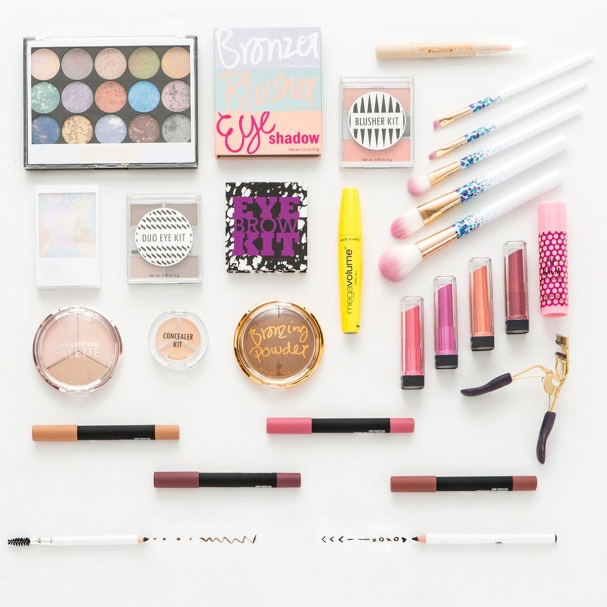
Attention, all you artsy beauties out there! With apps like Instagram and other photo editing tools within fingers’ reach, we’re all able to feel like professional photographers, artists and creators at any minute — it’s one of the beautiful elements of tech that we’re so happy to be a part of. If you’ve browsed any beauty blogger Insta feeds, you’ve probably noticed those majorly artistic layouts of beauty products that look like they fell perfectly into place. Well, guess what? They didn’t. In fact, those layouts are called “flat lays” (a little insider terminology for ya), and they actually take some expertise to master. We love seeing you all create and share your versions of all things artistic so much, we decided to go ahead and share some behind-the-scenes pro tips for how you can take these types of images to a whole new level. Watch out, Instagram — here comes a whole new wave of talented beauty babes!
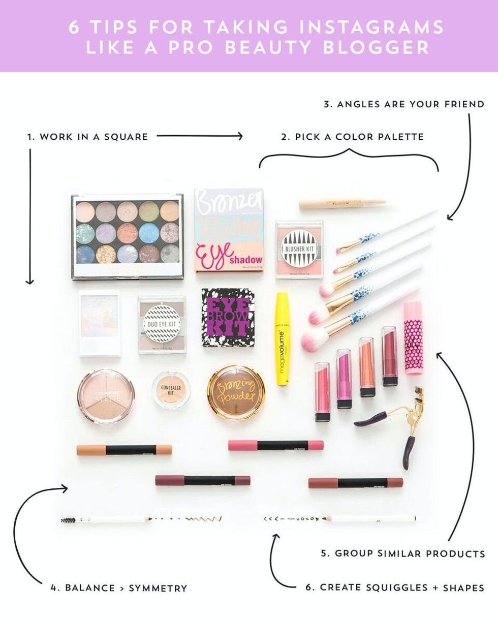
1. Work in a square. Obviously if you’re working with another crop, then go with that layout instead. The idea here is that you at least keep your work space in alignment with the crop your image will be.

2. Pick a color palette.There really are no specific rules as to what color scheme is best. The important thing is to be intentional with your color choices. Be mindful of how your colors play off each other and where they are throughout your layout — if you have a bright colored item on the lower right quadrant of the layout, try balancing it with another pop of color near the upper left.
3. Angles are your friend.If you can, conceptualize this image without any angles — SUPER boring, right?! Angles are a great way to get creative and utilize your space in an artistic, visually pleasing way.
4. Choose balance over symmetry.You can’t expect to have a symmetrical space when you’re dealing with multiple shapes and sizes of products. Rather than fight a losing battle, embrace it and aim to create balance. The best advice I have to achieve this is to pay attention to the negative (background) space. Keep that space fairly consistent between each product. Also, when you have a group of large products on one side, be mindful of what you place on the other quadrants of space. If you want to have a balanced sense of “weight,” you can counter-balance larger products by strategically structuring the negative space between smaller products.
5. Group similar products.This may not always apply, depending on the type of layout you’re working on, but if you have more than a few of the same type of product, the visual will translate best if you keep them grouped together.
6. Create squiggles + shapes.Use the products themselves to fill in spaces that aren’t looking quite right. For example, in the layout above, I couldn’t get the lower half to feel balanced, so I opened up the eyeliner and drew on some dots and squiggles to take up more space, which also looks super cute in the image!
When you first start off, you’ll end up moving things around quite a bit. Remember, though — there are so many different possibilities for how you can lay out the same items, and everyone will have their own interpretation of how it should look. Don’t put too much pressure on yourself to do it the “right” way. Just get creative, and go with the flow. Chances are, what you and the next person create will be completely different. After all, that’s the beauty of these types of creative projects!
Beautiful + Balanced
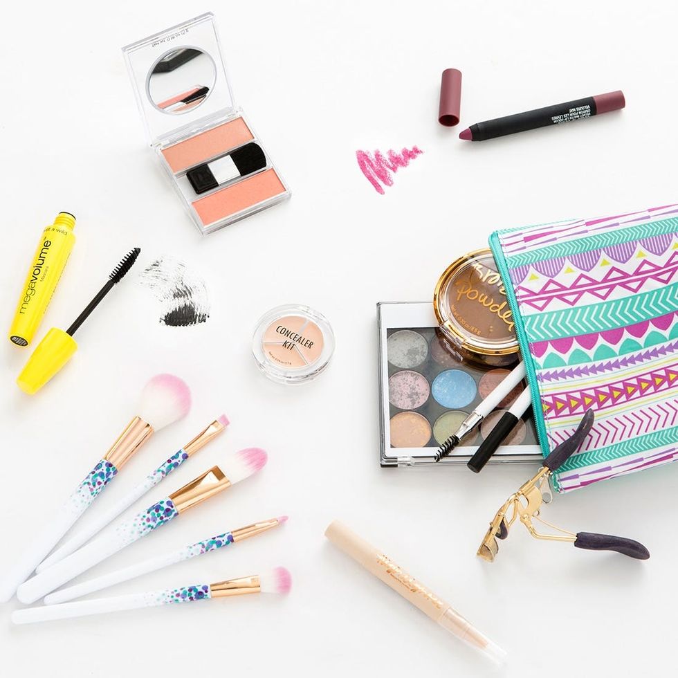
Now that you’ve got a solid handful of insider tips for how to create Insta-worthy product images, let’s put it into practice. When you want to share a favorite makeup look, or your must-have products that all your friends need to know about, this “get the look” or “what’s in my bag” approach is fun and effective. The layout here gets a little more three-dimensional and playful. Notice the lipstick and mascara designs: INSTA-ntly pretty!
Get the “What’s in My Bag?” Look
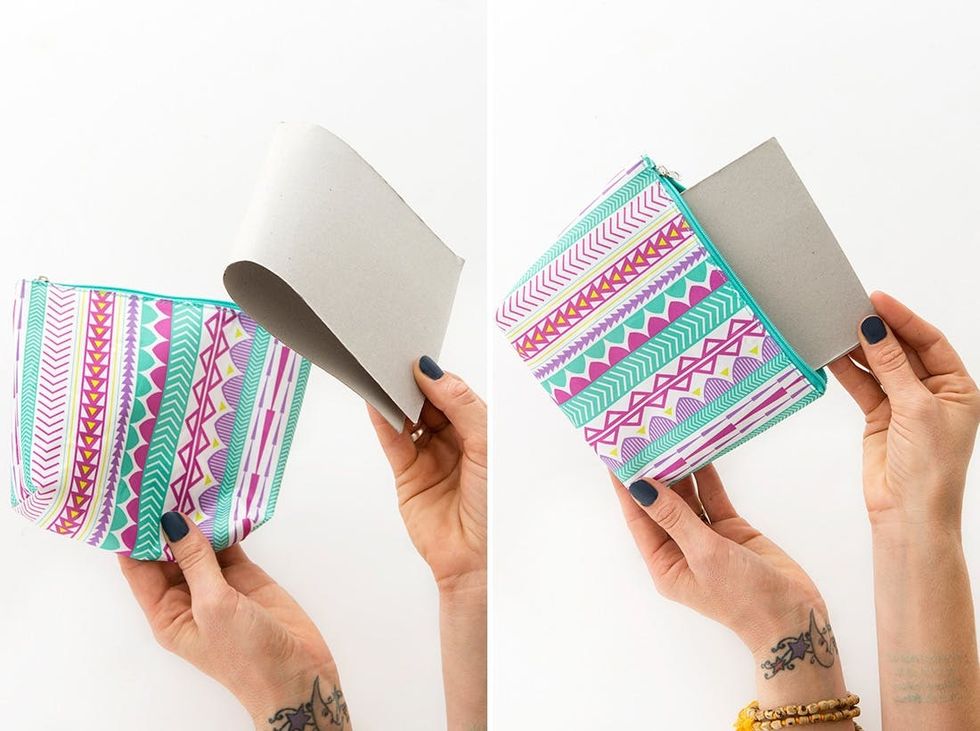
Another pro tip: When you’re working with soft goods like a makeup bag or purse, you’ll probably want to add something to make it look fuller, which will in turn make the image look next-level. You can use cardboard, tissue paper, bubble wrap or whatever else you have lying around.
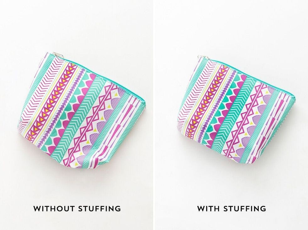
See how much cleaner the one with stuffing looks?


