Before + After: A Garage Turned Clean + Modern Guest Bedroom

When it comes to decorating, starting from scratch can be daunting. This is especially true when you’re trying to create a room that doesn’t already exist in your home. But when Harold came to NousDecor looking for help designing a guest bedroom out of what was previously a garage in his family’s San Francisco home, we didn’t back down from the challenge. Read on to hear more from Harold and learn how we brought his very clean and modern guest bedroom to life.
How were you using the space before this project?
This space was literally our garage! We live in a multi-level townhouse, where our garage and storage area occupied the entire ground level. It was so poorly used that we decided to create a living space where we could accommodate all of our friends and family who visit San Francisco. The goal was to give them a space they could feel was like their own apartment when they visited. We decided to take some space from the garage, as well as a portion of our backyard, and build out a one-bedroom apartment.
“Before” Photos
What about your style? Did you have a strong vision for what you wanted the space to look like?
I love clean, modern style. I travel to NYC a lot and have always loved The Standard Hotel. That was the inspiration for the bedroom’s decor. The team took this idea and ran with it, setting out to create a space that would feel like a luxury hotel for a visitor in San Francisco, with certain elements that would make it feel very “city.”
In addition to the fact that you were creating a bedroom from scratch, what were some of the biggest challenges about the space?
The space designated to be the guest bedroom doesn’t have a window, only a sliding frosted glass door for privacy. We wanted to create a rich, warm space, without it getting too dark. The design team did a fantastic job striking that balance.
Digital Design Mockup
What was the process of designing the space like?
I had a hard time conveying what I liked at first. We went back and forth on ideas quite a bit at the beginning. Then on a trip to New York City, I stayed at one of my favorite spots, The Standard Hotel. Not only did I love that clean, simple and modern look, but I loved how I felt in the space. That’s when I asked the team to model the bedroom after that. And everything came together from there. The general design and flow was done on the first iteration. Plus, they integrated several pieces that I already had.
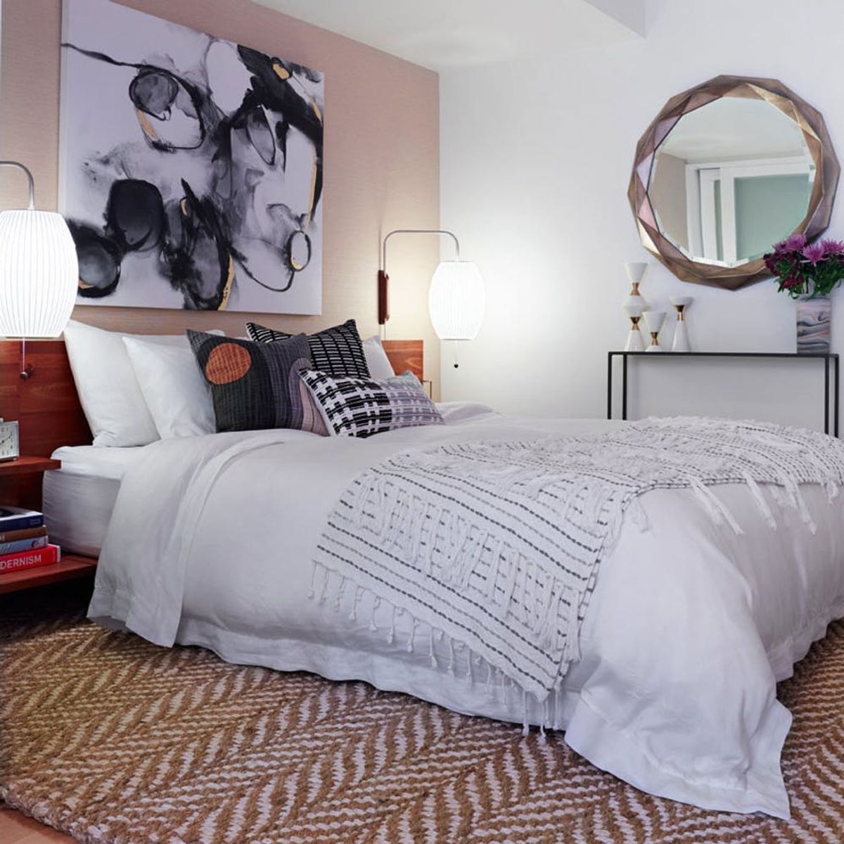
“After” Photos
Tell us about the design!
The central piece in the room is the sleek platform bed. Because it’s low, they had fun playing with the scale of the rest of the decor. For example, they found a great art print for the wall. It’s nice and big and looks really good with the low bed.
What do you love most about the new look?
The Nelson Cigar wall sconces are pretty cool. I didn’t think about using sconces for lighting. It’s nice having more room on the side tables, instead of needing two table lamps.
The console table vignette is gorgeous. Is there a story behind that?
We wanted more surface space, but there wasn’t enough room for a dresser, so the team found a great small, narrow console for the back wall. It works really well.
Were you happy with how the room turned out?
That goes without saying! I’m thrilled with how the room turned out. It’s warm and cozy, but still modern. I love bringing people down to show them the room. Plus, everyone who’s stayed there so far says it feels like their own apartment. And when I work from home, I spend the whole day down there, and it’s perfect. Next, my wife and I want to spend a night down there and pretend like we’re on vacation!
The NousDecor team can help you create a guest bedroom too, no matter what you’re starting with. We’ll make sure that all your future guests are put up in high style. Click here to start a project today.
Loving this before and after? Follow us on Pinterest for more home makeovers.


