Hint: Comis Sans is always a terrible idea.
These Are the Best + Worst Fonts to Use on Your Resume

May is going to be here in the blink of an eye (cue that hilarious Justin Timberlake meme), and with the new month comes a slew of college graduations. And after all those grads return from their eye-opening backpacking trips they’re going to get to work on their resumes, which everyone knows is no easy feat. What should you be sure to include and what should you definitely leave out? Should you forget the rules entirely and send companies something totally unexpected? Hey, that tactic worked for our DIY editor Kelly, who was hired after she snail mailed Brit + Co a resume she made out of wood.
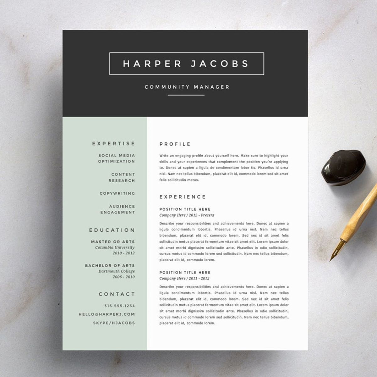
But for those of you who are looking to create (or update) an old-fashioned paper-and-ink kind of deal, there’s one factor that’s crucial to consider: the font. Send an employer your skill set in Comic Sans and you can probably kiss that job opportunity goodbye, but try Times New Roman and you just might snag an interview.
To figure out the best and worst fonts to use, Bloomberg asked three typography experts which make your CV look super classy, which should never be seen by a potential employer and whether or not emojis are fair game. The definite winner was not-so-surprisingly Helvetica. The frill-free typeface is simple, clean and so well-respected it even has a documentary dedicated to it. If you’re looking for something that’ll definitely pass recruiters’ eyes with flying colors, this should be your go-to.
Coming in second is Proxima Nova, a sans serif font that looks a bit like “Helvetica’s cousin” according to one of the experts. The other three top picks were: Garamond, Times New Roman and Didot – all of which are still simple, but offer a little more detailing.
Now, onto those that fall into the never, ever use category. Coming in at number one was Zapfino, a scripted type that’s flowery and hard to read. After that came the old-school Courier. Of this one, an expert simply says, “You don’t have a typewriter, so don’t try to pretend that you have a typewriter.” And of course, rounding out the no-gos is the notoriously clown-looking, Comic Sans.
Now, about those emojis. Surprisingly the experts say including them might be a great idea. “Put a lot of emojis on the bottom. Some chicken wings. They will love it,” they say. “Maybe an emoji is your logo. Maybe you just really key in on the 100 logo, that’s your thing, you put it everywhere.” We’ll say this much, adding in the tiny icons will definitely make your rez stand out. Whether the company finds it endearing or unprofessional is a risk you’re just going to have to take.
What font do you use on your resume? Share with us in the comments below.
(Photos via Suited Brand Lab, CV Special and Refinery Resume Co.)


