This Blogger’s Bungalow Makeover Is Giving Us Serious Rental Inspo
When it comes to color, lifestyle blogger Erin Hiemstra of Apartment 34 goes bold. Take the 1950s San Francisco-bungalow-turned-Airbnb-rental she recently transformed for fellow creative Chloe Roth. Using BEHR’s 2018 color palette and taking inspiration from the neighborhood, Hiemstra infused each room with hues from across the spectrum. Between the jewel-toned living room and the retro pink bathroom, you’ll find unexpected delights around each corner. Keep scrolling below to see the designer’s gorgeous renovation and how you can bring the entire color-tastic look to your own abode, temporary or permanent.
Roth snagged a spot most of us can only dream about (by the beach) so Hiemstra was intentional about using this #jackpot location as the animating force behind the makeover. “We took inspiration from the beach, sand, and trees and used light, airy colors inspired by nature, as well as deep, saturated hues,” she said. And since Roth wasn’t in a position to do major renovations, Hiemstra quickly pinpointed the best way to bring the theme to life: Paint.
Choosing a perfect color for each room is a TASK in and of itself, so the designer opted for standout shades in select rooms to highlight the personality of each one. Using BEHR’s 2018 Color Trends palette, she contrasted items like green and pink with more neutral tones like white and mint. “The juxtaposition makes this transformation so fun,” Hiemstra says.
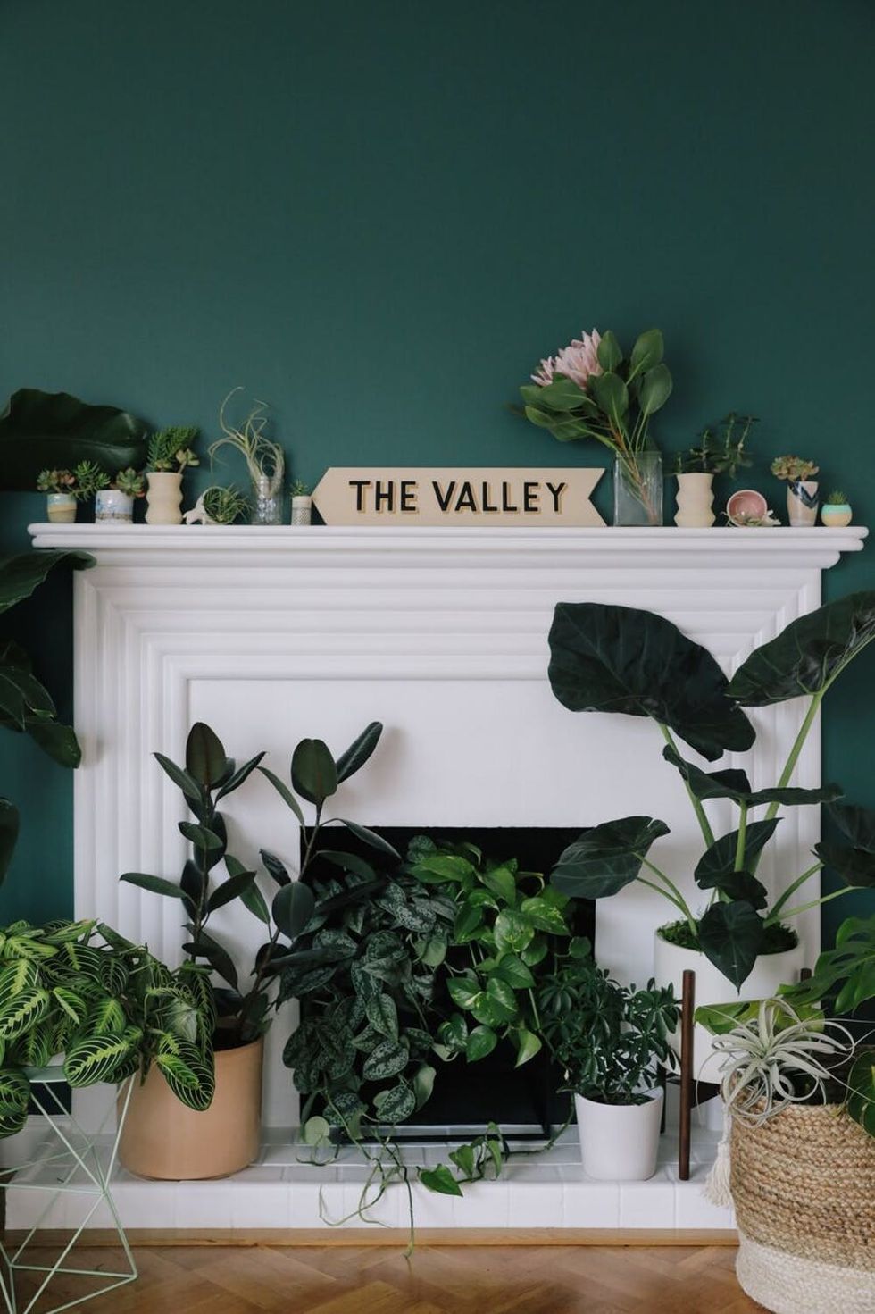
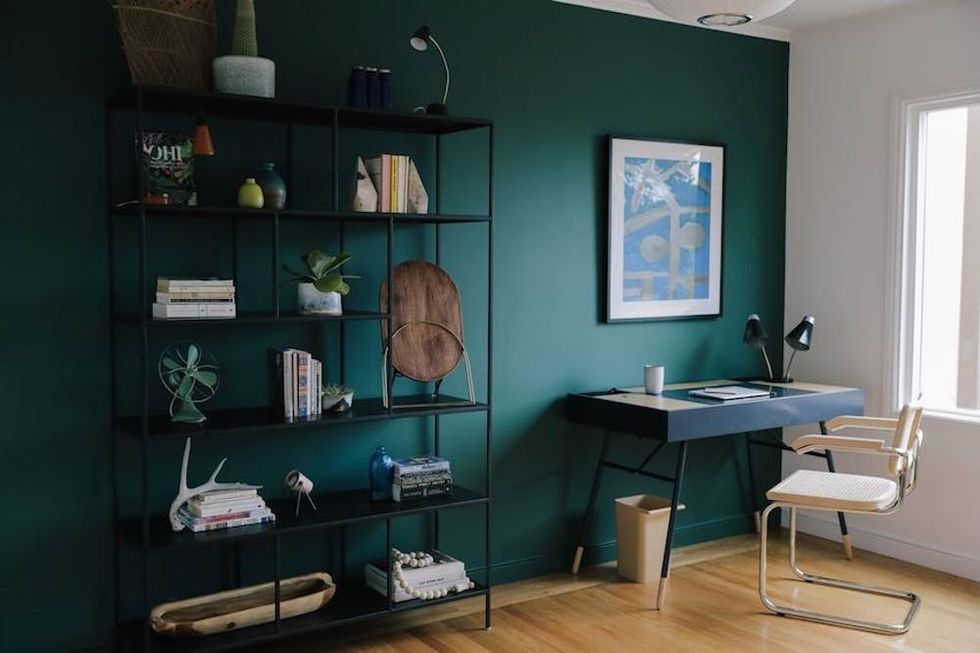
For the living room, Hiemstra used Roth’s pretty plant babies to dictate the tone. She positioned them front and center and highlighted them by using a rich green on the walls. “We chose to turn the fireplace into a lush, green space to hold plants. Equilibrium, a hue in BEHR’s 2018 Color Trends palette, served as an ‘ah-ha!’ moment. We painted the wall in this deep, bold hue to serve as a backdrop for the plants. We also painted Chloe’s office in this same hue to tie it all together,” the blogger shares.
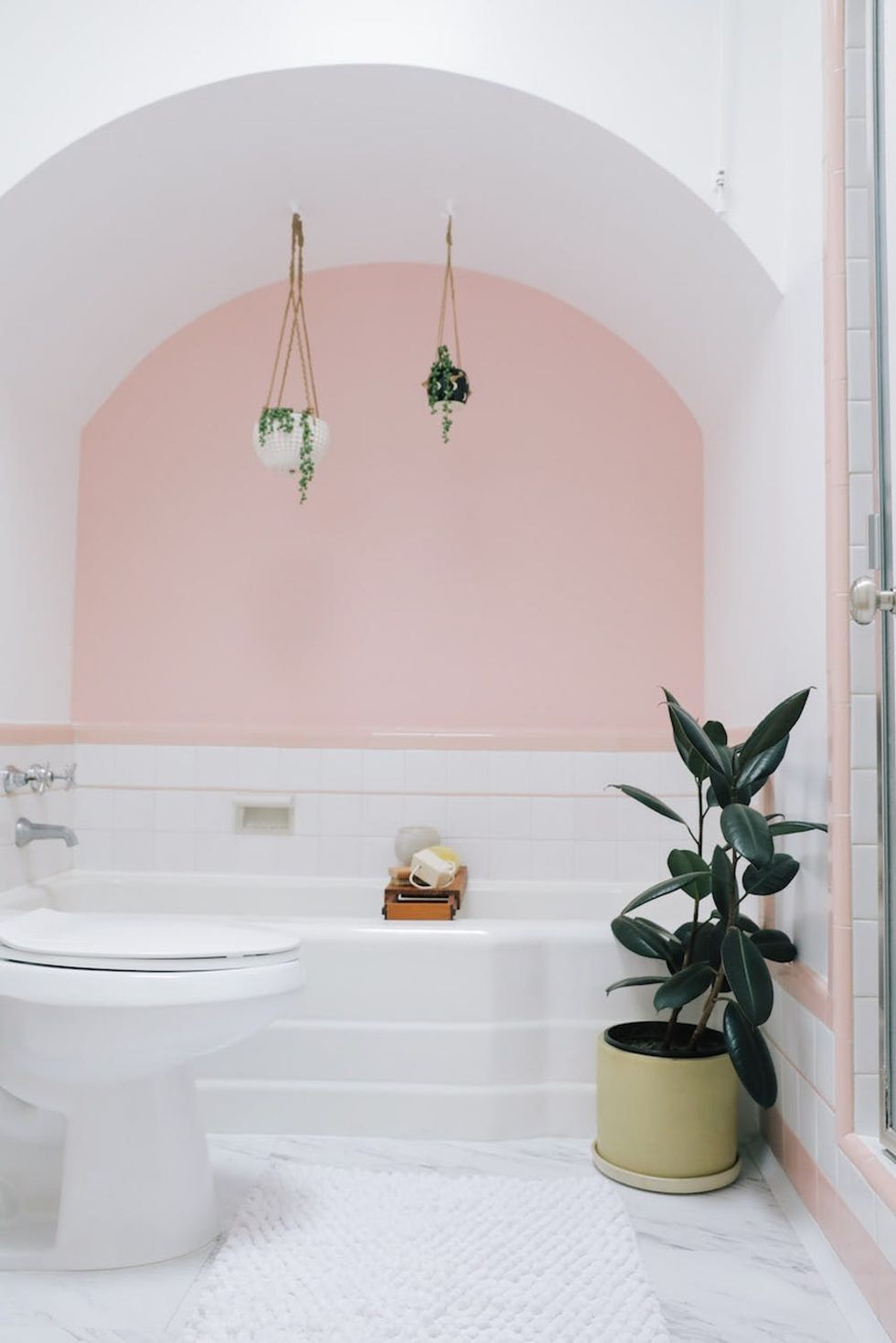
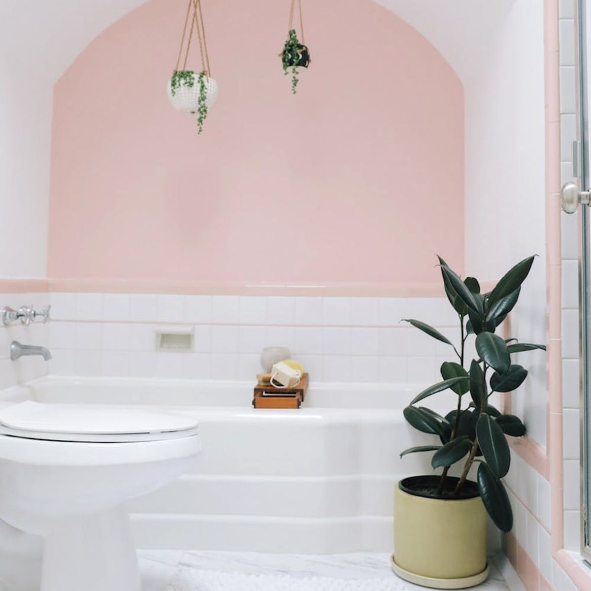
A bathroom can quickly fall victim to blah, boring decor, so the pair wanted to make sure their room was the exception. Since Roth loved the space’s original tile, the designer decided to show it off. “We highlighted the retro factor of the light pink tile by using the Positively Pink shade: It’s light, girly, and playful pink — perfect for an oasis,” she says.
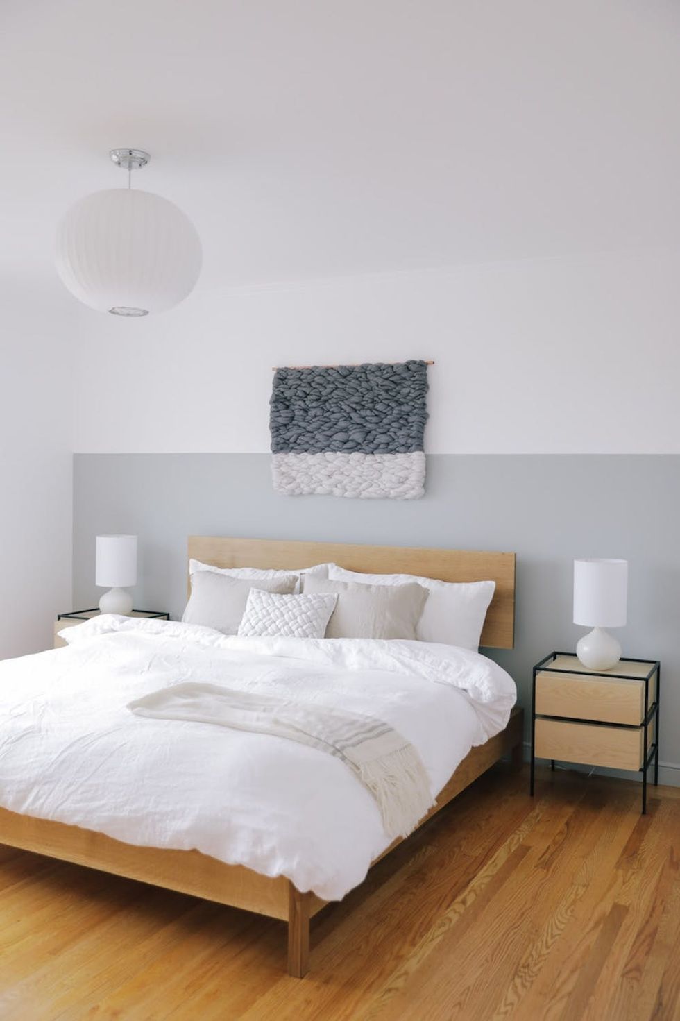
The duo settled on a more calming tone for Roth’s sleeping area. Hiemstra pulled out a pro rental decorating tip — a half-wall color job — to make the space feel bigger than it was. “The half wall helps evoke the atmosphere of the ocean or sky. Chloe’s home has pretty standard 8-foot ceilings, and adding a half wall adds height,” she says.
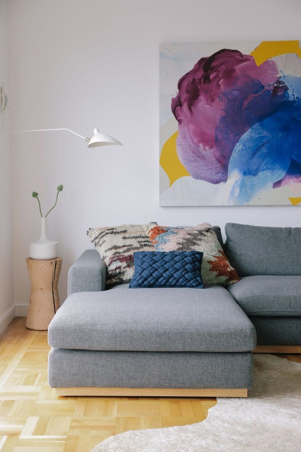
In the communal area, the pair commissioned an original piece by Bay Area artist Nicole Mueller to pull all the tones of the home together. (This was one of Hiemstra’s favorite parts of the project.) “It brings life to the space and really makes an impact,” she added.
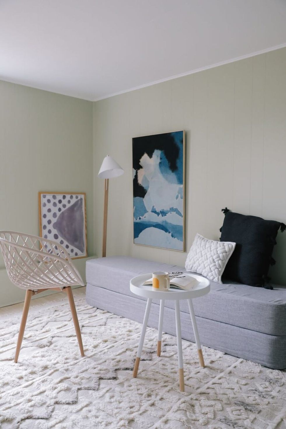
For the extra studio space, Roth’s intent is to rent it out on Airbnb, so Hiemstra put her best temporary decorating tricks to work, starting with the light green palette. “BEHR’s Wabi Sabi allowed us to add personality and character to the rental space while still feeling like a neutral. This color tied in the tones of the rest of the home and made it feel cohesive,” she says. The blogger also gave us her own takeaways for less-permanent upgrades. “An easy way to personalize a rental space is through paint color and light fixtures. You can always swap out light fixtures and repaint if you need to, and it’s an easy way to put a personal stamp on a new space,” she suggests.
Whether you’re planning on setting up permanent shop in a new dwelling or simply need a room refresh, if there’s one thing we’ve learned from Hiemstra’s latest project, it’s to never shy away from color — or a talented designer friend.
If you love seeing the look of your favorite bloggers, follow us on Pinterest for more decor inspo and celeb home tours.
(Photos via Andrea Posadas Creative for Apt. 34)


