Take a Tour of Model Coco Rocha’s Glam Nursery

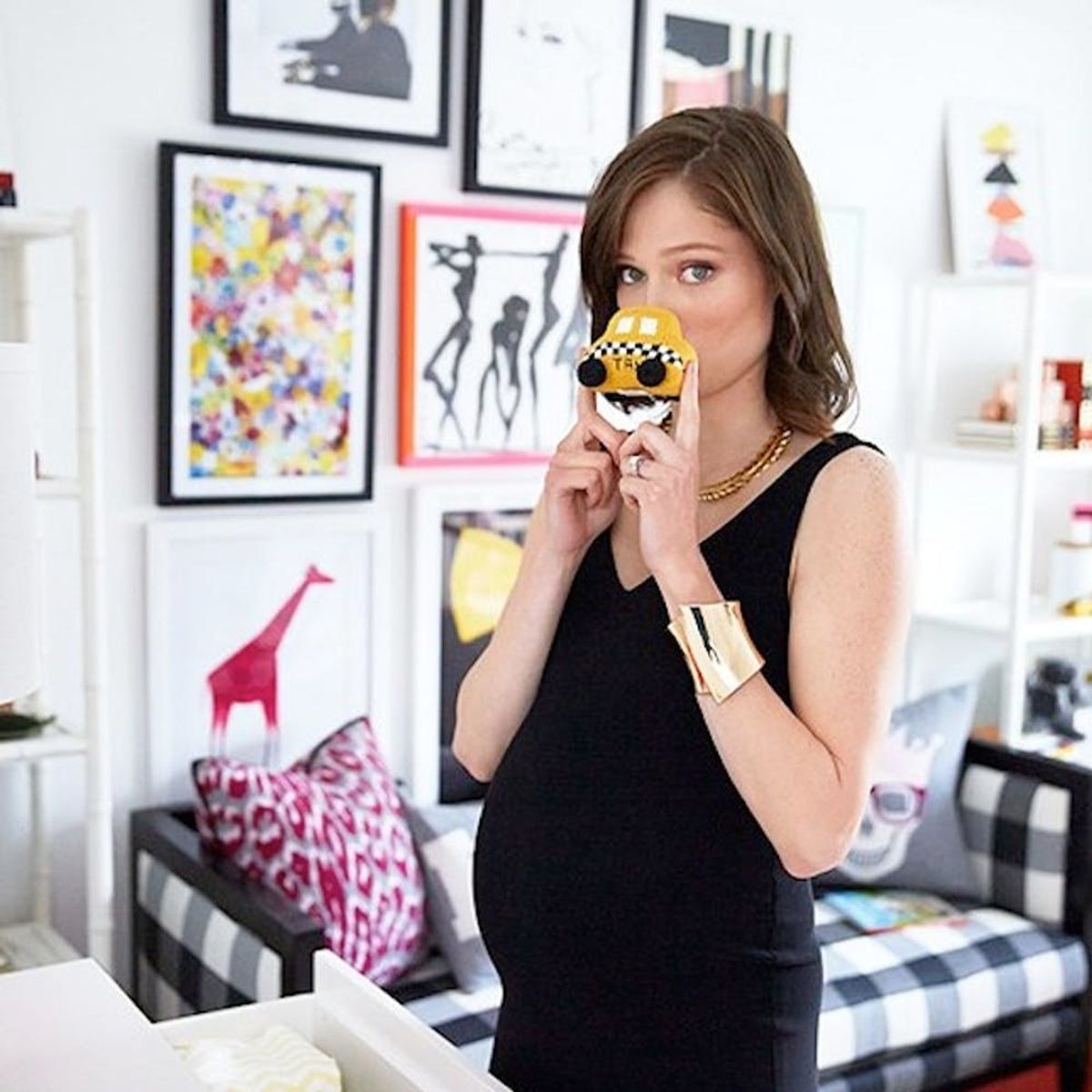
Whether it’s a celebrity or someone a little closer to us, we absolutely love taking a peek into how people are decorating their nurseries. Maybe it’s the little kid in us, but nursery decor seems to allow for the freedom to be as whimsical and colorful as you want and still get away with it. As soon as we saw this (shoppable!) nursery from model Coco Rocha on One King’s Lane, it became one of our all-time favorites. Not a shade of pastel pink to be found, this nursery is all glam and style, with just a dash of edginess. Rocha took a stance against a theme because she wanted the room to feel more organic and sophisticated than the traditional “zoo” or “princess” theme. Complete with a fab gallery wall, playful patterns and a refreshing palette of gender-neutral colors, Rocha’s nursery will have her new daughter Ioni entranced for years to come.
Rocha wanted a nursery that was modern and filled with furniture that wouldn’t be banished to the attic when her daughter grew older. And she absolutely put her foot down when her mother-in-law asked about a pink fairytale mural. Even though there are traditional pieces like a rocking chair, Rocha chose one in an eclectic Pendleton print that she would want to display in other rooms in the house when the time came. Even though the crib is under the window, there is a roller black-out screen for nap time. An enormous panda also helps to reinforce the modern black and white theme perfectly.
We love how Rocha used toys, blocks and 3D pieces as art. Since there are no storage boxes in this nursery, she wanted everything to be on display and still look beautiful. And if that means buying the prettiest baby toys you can find, we definitely agree. Instead of a toy box, Rocha went for a colorful lidded basket to keep the toy mayhem under control.
How fabulous is that gallery wall?!? Rocha got several of her illustrator friends to do little sketches for her, resulting in a totally unique and meaningful display. If you have creative friends, don’t hesitate to ask them for art. Other than the crib, nothing is this room screams nursery. Rocha could see her daughter staying in this room forever or maybe turning the space into an office. The daybed would be great in a guest room and using a dresser instead of a changing table means you can use it for chic storage anywhere else in the house.
While the room is bold and dramatic, Rocha wanted the bedding to be a little more soothing and suitable for sweet dreams. A soft gray and pink palette fit the bill perfectly, although pop art pillows keep the bedding on track with the graphic room. We love seeing a car in this little girl’s bed, because who says girls don’t like playing with cars?
Rocha mentions how much fun she has been having buying baby clothes, although she tends to steer clear of overly frilly, girly clothes for her daughter. She admits that after working in fashion, it’s fun to dress her daughter as a “mini-me,” which means that little Ioni will be one very stylish little fashionista. Instead of pinks and purples, Rocha filled out her daughter’s wardrobe with super soft clothing in creams, grays and graphic patterns.
Instead of purchasing a changing table, Rocha intends to use this stylish gold and white campaign dresser as a changing table (without all the knick knacks, of course). The mirror helps bring in more light and might help make sure you don’t have any sneaky patches of baby powder on your outfit. The length of this dresser easily accommodates a changing tray on top, with plenty of room left for a punchy red lamp.
Make playtime a little easier on yourself by layering up the rugs and adding some extra cushion. A sheepskin rug warms up the room and makes even wooden floors softer for baby (and grown-up!) knees. Rocha did a lot of rug shopping before deciding on this orange- and pink-striped one. She wanted protection from the wooden floors, but also didn’t want the room to start looking like a rug store.
Rocha was an avid book lover as a child and even kept some of her favorite childhood books that she can’t wait to read to her daughter. Can we get an awwwwww? Colorful frames show off some of the most beautiful moments of Rocha’s life, like her wedding day and an ultrasound picture. In order to keep the room from feeling too overwhelming, the walls, shelving and dresser are all white. This helps to keep the room playful and modern, but also a relaxing space for naps and quiet reading time.
When asked what element of the nursery she loves the most, Rocha picked the golden chandelier, and we are totally in agreement with her. Not only does it look uber glam, but the gold-dipped bulbs keep light from shining down too harshly, creating more of an ambient glow.
What do you think of this ultra-modern nursery? Tell us what you love and what you don’t love in the comments below!
(h/t One King’s Lane)


