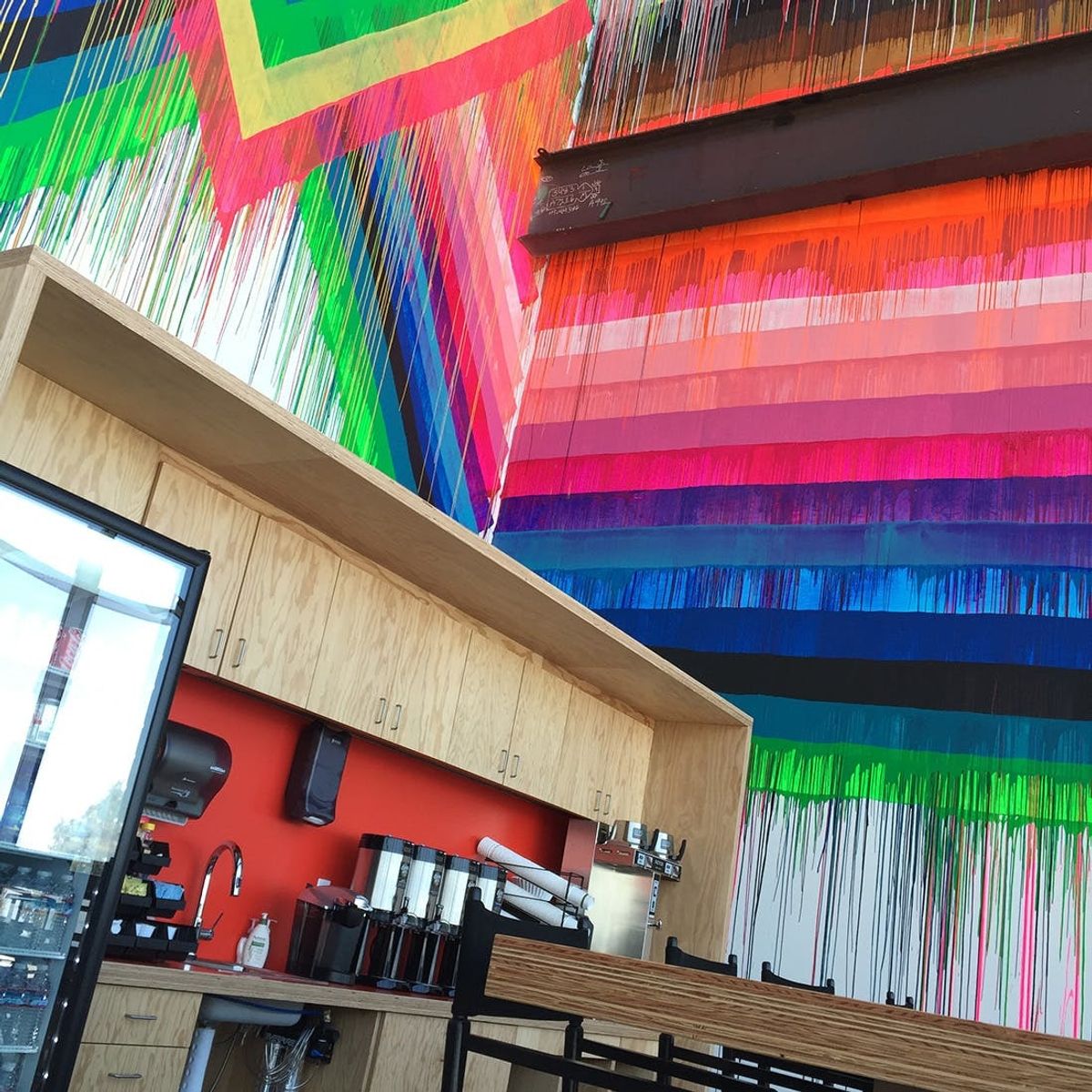
It’s just as awesome as you’d think.
The 10 Coolest Things from Facebook’s New Offices

Hi, I'm Brit, the founder and CEO of Brit + Co. I'm a young mom of two, tech nerd and design-inclined lady who has a zillion hobbies and curious about... just about everything! My mission from the beginning has been to unlock women's creativity and courage to try new things so that they can find the path to their true passions.
When it comes to designing a new office for the biggest social network in the world, you need a space that’s crafted to inspire employees and entertain guests. Since Facebook is basically the startup to top all startups, it’s no wonder that its HQ is very, very cool.
I had a chance to take a tour of Mr. Zuckerberg’s newly opened addition to Facebook’s headquarters (designed by architect Frank Gehry!) and it was a crazy cool explosion of art, design and inspiration. Here were a few highlights to spark your own creativity/workspace FOMO.

1. The building itself is actually super simple. No, the new office isn’t shaped like a giant “LIKE” thumbs up or built entirely out of upcycled laptops. From the outside it actually looks more like a giant shed. The inside isn’t super fancy either. The ceilings are exposed and there are even wires dangling from the roof, but all that’s on purpose. Mark wanted to make the space feel like a work-in-progress as a symbol of how much there is left to be done on FB’s mission to connect the world.

2. You enter through a tunnel. To get to the new office you walk through a tunnel that runs under an expressway. Imagine if the Narnia wardrobe was a lot bigger and totally techified. Yup, that’s it. (Oh and if you don’t want to walk, you can take a Disneyworld-style tram there too.)
3. It’s totally open. No cubicles or tiny rooms here. The 430,000 sq ft space is actually the largest open space floor plan in the world. It sort of feels like a gigantic airport terminal. Word has it that Steve Jobs also designed both Apple and Pixar this way, as a way to incentivize employees to collaborate more.
4. There is art everywhere! This is obviously my favorite part. Being the color lover I am, I was more than a little obsessed with a few of the art installations I saw around the office (there are 15 pieces total). The giant, drippy mural by Maya Hayuk, the psychedelic piece by Jen Stark and the bulging wall of frames by Barry McGee were my three favorites.

5. There’s a room that’s painted totally orange. Because you know, when you’re buried in that white and blue world all day, sometimes you just need to reset your eyes in a contrasting color. (PS: Did you know that Facebook is blue and white because Mark is colorblind and blue is one of the few colors he can see?)
6. You can even get an art fix on your lunch break. Facebook’s new cafeteria “Full Circle” welcomes you with this giant piece of wall art made using different colored cups and plates. I could totally get down with doing a similar installation in my own kitchen one day.

7. The rooftop is EPIC. This isn’t just a finished roof with a couple of benches. This is basically a nine-acre park in the sky complete with a half-mile walking loop, 400 trees and a gorgeous view of the bay. According to an employee I met with, many Facebookers are often seen having meetings here, laying out in the grass on a sunny day, or running the track for a good pre or post work fitness session.
8. The lobby chairs are made entirely of paper If this doesn’t beat your DIY heart, then I don’t know what will. These red chairs (which are actually quite comfortable, btw) are fully made from 100% recycled paper. Yet they are works of art on their own. I swear I didn’t even want to get up, they were THAT comfy.


