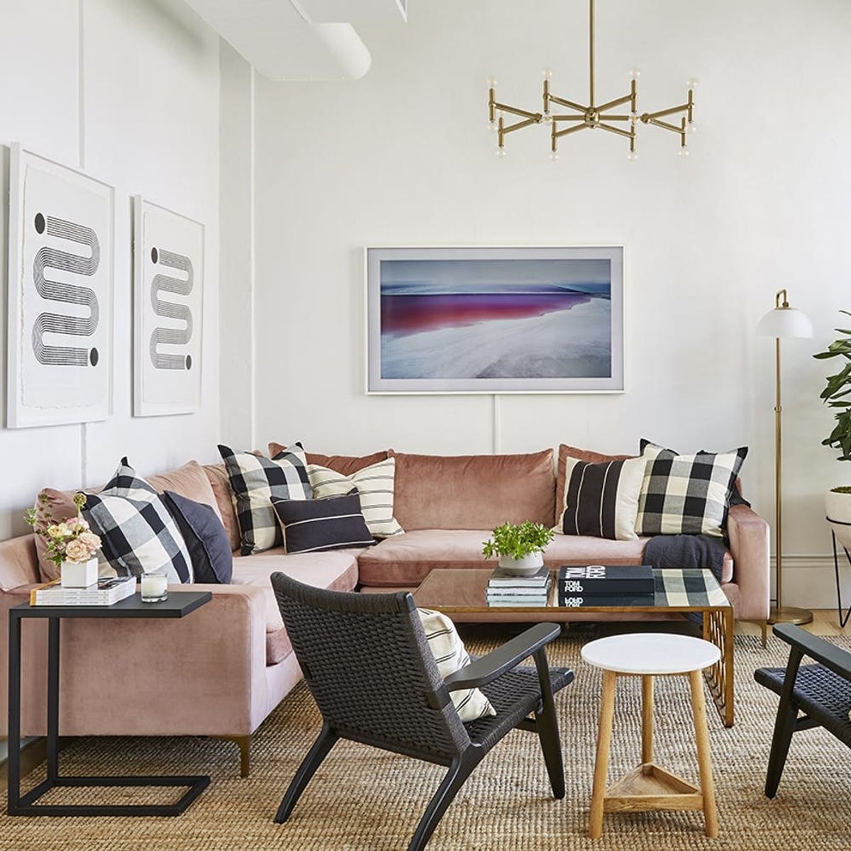
We wouldn’t mind working overtime in this glam office.
Tour the ‘Resi-mercial’ Office Makeover of This Lady-Led Agency

Remember when offices were synonymous with sad wall-to-wall carpeting, gray cubicles, and a total lack of natural light? Those days are long gone, and we couldn’t be happier. Sadly, we didn’t have a word for this new cadre of plant-filled, design-minded, so-cozy-I-kinda-want-to-live-there brand of offices. But Foundation co-founder Kelly Fobar Davis and Homepolish designer Molly Torres may have just coined a phrase for the livable office look: “resi-mercial.” Which makes sense, considering that Foundation’s new digs are exactly that.

For the office space of Foundation, a communications agency focusing on beauty, lifestyle, fashion, and wellness, “Kelly was adamant about creating a welcoming ‘resi-mercial’ environment that truly felt like a home, rather than a corporate office,” explains Torres. “We worked closely together throughout the process to encompass Kelly’s ‘cool-girl’ style and Foundation’s new, elevated brand aesthetic in the office design.” It’s doesn’t hurt that the agency’s client list features several cult-favorite design products, including Flesh, Chriselle Lim x Nordstrom, and Hourglass Cosmetics, so opting for open shelving was a no-brainer.

The first step was breaking down walls — and not just figuratively. “I was inspired by Foundation’s mantra of inclusivity that’s also evident across the impressive roster of talent and brands the agency works with,” says Torres. Openness clearly needed to be a part of her design plan. “Rather than putting up walls to segment the space, I opted to stick with an open plan, utilizing modern lighting and large area rugs as a way to visually separate spaces,” she says. We love how the designer used double-doors that fold away to minimize visual clutter in this conference room. “Track drapery was installed to create a ‘true’ entry, though it also created softness juxtaposed with the conference room’s custom industrial metal doors and windows,” she says.

If you were concerned that blush pink was on its way out, think again: Torres makes the trendy hue feel timeless here, and it was a natural fit for Foundation. “Playing off of Foundation’s branding, blush and other skin tone colors can be found throughout the space in large elements (like the blush velvet sectional in the lounge area and custom wallpaper accent walls in the conference room and kitchen) and décor,” Torres notes. Neutrals keep things feeling grounded, rather than overly glam. “To keep the space feeling minimal and organic, yet cozy and refined, I painted everything a bright white and focused on utilizing clean lines, neutral colors, layered textures, and simple shapes,” she tells us.

There are no corner offices to be found at Foundation, but we kind of love the way that Torres was able to give a little extra weight to the co-founders’ desk areas. “I crafted a ‘private’ office section for Kelly and her two co-founders, Jane Lim and Jenny Lin, that feels a bit more sophisticated and polished,” she explains. Situating the desks perpendicular to one another may seem unusual, but it makes a huge amount of sense in the context of the room… and gives the illusion of more privacy when working. Eye-catching abstract art by NG Collective Studio (courtesy of Uprise Art) provides extra creative inspo for the busy co-founders.

Of course, the little details are what really puts the office over the top. “The kitchen… may be my favorite area because of the super cool, custom ‘Found My Work Wife’ neon sign we installed,” Torres recalls. This tongue-in-cheek touch is a perfect nod to Foundation’s laid-back vibe.

No office is complete without a bamboo bar car, obvs. “I’ve always wanted a space where clients, industry friends and colleagues could be comfortable to stop in and work, but also just hang out and chill,” Davis tells us.

Approachable, feminine, and modern all at once, the makeover was a total success, according to Davis. “Our new office has completely exceeded my expectations,” she gushes. Personally, we’ll be trying to achieve a similarly masterful mix of natural and luxe textures at home.
Looking for more inspiring spaces? Follow us on Pinterest!
(Images via Seth Caplan for Homepolish)


