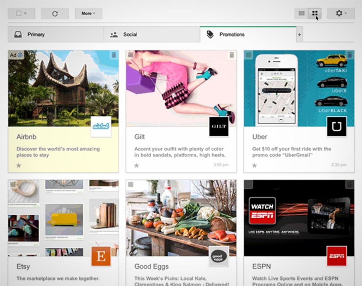
Times, they are a-changin’ and that goes for your Gmail too. Good ol’ trusty Gmail is about to get a new look. A colorful, grid-like look that kind of looks like Pinterest and, well, even our own site. Weird. But cool!
Why Your Gmail Might Look More Like Pinterest Tomorrow

Times, they are a-changin’ and that goes for your Gmail too. Good ol’ trusty Gmail is about to get a new look. A colorful, grid-like look that kind of looks like Pinterest and, well, even our own site. Weird. But cool!
This would be a huge win for retailers and websites. Think about it — the daily barrage of emails from Gilt and even lines we love like Kate Spade Saturday all look the same at the end of a long day so you probably don’t open them all up. Another new dress. Another discounted trip to Hawaii. Woo. Hoo. With the Promotions option, you would be able to size up exactly what each is offering. Seeing the words “new dress” and seeing the new dress are two totally different experiences. And one might make you more apt to click through.
Let’s talk more about you and the dreaded P-word: productivity. The grid view offers infinite scrolling too so you’ll be able to browse through a ton of messages at once, which might help with inbox spring cleaning.
If you’re interested in testing it out, sign up through Gmail’s official blog where you can be a part of the field trial.
What do you think of the Promotions tab — would you use it? How do you deal with your deal emails? Share advice below!


