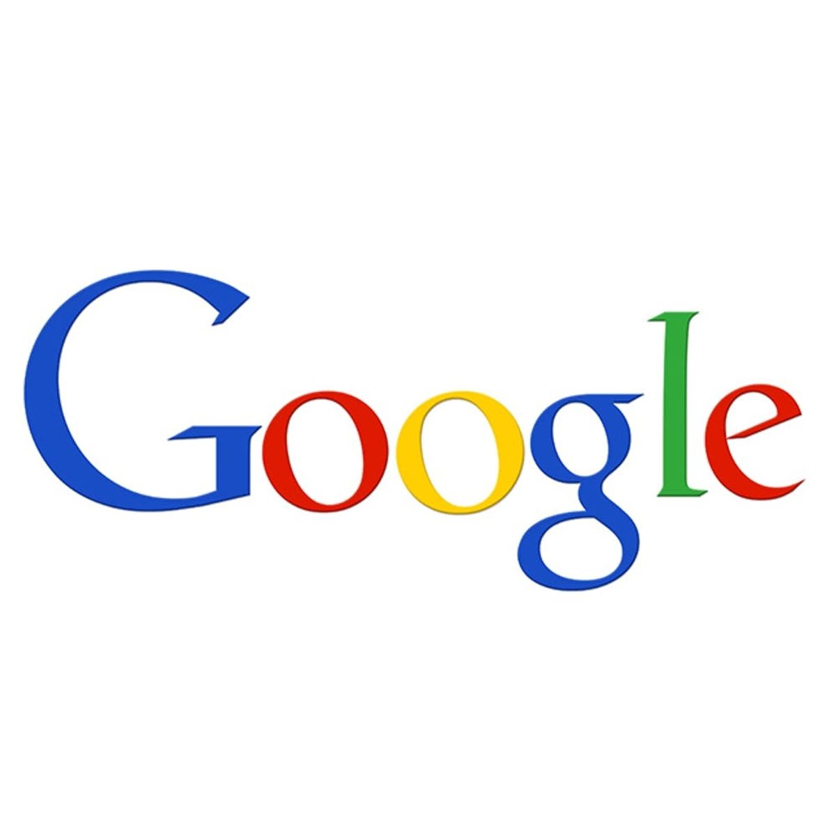
Say hello to Google’s new look.
Google Has a New Look, and No, It’s Not Just Today’s Doodle

Shortly after Google announced its company shakeup by introducing the world to Alphabet, the Internet giant is now rebranding itself once more. With a new logo.
The duo shared that the look of Google had remained unchanged for a long time because there was a time when the service used to be accessible on only one device. These days, however, Google products are reached on numerous platforms, apps and devices, and the company wanted to make brand recognition seamless throughout the various avenues and products, so a facelift was essential.
“Today we’re introducing a new logo and identity family that reflects this reality and shows you when the Google magic is working for you, even on the tiniest screens. As you’ll see, we’ve taken the Google logo and branding, which were originally built for a single desktop browser page, and updated them for a world of seamless computing across an endless number of devices and different kinds of inputs (such as tap, type and talk).”
The Googlers continued, “Meanwhile, we’re bidding adieu to the little blue “g” icon and replacing it with a four-color “G” that matches the logo.”
The post reveals that we will see all these new designs roll out across its product lineup soon. Are you excited about Google’s new look? Indifferent? Can you even tell the difference?
What are your thoughts on Google’s new logo? Let us know in the comments.
(Photos via Google)


