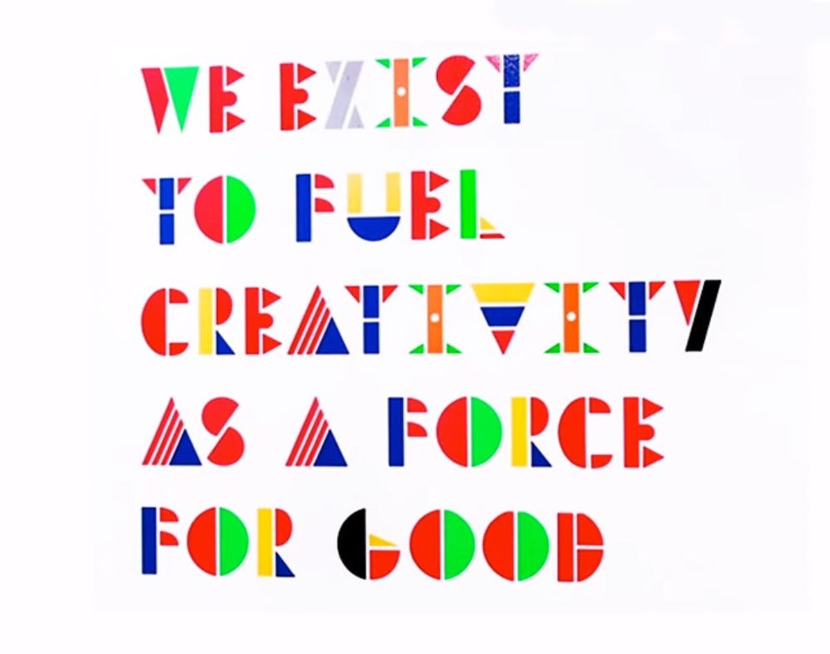
While surfing the web, there are a few things that always manage to catch our eye. A great idea. A good sale (hey, we’re human). A video of a hamster eating tiny burritos (please see: still human). AND our favorite word (creativity) in our favorite colors (BRIGHT, BOLD). Whoa, what is that beautiful typeface, we wondered. It looked oddly familiar, yet completely unique…
You’ll Never Guess What Inspired This Awesome Typeface

While surfing the web, there are a few things that always manage to catch our eye. A great idea, a good sale (hey, we’re human), a video of a hamster eating tiny burritos (please see: still human), AND our favorite word (creativity) in our favorite colors (BRIGHT, BOLD).
“Whoa, what is that beautiful typeface?!” we wondered. It looked oddly familiar, yet completely unique…
Turns out, it comes from advertising agency, Grey Group’s new Singapore division and is inspired by both the multinational employees who hail from 12 different countries + the more than 100 countries where the firm has clients. That’s a hint, btw — any guesses yet?
This isn’t your average everyday typography porn. Senior Graphic Designer Luis Fabra took the flags from the 106 countries that represent his coworkers and clients and deconstructed them into colors and abstract shapes, like stripes and dots. From there, he formed them into letters and numbers, splashed with colors from all of the flags represented.
They look pretty gorgeous etched in glass, too — signs using the typeface adorn the office.
Our favorite thing about this (besides its sheer beauty) is the unifying vision behind it. “The typeface was inspired by the team itself,” Fabra explained in an interview with Co.Design. “Each country we work for is represented, and we hope that through combining them, our unique multinational perspective comes through.” Their office motto made us “here, here!” too:
Okay, Grey Singapore, you have officially won our first ever Creative Employees of the Month. We’ll be sending some mugs your way — oh, nevermind, looks like you’re good with mugs.
Do you work in an uber creative office? “Nominate” your innovative coworkers below!
(h/t: Co.Design)


