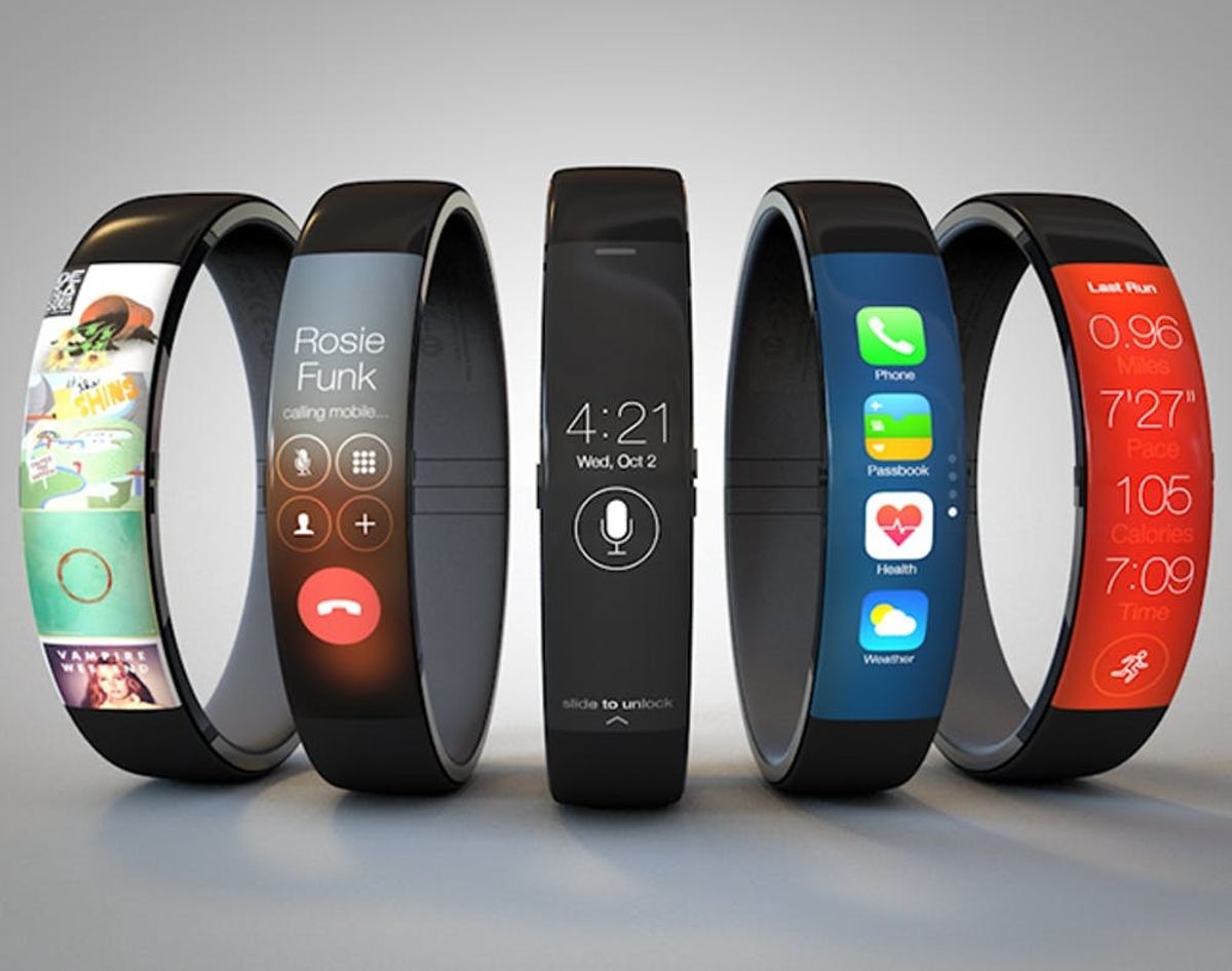
Another day, another Apple leak (hey, iOS in the Car!) AND another Apple mock-up. Today’s comes from interface designer Todd Hamilton and it has our wrists aching for the real deal. Especially if that real deal looks and works… well, exactly like this mock. Appleholics have been on the edge of their standing desks expecting a line of wearables announced during March’s keynote and Todd’s iWatch concept looks like it came straight from Tim Cook’s deck.
Is it March Yet?! What an Apple iWatch Might Actually Look Like…

Another day, another Apple leak (hey, iOS in the Car!) AND another Apple mock-up. Today’s comes from interface designer Todd Hamilton and it has our wrists aching for the real deal. Especially if that real deal looks and works… well, exactly like this mock.
Appleholics have been on the edge of their standing desks expecting a line of wearables announced during March’s keynote and Todd’s iWatch concept looks like it came straight from Tim Cook’s deck.
As he explains on his blog, Todd took inspiration from another iWatch mockup that looked like what would happen if an iPhone and a Nike Fuelband birthed a techy bangle-y baby. Kids, when two electronics really love each other…
Todd kept the Fuelband’s shape and brought iOS 7 to life around it, keeping in mind all the things we’re used to: swiping, Siri, apps, a home button. If you hold a black iPhone up to the photo and squint long enough, you can kinda see it morph into the iWatch, right?
CES 2014 showed us that wearables don’t have to be watches, but we like thinking about the convenience, not to mention the added “insurance” we’d have against dropping or losing our favorite device. As a runner, I’d appreciate a hands-free way to bring Spotify and all the comforts of my iPhone minus my actual iPhone with me. Hey, Todd, want to design a pair of wireless headphones to go with?
What do YOU think? How does this iWatch mockup compare to other smartwatches on the market this year?


