Light up your style.
8 Reasons Why the Meurice Chandelier Is the It Light Fixture You Need

Lighting doesn’t always get as much love as a statement couch or a hand-woven rug, but the truth is that an artfully-designed fixture can pull together an entire room. While designer options can run on the pricier side, often putting them into the “investment piece” category, they also figure prominently in the ambiance of your most coveted #decorinspo shots. Chandeliers bring immense luxe factor to any room, and we’re totally obsessed with pendant lights. But if we were to put our money where our mouth is and recommend the It light fixture to go all-in with, hands down, it would be Jonathan Adler‘s totally trending $1595 Meurice Rectangle Chandelier. The stunning metallic fixture is a certified work of art, and although it originally launched in 2012, it’s blowing up the most design-savvy instagram accounts on the daily. Scroll on to see why the it’s the piece to watch.
View this post on InstagramA post shared by cc&mike (@ccandmikecreative) on
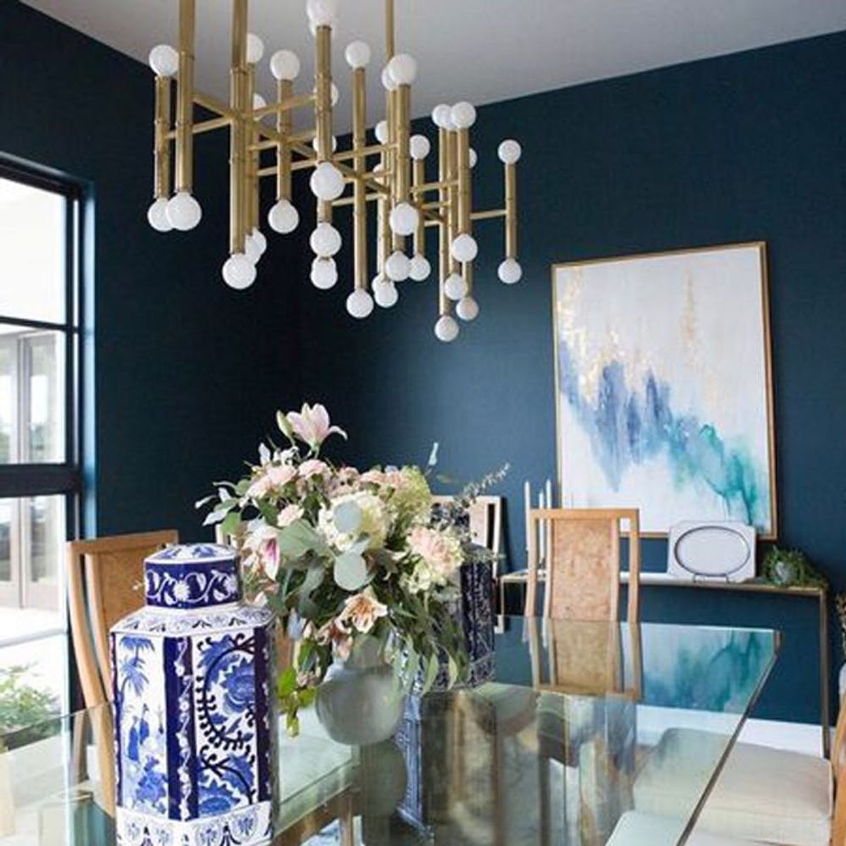
1. It’s classy AF: Lifestyle designers CC and Mike used the Meurice Chandelier to create dining room drama and offset richly colored walls.
View this post on InstagramA post shared by Becca Stephens (@beccastephensinteriors) on
2. It’s so chic: The Meurice adds a fizzy pop of pizazz to this modern, eclectic room. (P.S. We are totally digging that gold pig.)
View this post on InstagramA post shared by Rachel Reider (@rrinteriors) on
3. Meurice is sophisticated: When Rachel Reider Interiors revamped the Attwater Boutique Hotel, the team brought in Newport’s coastal charm. The Meurice Chandelier is the cherry on top.
View this post on InstagramA post shared by Karly Kristina Design (@karlykristinadesign) on
4. Meurice works with simple: Even with a more understated aesthetic, the Meurice Chandelier, this time in nickel, adds cool factor to this clean kitchen.
5. It feels fresh: Our design icon Sarah Sherman Samuel took the wow factor of the Meurice and balanced it with white-on-white touches for a light-as-air feel to this room.
View this post on InstagramA post shared by Beth Hontzas (@bethhontzas) on
6. But it also feels homey: Marianne Strong Interiors has pulled off a warm and inviting space where the Meurice looks right at home. (How perfect is this for family dinners!)
7. Meurice is modern: A chrome pull-down faucet and retro patterned walls are a perfect match for the Meurice in a playful, modern kitchen space.
View this post on InstagramSo much color brought into this space by the ✨ chandelier and 🌊 art! #dininginstyle
A post shared by Brianna Michelle Design (@briannamichelledesign) on
8. And also elegant: This dining space created by the Brianna Michelle Design Firm uses the Meurice to bring a formal note to this relaxed and refined Florida home. (Photo via Stephen Allen Photography)
Already a proud owner of the Meurice Chandelier? Tag @britandco in a snap of your pad!


