Matchy-matchy is *so* last decade.
12 Tips for Making Mismatched Furniture Look Chic AF

Furnishing a home is no easy feat. It can be hard to develop a streamlined, cohesive look, especially when all the cheap furniture and cheesy posters from apartments past seem to come back to haunt you. On top of this, big-box furniture stores work hard to sell the idea of matched sets as the only way to have a truly grown-up home. But as far as we’re concerned, you can mix it up all you want, so long as you do it well. So don’t give up on thrift shops and yard sales just yet, ’cause we’ve got you covered with these tips for using mismatched furniture to create a cohesive yet stylish look.
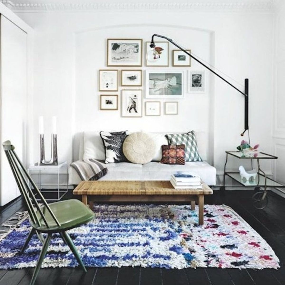
1. Create a Focal Point: When different furniture makes up a room, create a focal point with a statement light fixture. Play up the eclectic vibe with funky frames and colorful throw pillows. (via Mix and Chic)
2. Keep It Level: Mismatched chairs on the same level make for a quirky set with a family feel. Play with shapes to keep the set light and fun. (via Honestly WTF)
3. Make a Statement: Understated mismatched furniture looks deliberate and interesting when paired with a statement rug. We love this plush one that looks right at home in an otherwise minimally decked out space. (via Apartment Therapy)
4. Embrace It: Go with the flow and let different nightstands shine in all their unique glory. You can also play up the asymmetry with uncentered decor, like these wall decals. (via Centsational Girl)
5. Replay Hit Colors: The ochre all over makes this odd couple endearing and adorable. Just add light accents and bring in some fresh florals, and you’ve got one swoon-worthy space. (via A Beautiful Mess)
6. Choose a Theme: A simple way to unify nursery furniture that’s not in a set is to connect it with a theme. This woodland-themed nursery uses different woods, but looks cohesive and on point for your little one. (via Project Nursery)
7. Play up Silhouettes: Use similar silhouettes and styles to bring mismatched chairs together. These all look like they’d be right at home in Don Draper’s house, right? (via A Love Is Blind)
8. Keep It Simple: Limiting colors keeps your space from getting too unwieldy. The understated white + wood combo in this apartment is modern perfection. (via Apartment Therapy)
9. Neutrals Are the New Color: While not our usual take on life, we’re all about how fantastic a room built on neutral colors looks. Muted hues here and there keep it from being too stale, but those varying shades of gray (and pops of gold!) are a minimalist’s dream. (via HomePolish)
10. Kill It With Kilim: What do different woods, a glass table and a kilim rug have in common? All are right at home in this kickass dining space that we’d love to serve up dinner in. (via Design Milk)
11. Use Light + Bright Colors: Go bold and bright to keep different pieces looking intentional. The repeated use of orange-red adds a cohesiveness to this adorable family room. (via Better Homes and Gardens)
12. Go All-White EVERYTHING: With this much white, did you even notice that those were different tables? Go with a clean white palette to give your bedroom a walking-on-clouds feel. (via Centsational Girl)
Do you have multiple furniture styles going on at once? How do you make it work? Let us know in the comments!


