Scandinavians, stop being so gosh darn designery already.
Norway’s New Passport Is Frame-Worthy

When it comes to government-issued documents, Norway is totally killing it this year. A couple months ago, they hosted a design competition to redesign their bank notes, and the result was a series of new bills that are beautiful, abstract representations of the sea. Now they’ve done it again with a new passport design that’s making us seriously consider relocation.
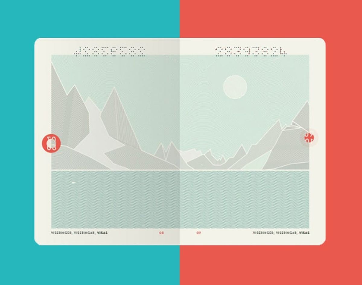
The revamped passport is also a result of a design competition, and the winner is design studio Neue. Similar to Norway’s new bank notes, the design totally nails graphic minimalism with a major focus on nature and the sea.
On the cover is a simplified replication of the country’s crest in gold on top of either a white, teal or salmon orange background. We’re all about this color scheme.
Since this is a government document, they do have to get fancy with the inks so they’re difficult to duplicate. They do this with inks that glow under UV light. With the UV rays, you can see the northern lights beyond the landscapes, bringing a whole new life to the design. More security measures will also be implemented before the release of the new official passport.
In the US, the only way to design money is with an eye for the extremely intricate and complicated detail, but we should take inspiration from not only Norway’s competition-based process, but their simplistic, modern design. Gørill Kvamme, Managing Director of the winning design studio, explains it best: “Design has a natural role in helping express what country or culture you are a part of.”
If you could revamp the design US money and passports, what would you do? Let us know in the comments!
(h/t The Guardian)


