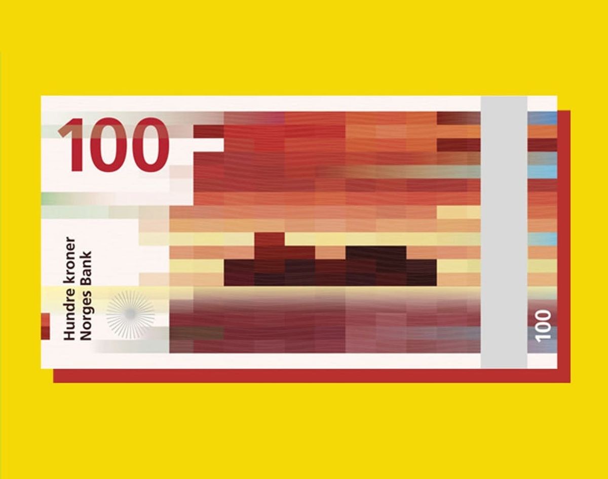
No offense to 280-year-old President George Washington, but we think it’s high time our money looked as pretty as this.
Norway Redesigned Their Money and the Results Are Stunning

If we’re honest with ourselves, currency design has never been our country’s strong suit. Our presidential dollar bills are just starting to veer from shades of green, while banknotes around the world have long since been a vision of color and modern design. (Which is probably why we still refer to any currency other than our own as Monopoly money.) And out of all the pretty bills floating around the world, Norway’s new abstract money might be our favorite.
Norges Bank of Norway invited eight creative teams to submit new designs for the Norwegian kroner under the theme “the sea.” The submissions were all so great that they ended up picking two sets of designs: one for the fronts of the bills and one for the backs. The winning teams were an architecture firm, Snøhetta, and a graphic design company called The Metric System. Snøhetta created abstract images of the sea from mere pixels, somehow making a tranquil landscape only out of squares and rectangles. As the banknotes’ denominations increase, the pixels get fewer and fewer, making the image more and more abstract.
The team at The Metric System opted for more traditional ocean scenes with intricate line work and precise proportions. To merge the glory of these two vastly different styles, Norges is using the elaborate illustrations for the fronts and the pixelated seascapes for the backs. The new kroner designs are set to go into circulation as early as 2017.
No offense to 280-year-old President George Washington, but we think it’s high time our money looked as pretty as this. In fact, it might make it easier for us to save up. Right? RIGHT?
Do you have a favorite currency design? Let us know in the comments!


