We talk to the artist who started it all and the Pantone color expert who knows exactly why it’s working.
These Mesmerizing Paint-Mixing Instagrams Are Millennials’ New Therapy
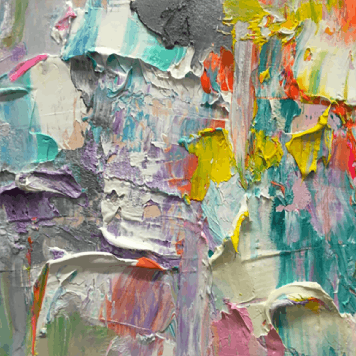
It was during the swift, downward spiral of a late-night Instagram session that I stumbled across Vancouver-based artist Sára J. Molčan’s account. The rainbow-hued feed drew me in. But it was the array of weirdly satisfying videos that made me stay. Molčan’s feed was saturated with short videos of her mixing paint on a clear palette with a knife. It sounds like there should be more to it, but really, it’s just that: mixing paint on-camera. I watched a bunch… and then some more. And afterward, I was engulfed in this unexpected state of bliss. Molčan currently has more than 68,000 followers on Instagram, so clearly, I wasn’t the only person who found these videos strangely fascinating.
Molčan’ was one of the first artists to create this kind of video on the social media platform. Over the phone, she explained to me how the idea originally came to be. She says, “The very first video I did, nothing happened. I didn’t do any more months after that. The first video of my palette was in November [2015]. It was not a very well-done video. It was my whole palette and I was mixing all the color in a stop motion format. After that, I started posting close-up images of my palette and those got a lot more attention. People started asking how I made certain colors so I decided to just show them.”
For her, it wasn’t so much about the satisfying effect they have on others as it was an educational lesson to be learned. The success she found in her second iteration of the idea eventually led to the launch of a series she called #100daysofpaintmixing. “That was a challenge to me personally to not only share my formulas but educate on color theory,” she explains. “I’ve been in art school twice. I have quite a lot of years of color theory under my belt from different courses and classes and universities, and I always have people mystified by why ‘x’ and ‘x’ make ‘x.’ So I decided to take that project on as a way to help other artists — particularly emerging artists — who are still learning and show them how that works in real time. I did one video a day, and shared my formula. I made a notation about what I was using the color for, and I got so much great feedback.”
But don’t hit her up with color combinations you want to see mixed. Unlike some accounts out there, she doesn’t take requests. “I’m not a DJ booth,” she says. And she doesn’t want to waste paint to create endless pools of brown, which is what happens most of the time if you don’t mix correctly. But the meditative effect her videos have isn’t exactly a happy coincidence. Molčan’s art revolves around psychology. She says, “My work might evoke that kind of feeling because I know those aspects and can see what color creates the most therapeutic response, versus what colors make people uncomfortable.”
That strategic use of color is actually not too far off from why Pantone color expert Leatrice Eiseman thinks these videos are seeing such therapeutic results. Eiseman, who is the executive director at the Pantone Color Institute, boils their success down to two things: the prominent pastel shades used and their noticeable ties to childhood. She tells us, “The videos evoke that same feeling you used to get as a kid when playing with watercolors, silly putty or crayons — anything that gets your creative juices going. It’s that same kind of abandonment you had as a child. You put all those colors together and smash them and it just releases that feeling of comfort. I think it really has its root in childhood remembrances.” It’s not unlike the reason coloring books have struck such a chord with adult audiences over the past few years.
View this post on InstagramA post shared by Annette Labedzki (@annettelabedzki) on
When looking at the videos, Eiseman quickly noticed that most of the combinations resulted in a pastel color, a range of tints that’s known to cause a tranquil effect. “Even though she [Molčan] might blend in a dark purple or bright yellow, what ultimately happens when she mixes them is they come out to be rather light pastel shades that are non-threatening,” she says. “You want to be surrounded by them when you’re looking to free your mind and relax.”
Both of Pantone’s colors of the year are pastels (Rose Quartz and Serenity), and that’s no accident. “There is that attachment to the pastels [during a crazy time],” Eiseman explains. (Like an election, perhaps?) “Pastels are childhood colors. Most babies’ rooms are usually done in pastel shades. It goes back to a time where you didn’t make decisions. They were all done for you, and this transports you back to that time in your life.”
With a seemingly endless list of harsh current events happening across the world this year, it’s not surprising that people are looking for some kind, any kind of relief. And these videos are the perfect trifecta for millennials to get just that. They require basically no commitment, the colors used are tied to calmness and tranquility and, whether you realize it or not, they evoke a nostalgic feeling that allows you to — even for a quick sec — slip back to a simpler time. These paint videos are not unlike the endless stream of food-making videos you’re currently seeing across your social feeds in that regard (ahem, Tasty). Consider this an extremely fundamental version of that. Now, if you’ll excuse us, we have some Instagram scrolling — er, meditating — to do.
How do these videos make you feel? Tag us in your reaction on Instagram @BritandCo.
(Feature photo via @sarajmolcan)


