Live life colorfully.
14 On-Trend Ways to Decorate With Pantone’s Spring 2018 Color Palette

By Maggie FoggOct 10, 2017
Maggie Fogg
Maggie Fogg is a style-savvy Canadian contributor to Brit & Co. After studying fashion, Maggie worked in the lifestyle industry for several years, but left her role as a Toronto-based marketing director for an indie beauty brand to pursue her passion for travel and style abroad. In the past year, she's visited 22 countries across four continents, as she writes about style and design trends from around the world. Maggie is also an avid runner with a new found love of hiking.
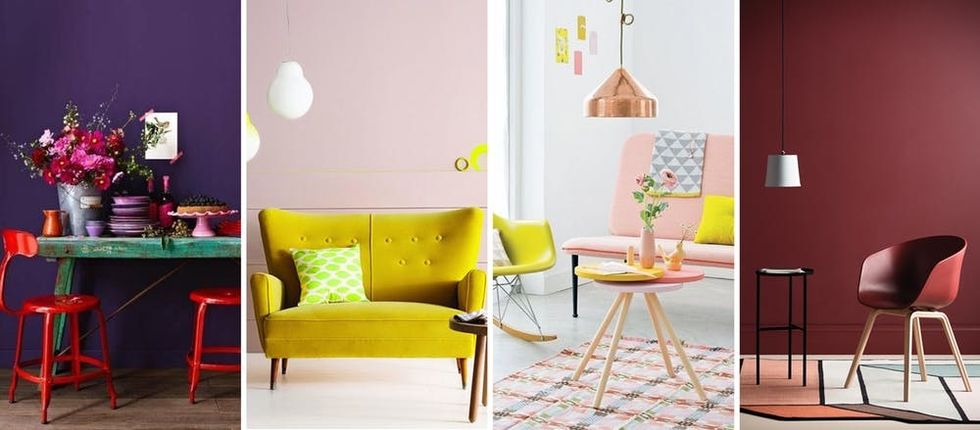 Pantone is *THE* color authority. In fact, it's hard to remember a time when trendsetters weren't clamoring for the next coveted release of It colors from the brand. And with fresh and unexpected hues like Meadowlark (a fabulous dandelion yellow) and Blooming Dahlia (a muted and incredibly versatile peachy pink), the Spring 2018 palette does not disappoint. Each of the 12 shades that ruled this report have us crushing hard and ready to make over our entire life, including our home. Click through our color playbook for all the pops of Pantone inspiration you need for your spring decorating.
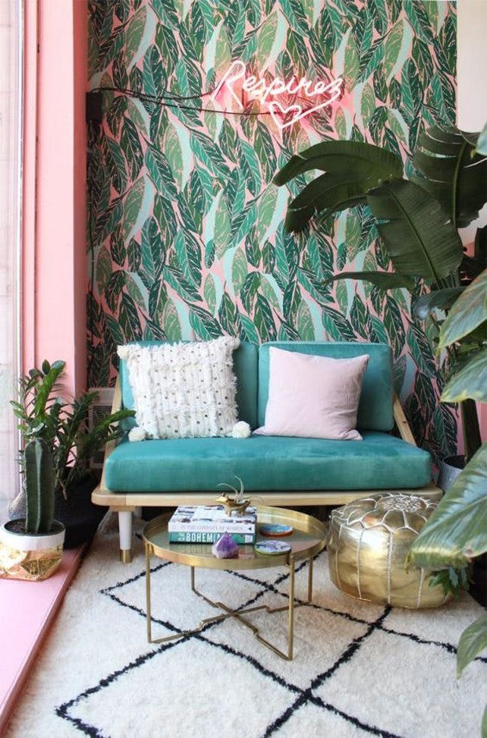 Arcadia + Pink Lavender: A stunning mix of emerald green and teal, Arcadia is a gorge color that can be brought in through palm-inspired wallpaper or a little loveseat. Plus, it mixes beautifully with anything pink.
(via Baba Souk)
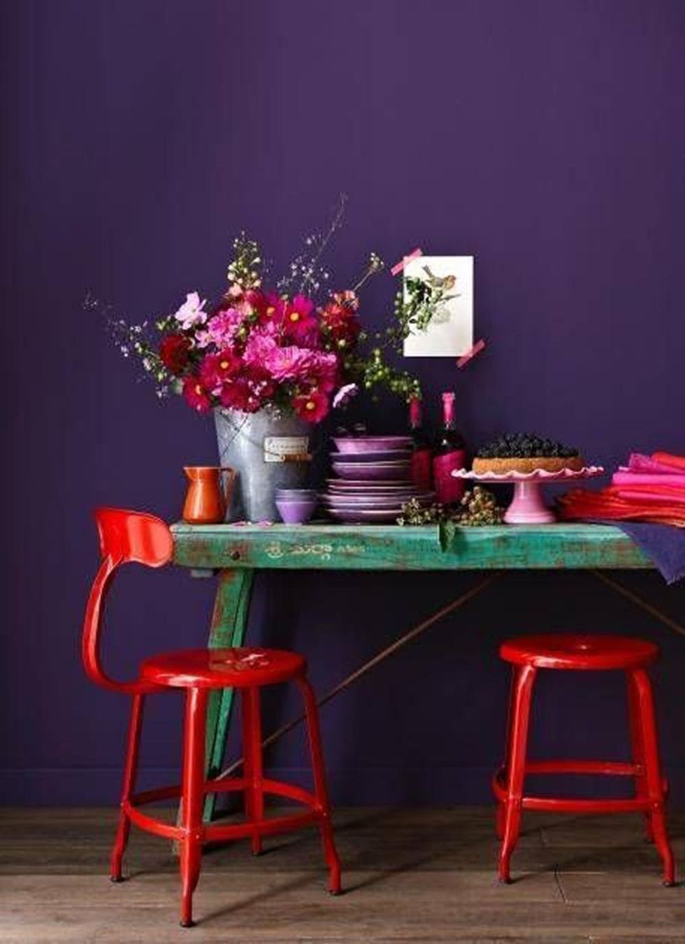 Ultra Violet + Cherry Tomato: Combine a rich striking color like this violet hue with the punchy Cherry Tomato. The result is vibrant and bold and would look amazing in your kitchen.
(via Domino)
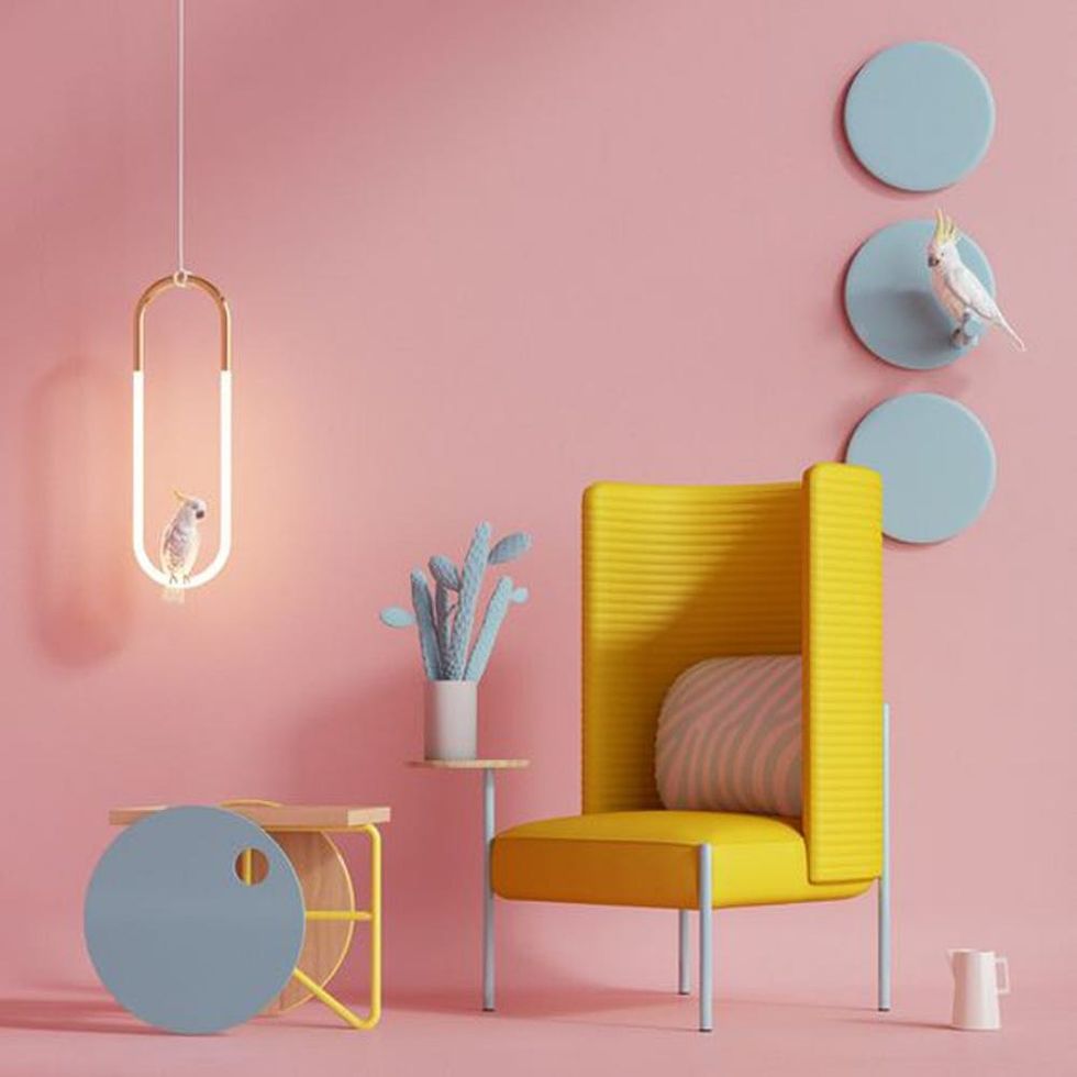 Blooming Dahlia With Meadowlark and Little Boy Blue Accents: The peachy pink of Blooming Dahlia is surprisingly versatile. Here, we love the modern feel of it paired with pops of Little Boy Blue and Meadowlark.
(via Behance)
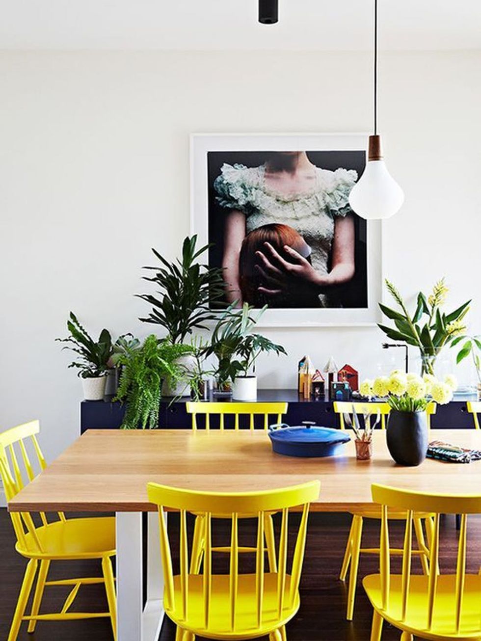 Meadowlark Pops: Looking to brighten up your minimalist dining room? Add sunny yellow chairs to bring the color. (via Digs Digs)
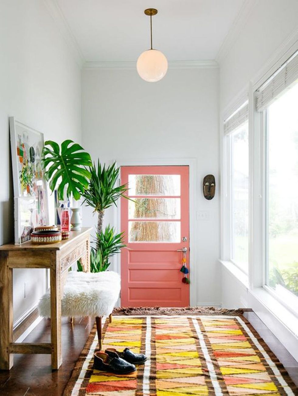 Blooming Dahlia, Meadowlark and Cherry Tomato Red: Peachy pinks, reds, and yellows warm up this otherwise neutral hallway. Try painting your door Blooming Dahlia or Meadowlark and tie the room together with a rug that contains both colors. (via Old Brand New)
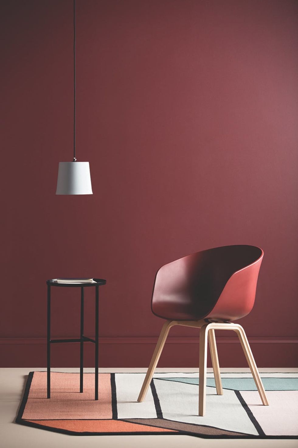 Chilli Oil: While this does not fall into a typical spring pastel palette, Chilli Oil is a deep crimson shade that can add major impact to your dining room, living room, or study. Pair it with Pink Lavender accents to give it a brighter feel. (via Eclectic Finds)
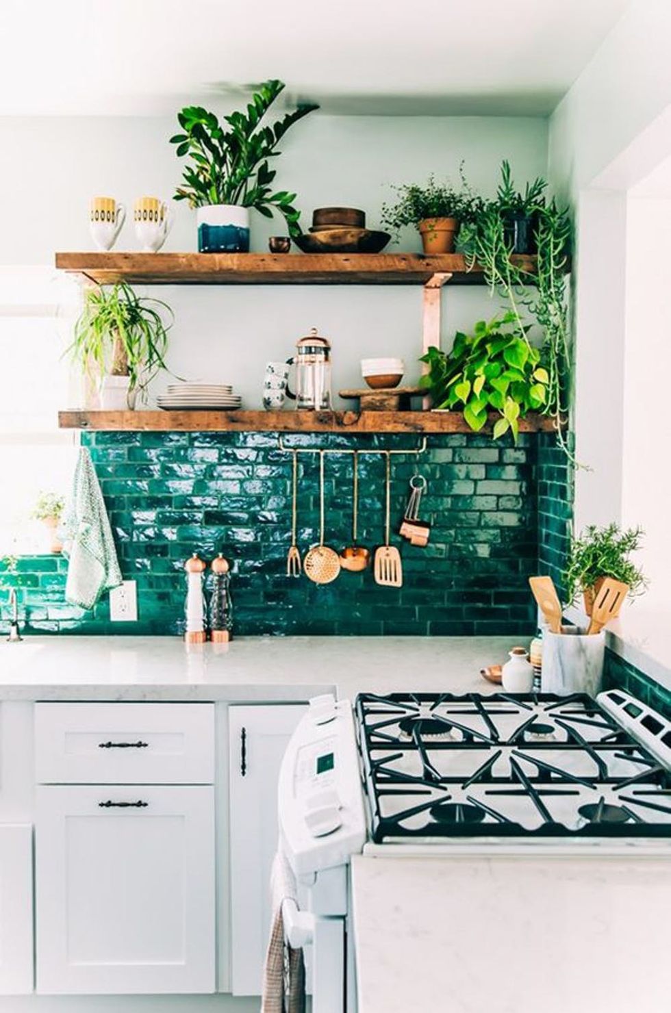 Arcadia + White: Our kitchens are the heart of our homes. Opt for a rich and vibrant green backsplash and keep the rest of the palette classic with white, wood, and metallics. Your space with feel inviting, earthy, and alive. (via The Jungalow)
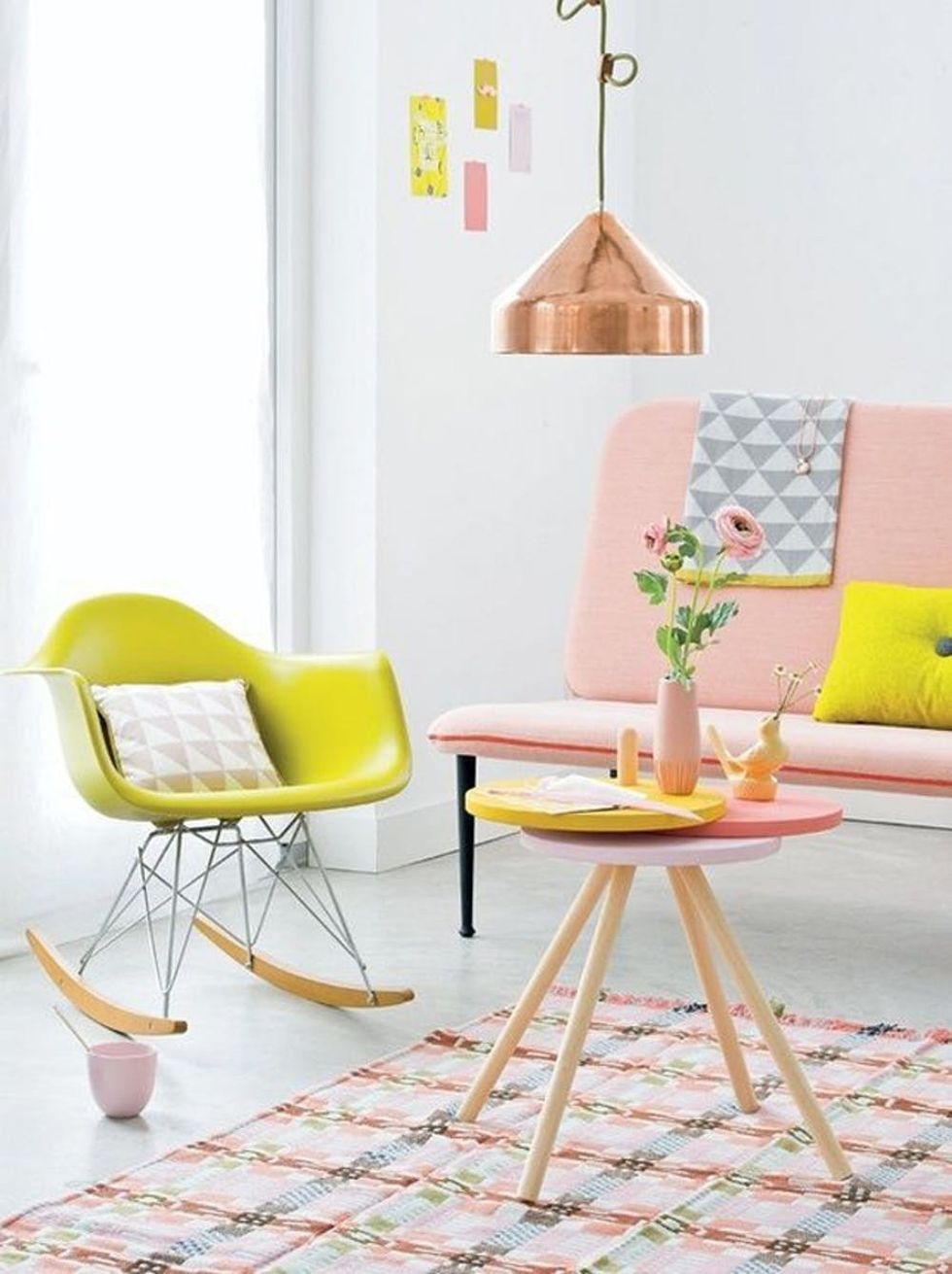 Blooming Dahlia + Meadowlark:
Mixing peachy pink with vibrant yellow is clearly trending, but we love how the combo can feel light and airy when paired with white walls and copper accents. (via The Millionaires Daughter)
 Spring Crocus:
Dress up a minimally decorated kitchen with some personality by pulling in a vivid chair color, like this deep pinkish purple. Your dining area will go from basic to artsy in no time.
(via Greige Design)
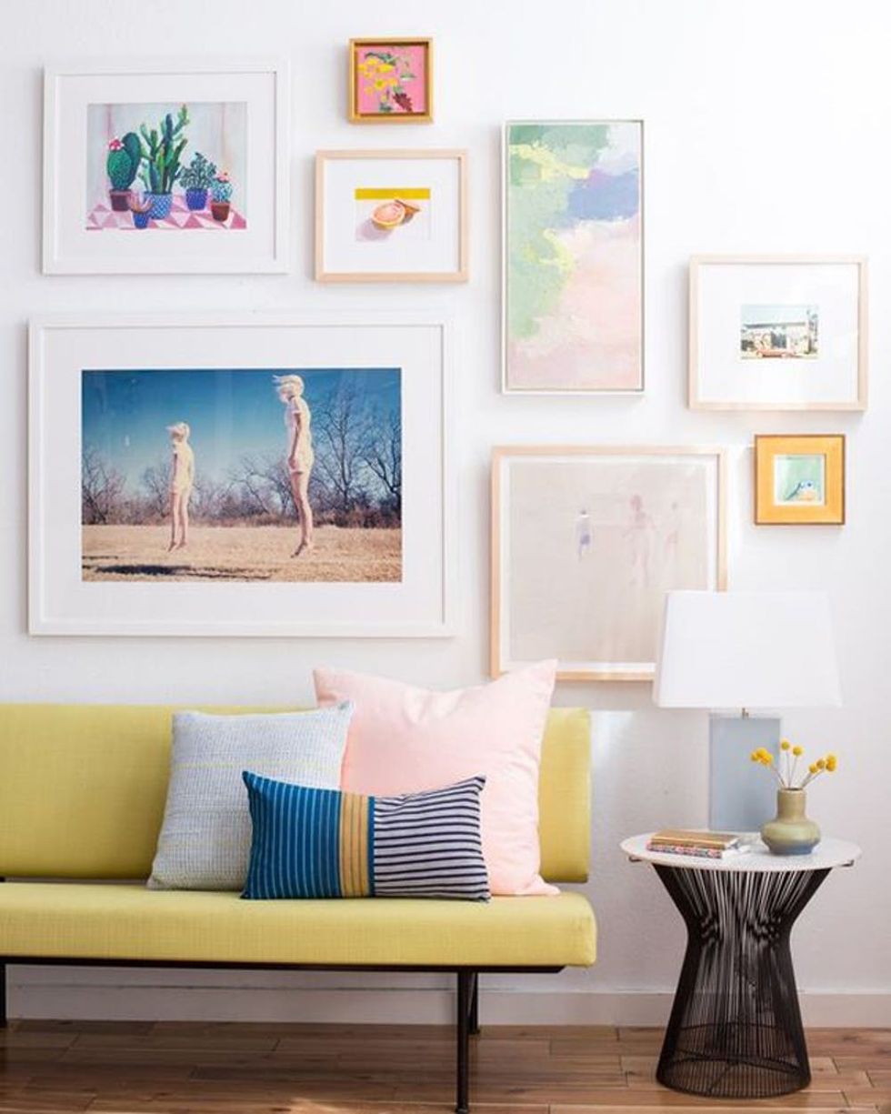 Meadowlark With Accents of Little Boy Blue and Blooming Dahlia: If the idea of a bright couch intimidates you, pair that bold textile with white walls and build a more muted palette around your centerpiece. (via The Millionaires Daughter)
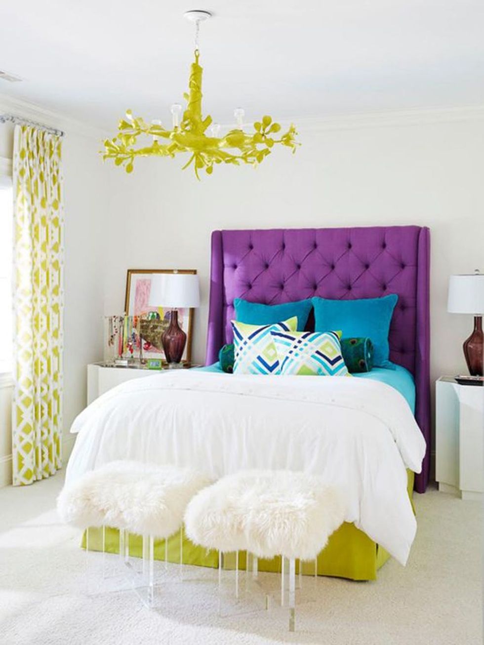 Lime Punch + Ultra Violet: A vibrant limey shade weaved in through accents like a bed skirt and chandelier will help give a pulse to your mostly white room. Use a deep purple headboard for a contrasting effect. (via House of Turquoise)
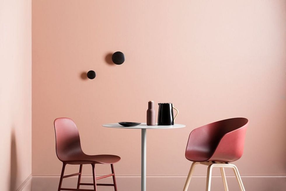 Emperador + Blooming Dahlia: When looking for decor that feels grounding, opt for different shades within a similar color family. The earthy chocolate of Pantone's Emperador pairs well with those lighter peachy-pink hues. (via Eclectic Finds)
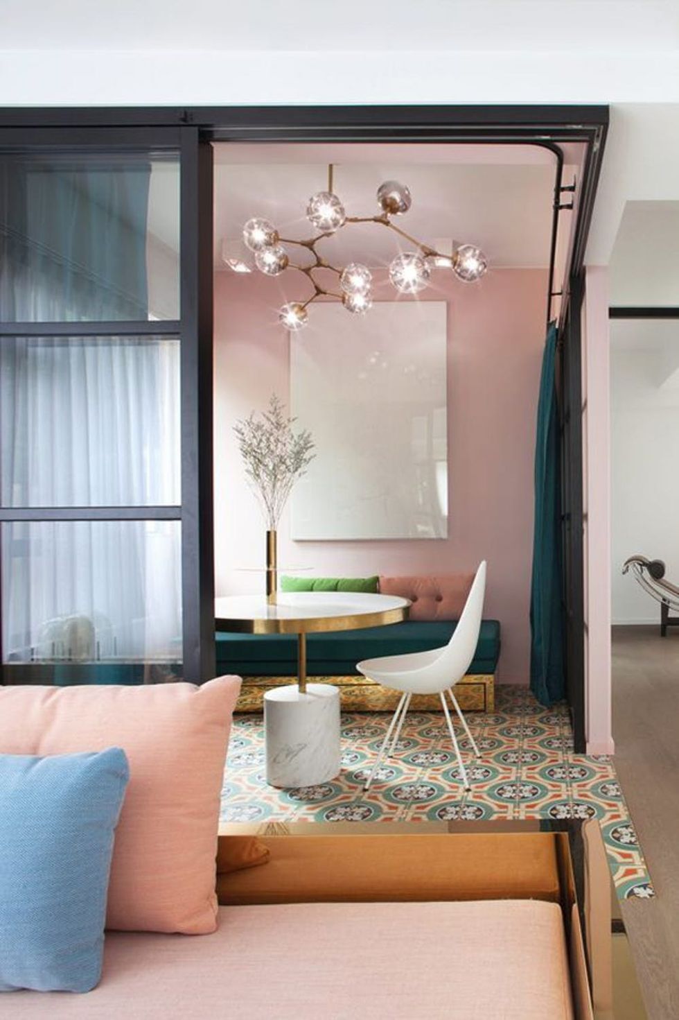 Blooming Dahlia + Little Boy Blue: Pastel color combos are *the* look for spring. So how do you get this trendy style without your space feeling childlike? Combine soft pinks and blues with modern fixtures and furniture, and a strong graphic rug. (via Domino)
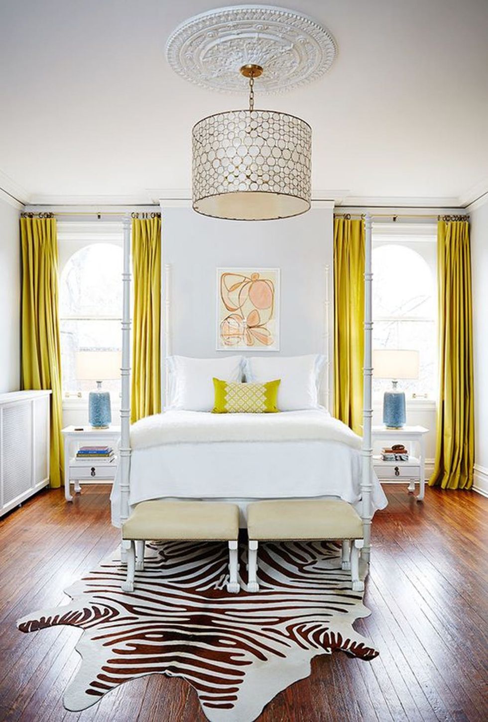 Meadowlark + Almost Mauve: A bedroom painted in the off-white hue Almost Mauve is the perfect backdrop for your minimalist style. Add a colorful twist with strong yellow window treatments.
(via The Heathered Nest)
Repainting your home with one of Pantone’s poppy new shades for spring? Tag @BritandCo in your Insta-reveal!
The Latest
Make Your Inbox Your Happy Place
Get freebies, inspo, & more delivered to you.


