We’re green with envy.
Pantone’s 2017 Color of the Year Will Fill Your Life With Greenery

Are you as Pantone-obsessed as we are? Dude, we’re even willing to sport a DIY Pantone patch to show off our color-based adoration. And while Pantone’s 2017 color trend predictions declared it the year of kale — and, honestly, we’re all about the leafy vibe — it looks like another shade of green has taken the top spot.
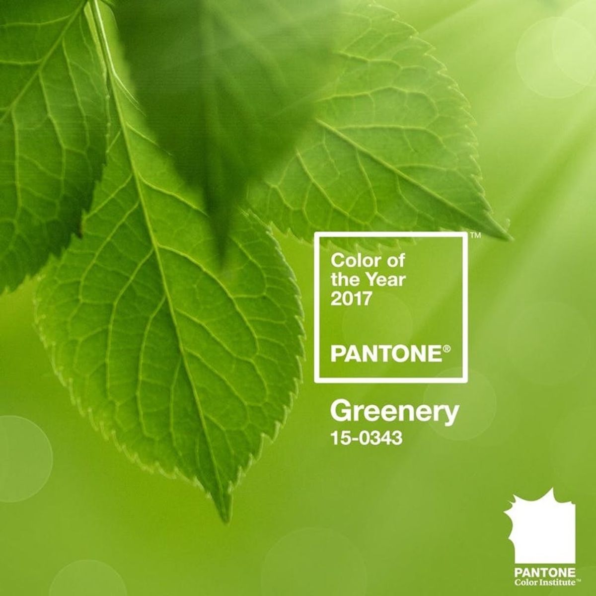
PANTONE 15-0343 Greenery
“A refreshing and revitalizing shade, Greenery is symbolic of new beginnings,” says the color experts themselves, adding that this particular shade is “a fresh and zesty yellow-green shade that evokes the first days of spring when nature’s greens revive, restore and renew. Illustrative of flourishing foliage and the lushness of the great outdoors, the fortifying attributes of Greenery signals consumers to take a deep breath, oxygenate and reinvigorate.”
So what can do you with Greenery? It’s a color that can be paired with neutrals, brights, deeper shades, pastels and metallics that will span all of your needs from fashion to beauty, products to graphic design.
Check out how Greenery is created below in this mesmerizing paint mixing vid…
What do you think about Pantone’s 2017 Color of the Year? Tweet us @BritandCo!
(h/t Design Milk; photos via Pantone)


