Let color be your compass.
The Ultimate San Francisco Travel Guide for the Color Obsessed

What I remember about a city is its color. Paris lives on in my mind as a light gray and soft pink city, while Portland, Oregon is made up of an array of greens and cloudy whites. While all sorts of qualities make up a city’s character, the lasting inspiration often lies in the unique color stories we see. So why not create a travel guide based on experiencing these magnificent palettes? With the help of the Sherwin-Williams® ColorSnap® Visualizer app, we’re bringing you a series of travel guides for cities by way of their seriously dreamy color palettes.
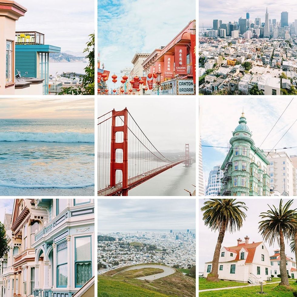
Up first: Brit + Co’s home base, San Francisco. This travel guide was created with two ideas in mind: What places should you go to see brilliant color stories that will *also* give you a good grasp of what the City by the Bay is all about? Luckily, SF is chock-full of beautiful vistas, vibrant cityscapes, and crazy beautiful architecture, so there’s no shortage of places to find inspiration.
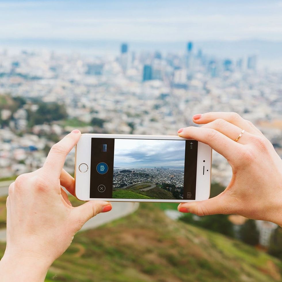
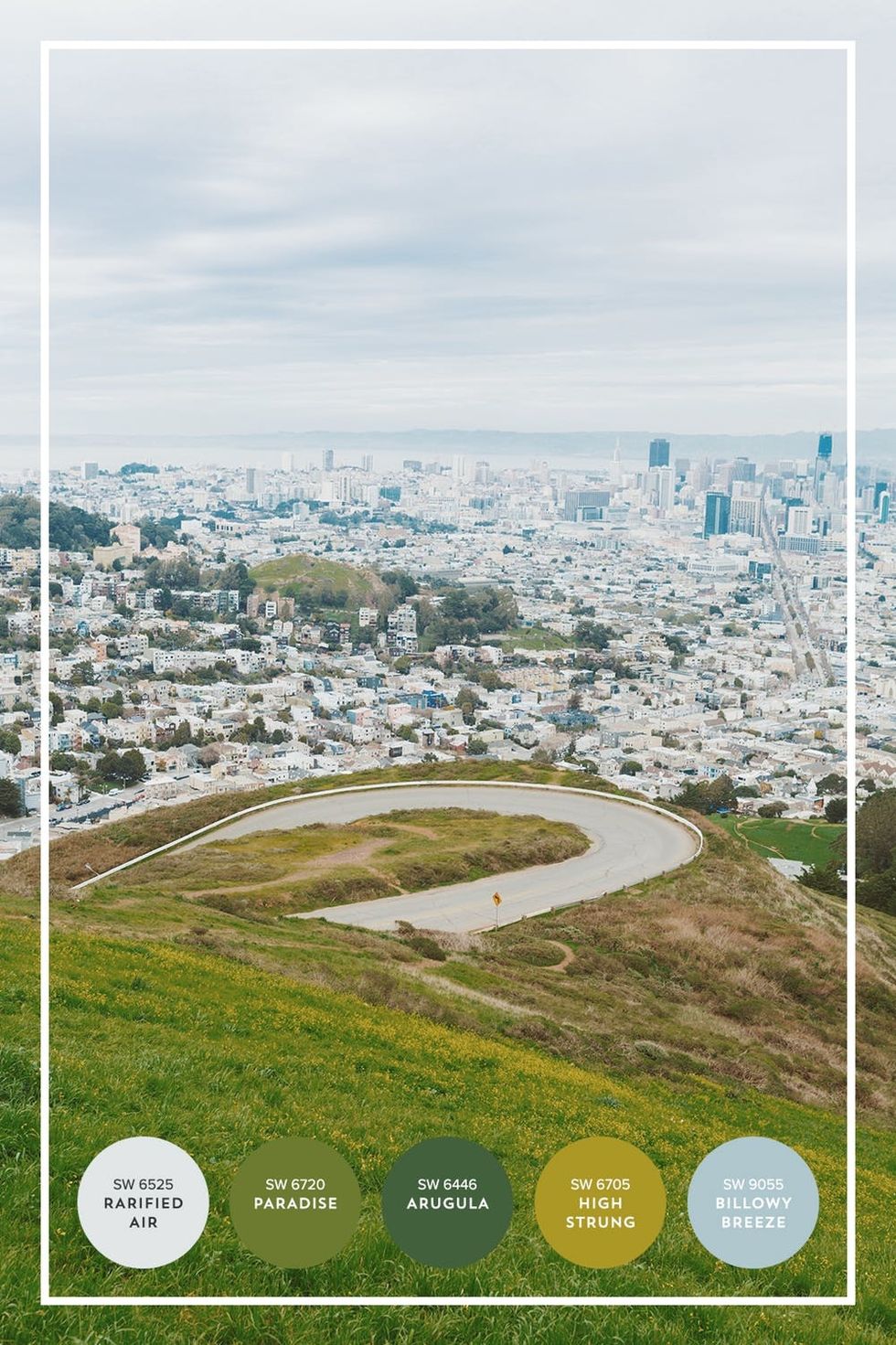
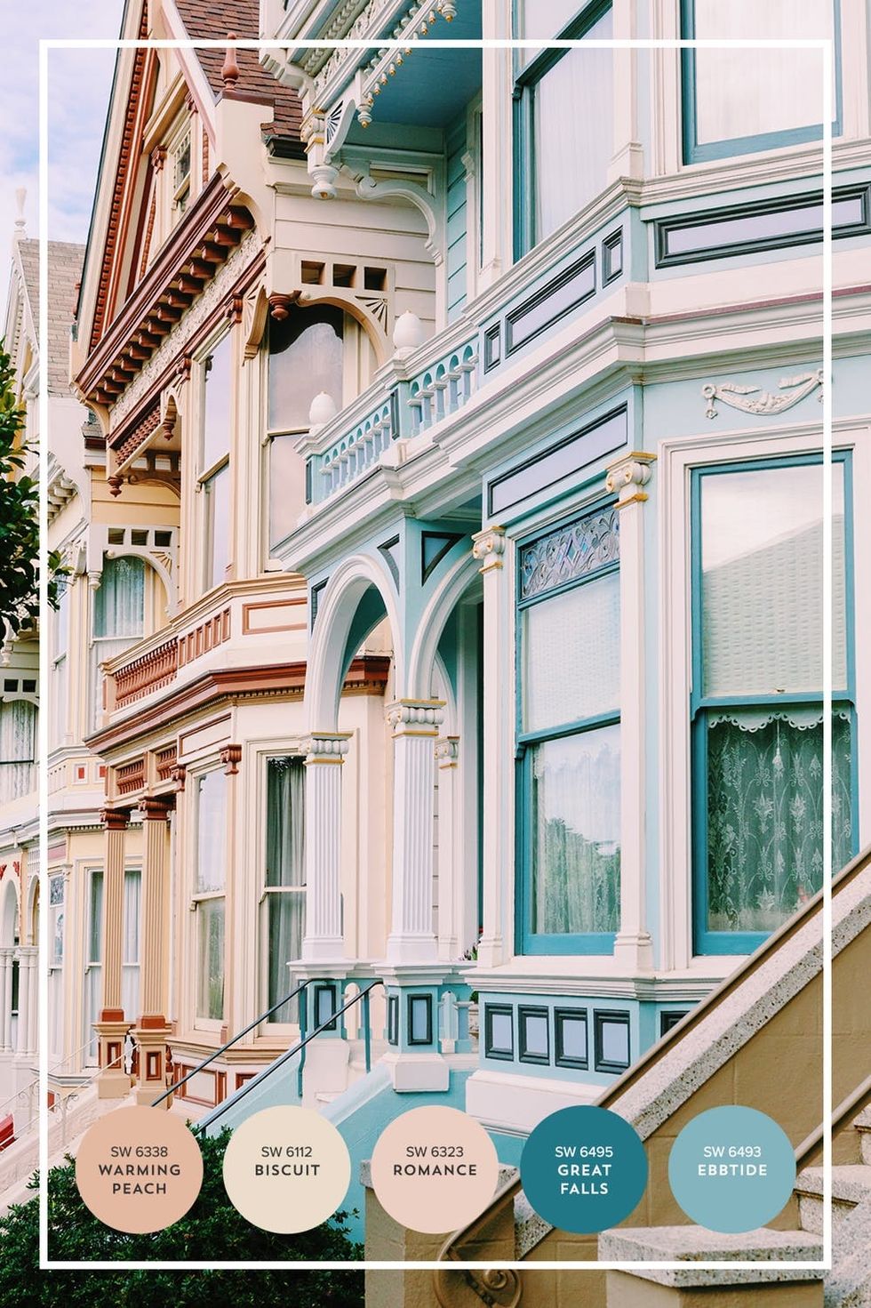
Thanks to ColorSnap Visualizer app, we have a tool to bring these incredible color palettes off of our cameras and into our home. ColorSnap Visualizer app samples colors from your photos and creates a customizable palette using Sherwin-Williams paint colors. With the help of ColorSnap Visualizer app, we created the following color palettes from our travels. We even applied one to an office space renovation, which you can peek at the end of this post.
First stop: Twin Peaks. We’ll start at the southern end of the city. Twin Peaks offers sweeping views of San Francisco, the San Francisco Bay, and even the East Bay across the water. The constant fog keeps Northern California’s infamous rolling hills a vibrant, lustrous green, and we ain’t mad about it. Twin Peaks is one of the best places to see these colorful hills up close. The greens and yellows nicely juxtapose with the hazy blues and whites of the cityscape beyond, don’t you think?
Witness the famous Painted Ladies. Talk about colorful! San Francisco is known for its charming Victorian houses found throughout the city, but most famously along Alamo Square in NoPa. We locals are pretty proud of the picturesque silhouettes, pastel colors, and ornate faces of these historical homes. And here’s a fun fact: These houses used to be painted Battleship gray due to surplus paint from WWI And WWII, but were updated in the ‘60s to their colorful state. Swing by Alamo Square to experience this magical architecture IRL, then walk down to NoPa for great boutique shopping and even greater food.
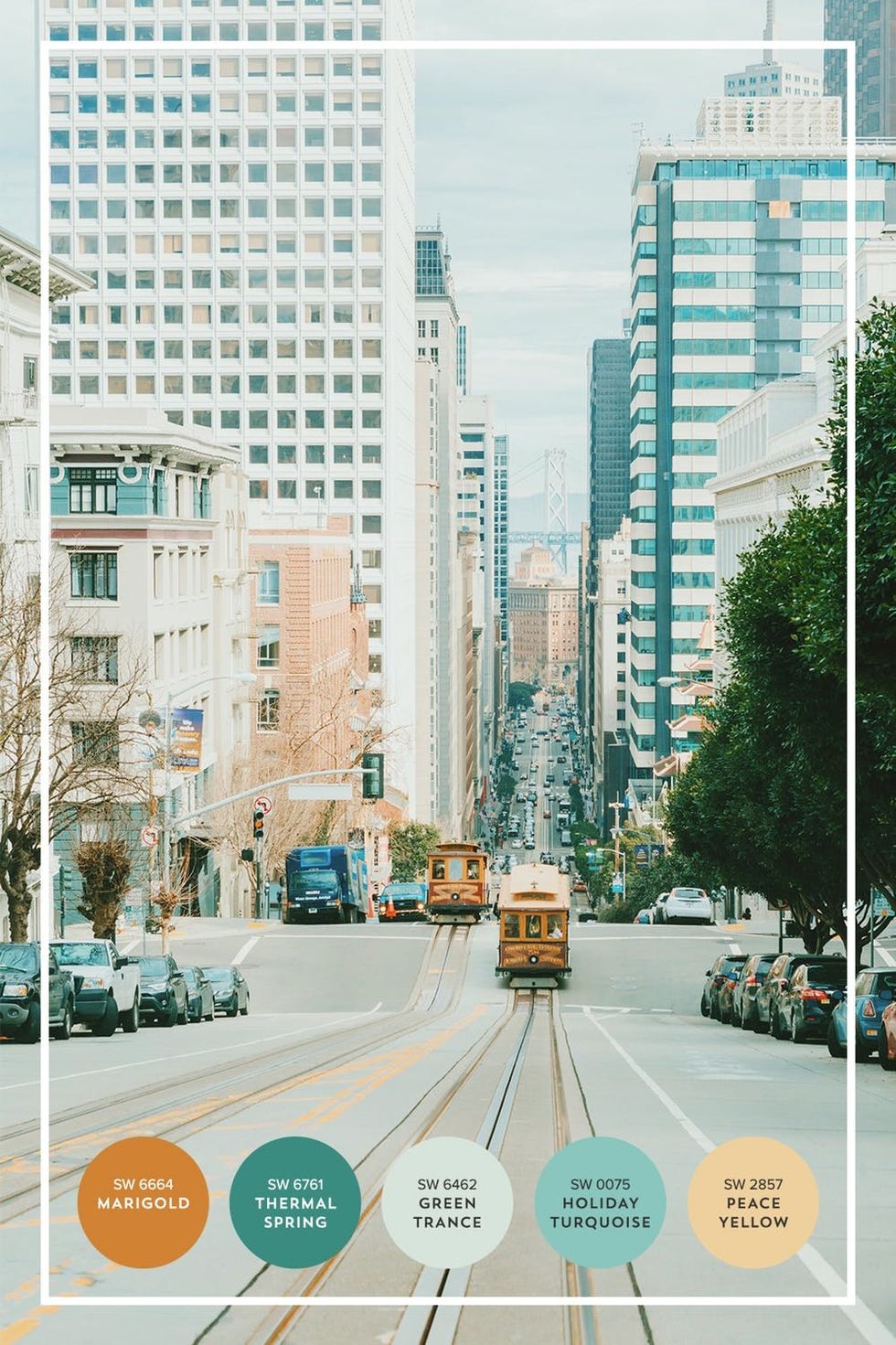
Hop on a cable car in the Financial District. The cable cars that run through downtown (until 1am!) are an iconic San Francisco sight that we try *so* hard not to take for granted. What other city uses life-sized toy cars as effective public transportation? What’s more, they’re a total photo-op: The golden trolleys pair perfectly with the sea-green reflections in the high rises they pass between.
Head to bustling Chinatown. With its vivid colors, buzzing streets, and strings of celebratory lanterns up all year round, Chinatown is a must for color inspo. There are tons of hues to be inspired by here, but we were particularly taken by the reds, pinks, and cream tones found throughout the architecture and store decor. We strongly suggest you pick up a steamed pork bun and a freshly made fortune cookie while you’re in the hood.
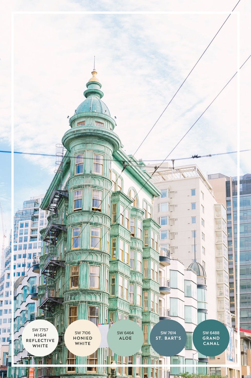
Walk over to North Beach. The first stop in this celebrated neighborhood? Check out the Sentinel Building, San Francisco’s tiny version of New York’s Flatiron. Found on the cusp of Chinatown and North Beach and just a block away from the famed Transamerica Pyramid, this awe-inspiring emerald building is rumored to house the office spaces of famous filmmakers! But you didn’t hear it from us ;) Personally, we love it for its unique architecture and how it juxtaposes against the white and blue high rises flocked behind it.
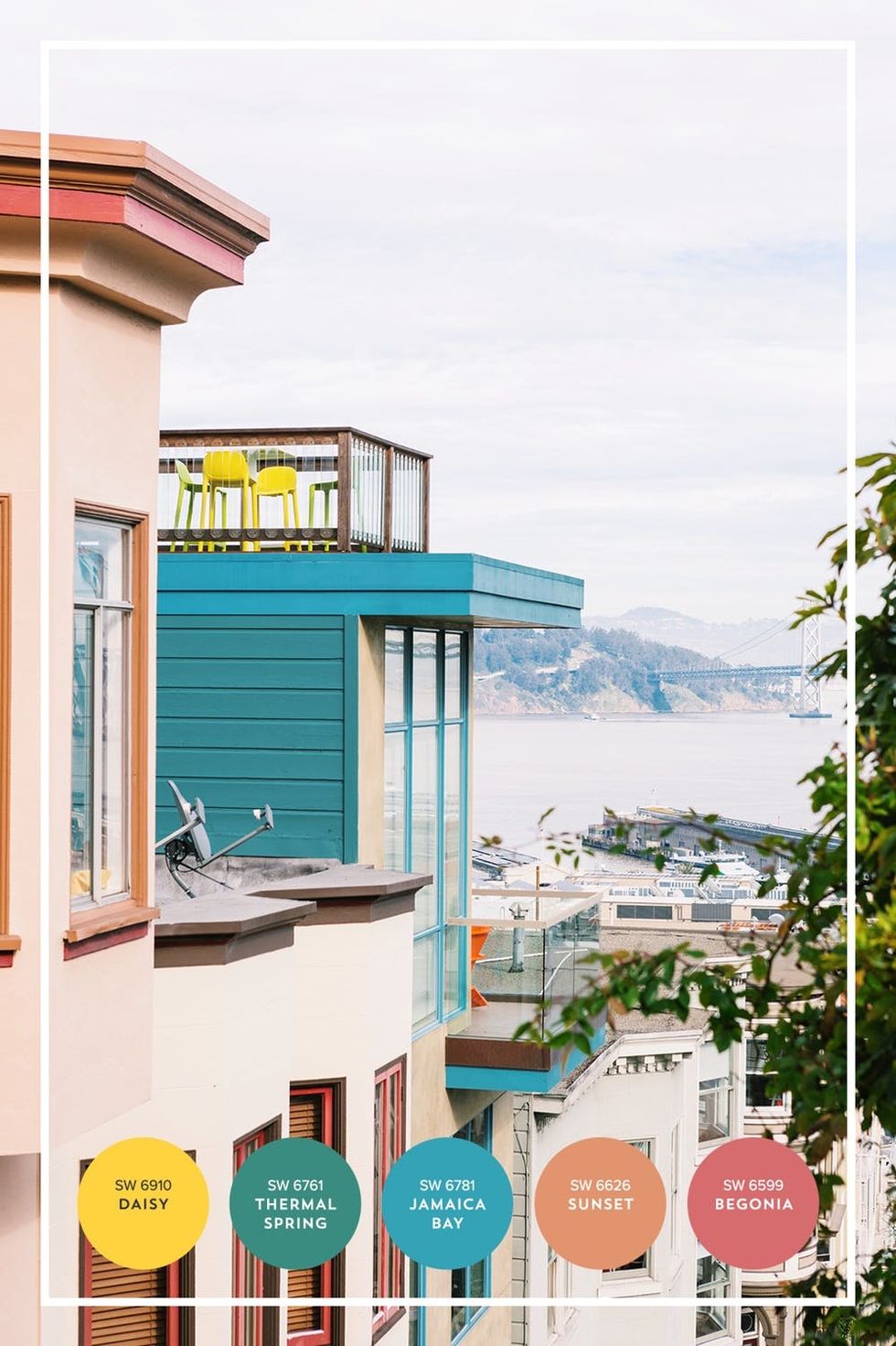
Check out the view on Telegraph Hill. You’ve probably realized by now that there’s no shortage of steep hills in this little city, which is arguably why the real estate is so sought after. There are spectacular views every place you go — of the city, the bay, the bay’s islands, the Pacific Ocean, the Golden Gate Bridge, the Bay Bridge, even the mountains in neighboring counties. This is especially true on Telegraph Hill, just east of North Beach. Take a stroll through this area to see some wonderfully colorful homes, lush garden stairs, and — you guessed it — incredible views.
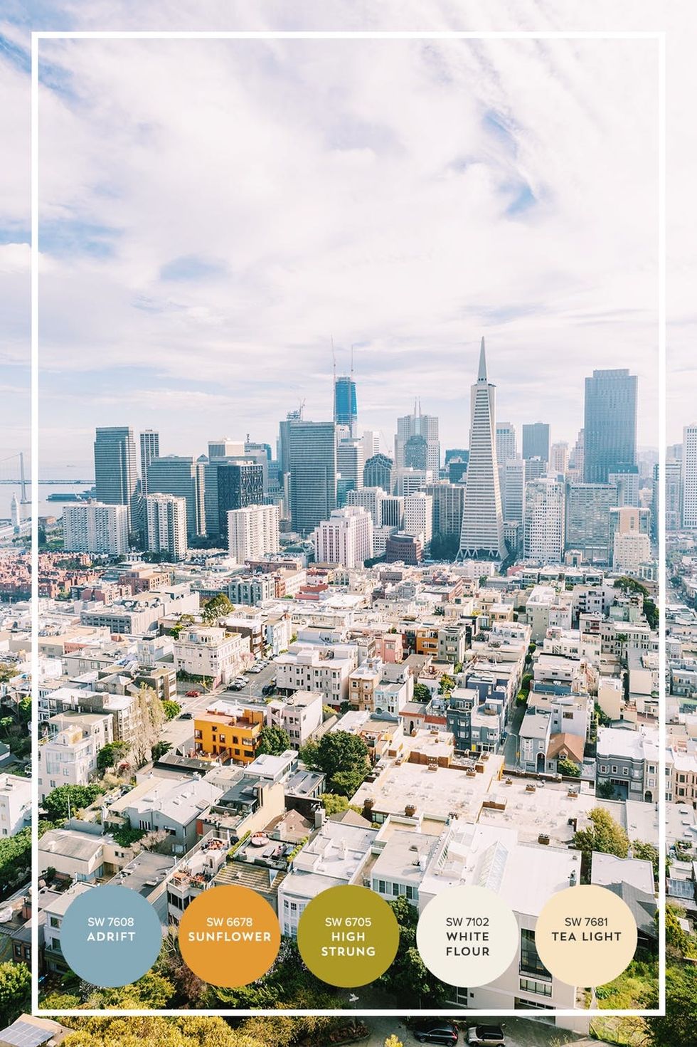
Hike up to Coit Tower. At the tippy top of Telegraph Hill stands Coit Tower, which offers a rad 360 view of Downtown SF, the bay, North Beach, Russian Hill, and beyond. As far as color stories go, this stop will offer dozens — it just depends on what direction you’re facing! The view above depicts the tree-lined streets of Telegraph Hill, funky, bright and whitewashed North Beach homes and the skyscrapers that fill the Financial District. We’re loving the ombre effect from green, to white, to blue, with pops of sunny yellow.
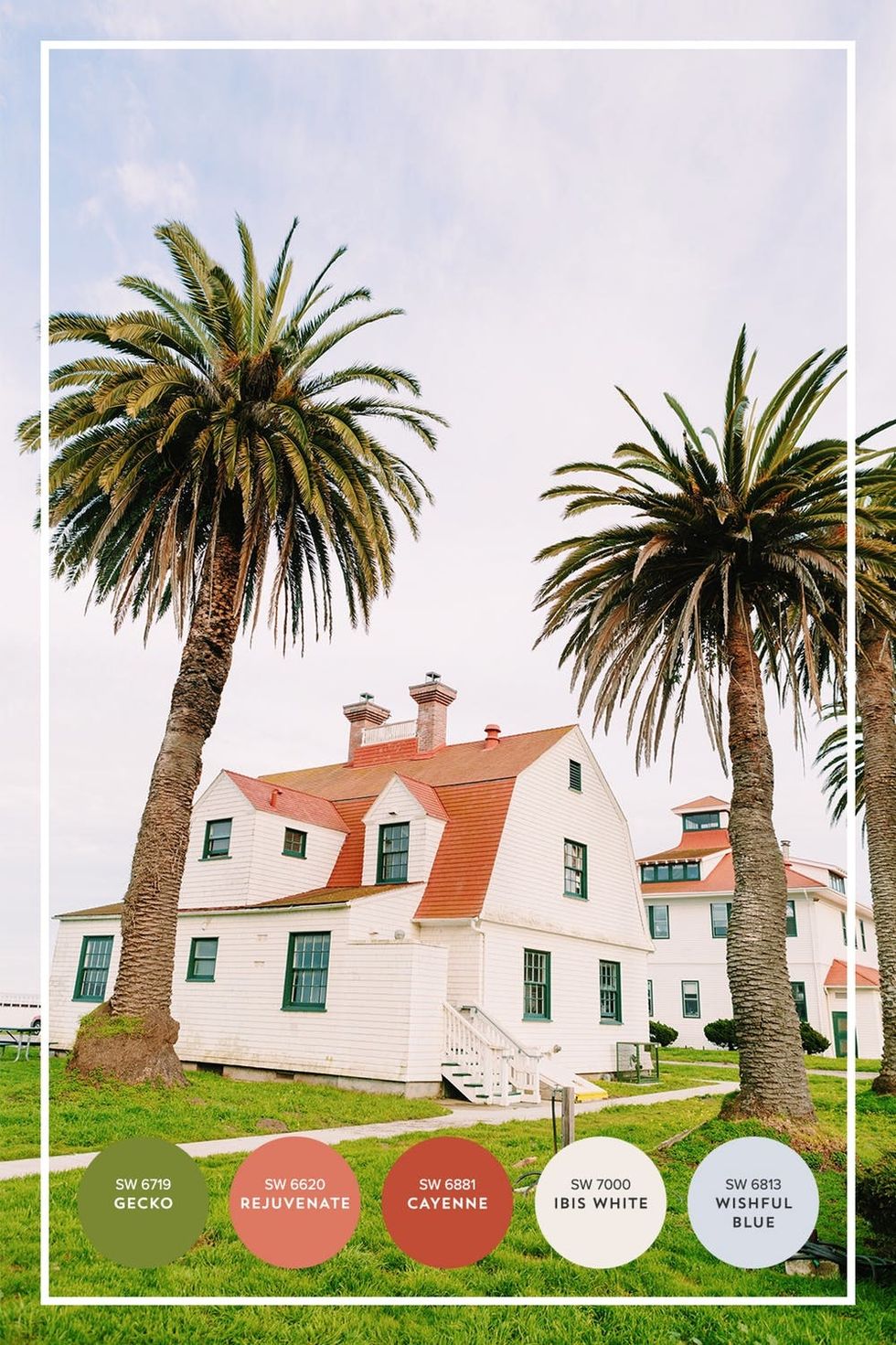
Picnic at Crissy Field. On the north coast of San Francisco lies Crissy Field, a span of green fields and beaches lining the bay. Translation: This is the ultimate picnic spot. While you’re nomming on some sandos, make sure to check out the beautiful historic buildings that dot the former US Army airfield. We’re about to nerd out for a sec, but we have *mad* crushes on the coral/ivory combo of these buildings. They’re so Instagram-able! Whatever army general decided on that color scheme had great taste :)
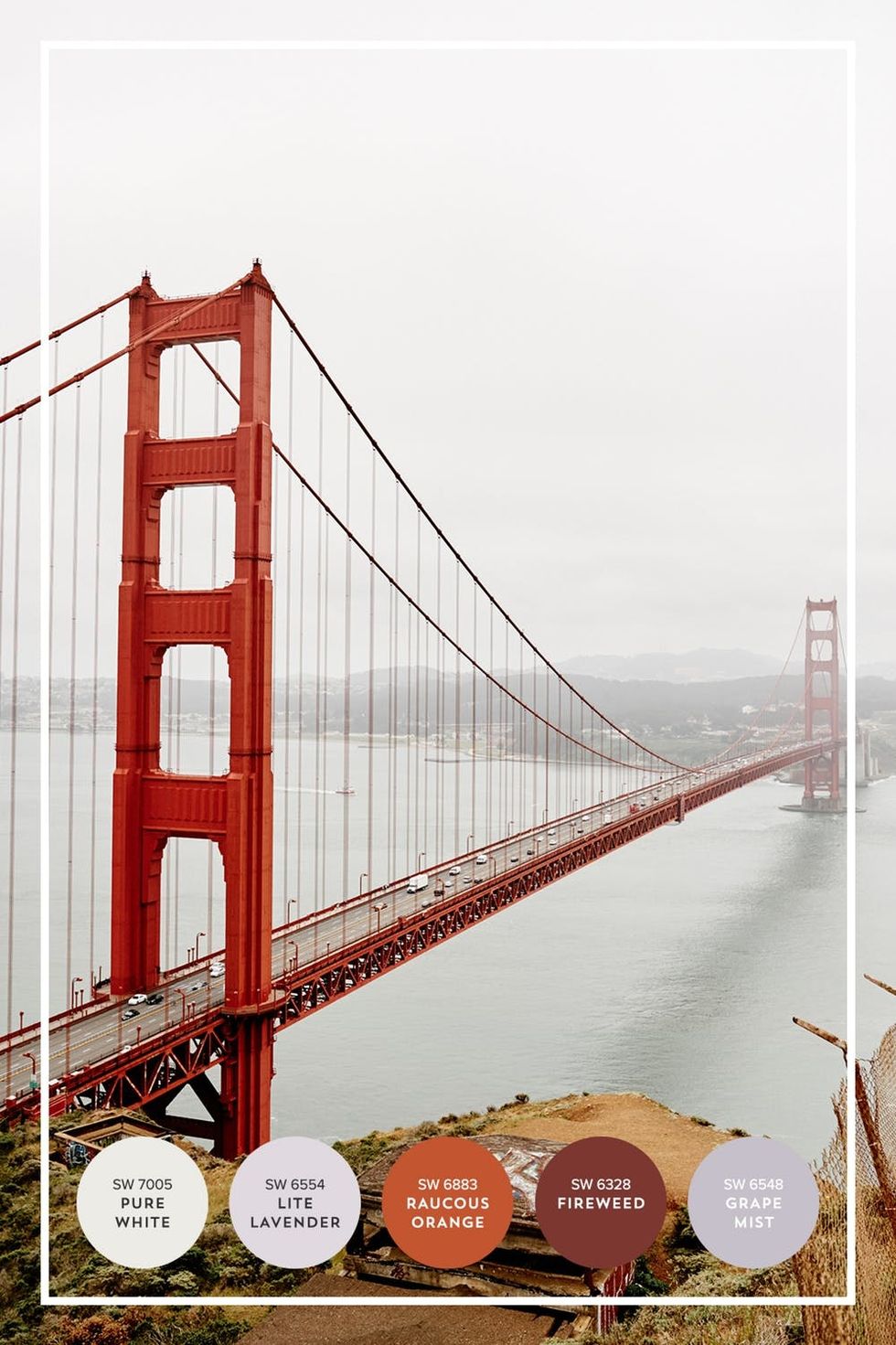
Ogle at the Golden Gate Bridge: Duh! This giant needs no introduction. Be sure to witness our proudest asset during your stay. This baby is beautiful from ALL directions, but we’re partial to the view just north of the bridge at Battery Spencer. The best part of the bridge is its chameleon tendency: The colors of the bridge, the water below, and the city beyond change with the time of day. If you visit on a foggy morning, you’re sure to see a lovely sight like the one above — with the bridge offering a punch of red on an otherwise misty scene. If you visit at dusk on a clear evening, the bridge’s traffic lights light up like electric wires beneath a sunset sky. It’s stunning.
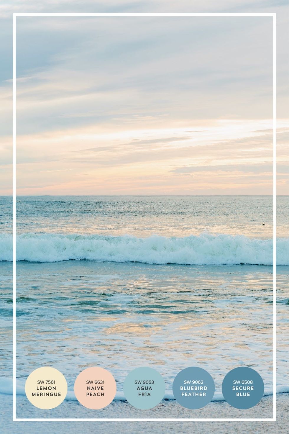
See the sunset at Rodeo Beach. It wouldn’t be a complete trip without a visit to one of the Bay Area’s cold and beautiful beaches. We’re partial to the lesser-known Rodeo Beach, a Pacific Ocean beach just north of the Golden Gate Bridge. Why? You’re sure to beat the crowds, and the drive is just as beautiful as the destination. Stop by in the evening to enjoy a pastel sunset that the Northern California coast is known for, complete with peaches, creams, and gray-blue hues. Just be sure to bring a jacket!
LET SAN FRANCISCO INSPIRE YOUR HOME DECOR
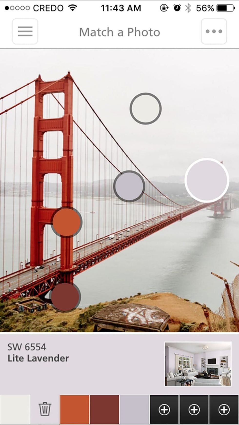
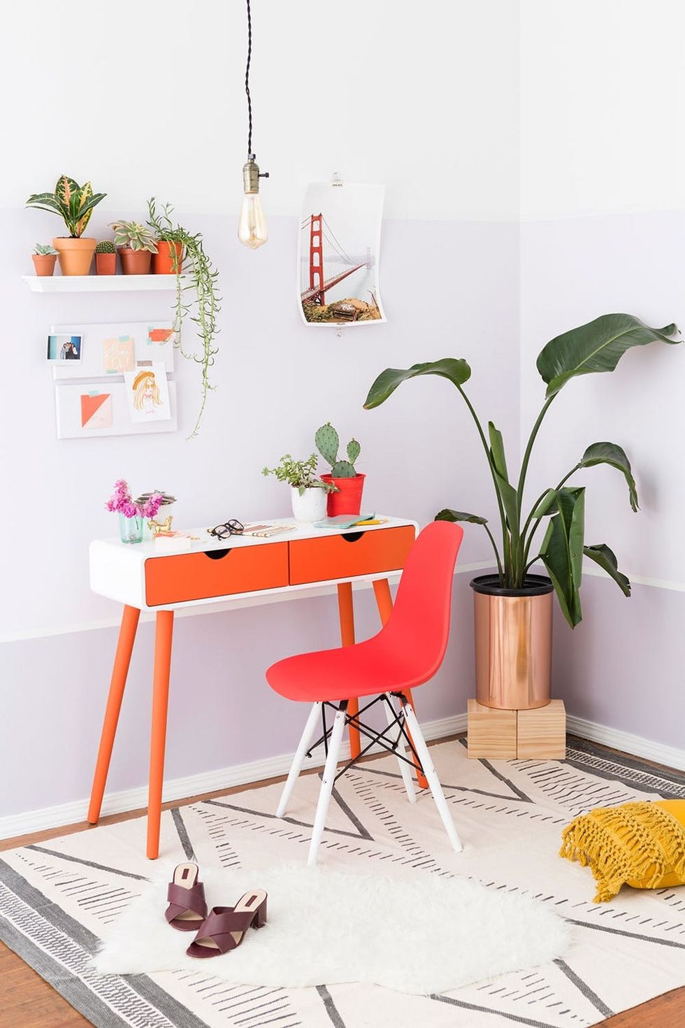
Wanna see *just* how easy it is to use the ColorSnap Visualizer app to redecorate? We’ll show you! We renovated an office space with the photo of the Golden Gate Bridge as our inspiration.
First, we extracted colors from the photo. Those bubbles you see can be moved around, so you can create your own customized color palette from any image.
Then we got painting! We painted the office’s walls in three tones — Grape Mist SW 6548, Lite Lavender SW 6554, and Pure White SW 7005 — to mimic the silhouettes of the hills and cityscape in the background of the photo. Then we painted our desk Raucous Orange SW 6883 and the chair Fireweed SW 6328 because they’re the focal point of the room, just like the bridge is the focal point of the photo :) We further decorated with classically San Francisco vibes: a nod to mid-century decor, layered textures, and lots and lots of plants.
See? It’s *that* easy to have a vacation directly inspire your home decor :)
There you have it: a San Francisco travel guide with color as your compass, and a demo of *just* how simple it is to apply these Bay Area color palettes to your home decor. Stay tuned for more travel guides of our favorite destinations!
Putting this travel guide to use on your next trip to San Francisco? We want to see! Share photos on Instagram and tag #britstagram so we can take a peek!
Color Palettes: Maddie Bachelder + Karen Pham
Photography: Brittany Griffin + Adam Naples
This post was empowered by Sherwin-Williams®.


