You’re gonna want to make a stop at the paint store after reading this.
6 Color Palettes That You’re About to See Everywhere in 2019
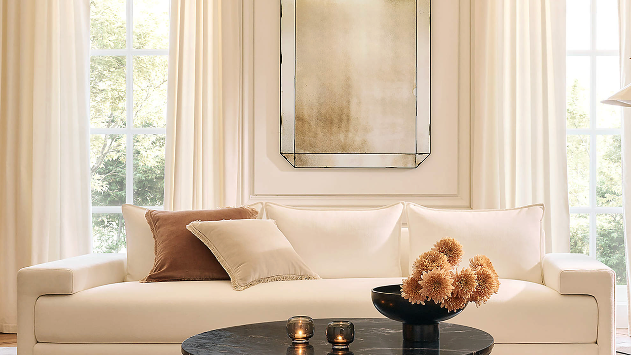
Ever wish you could peek into a crystal ball and see what decor trends are headed down the pike? (We totally feel you.) And while we don’t know what must-haves of 2018 are still going to be relevant this time next year (Rattan? Are you leaving us so soon?), we do have a little insight into what colors are going to be dominating homes everywhere. Hot on the heels of their color of the year announcement, Sherwin-Williams just revealed their Colormix Color Forecast, and with six unique palettes of inspiration, it goes a loooooong way toward telling us what 2019 is going to look like. Each palette evokes a mood and a personality, with a cool mix of bold accent hues and versatile neutrals to make the look work in any space. Thinking of painting soon? Consider this your cheat sheet for 2019.
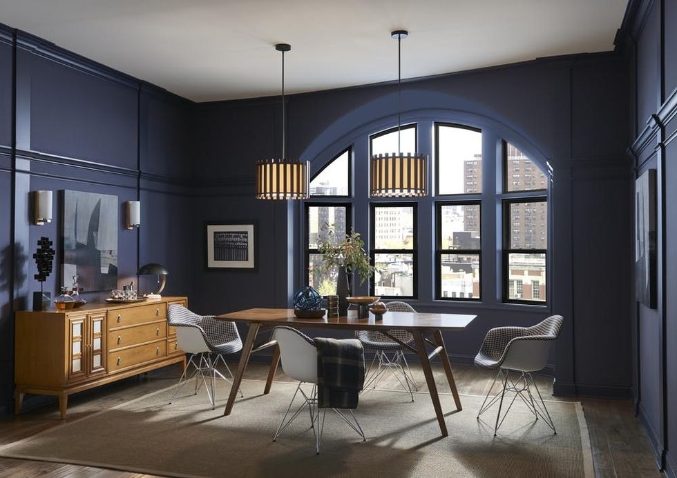
1. Rich Blues and Golds: This combo has definitely been on our radar, ever since the explosion of dark cabinets and brass trim hit kitchens earlier this year. “The Shapeshifter palette is all about colors that embrace the mystical. It’s the blues of the unseen depths of the ocean and the celestial hues of the night sky,” says Sue Wadden, Director of Color Marketing at Sherwin-Williams. We can definitely see the dramatic influence these colors give to a space!
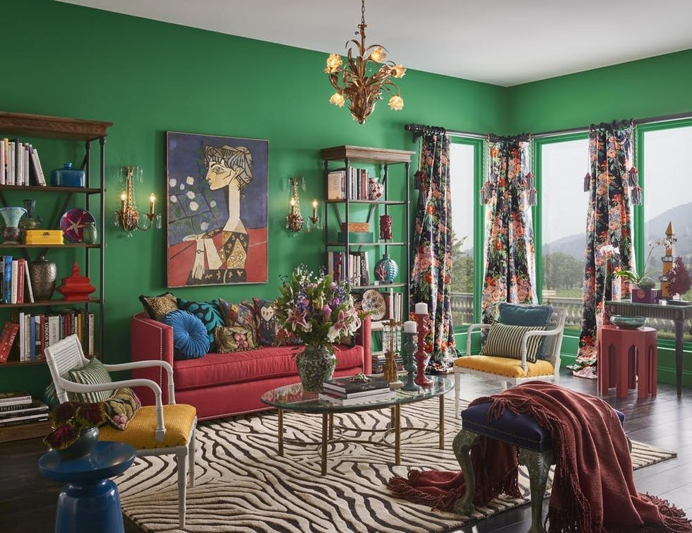
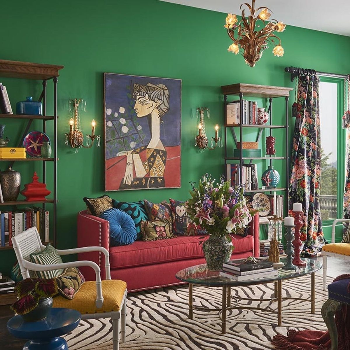
2. Maximalist Greens, Reds, and Yellows: Minimalists, your time is drawing to a close. The fun factor of maximalism, with its bright and cheery prints and super-saturated shades, is just too good to resist. “People are often afraid to embrace big, bright colors in the home,” says Wadden. “This palette is about being carefree and showing a little attitude with unexpected pops of bold color.”
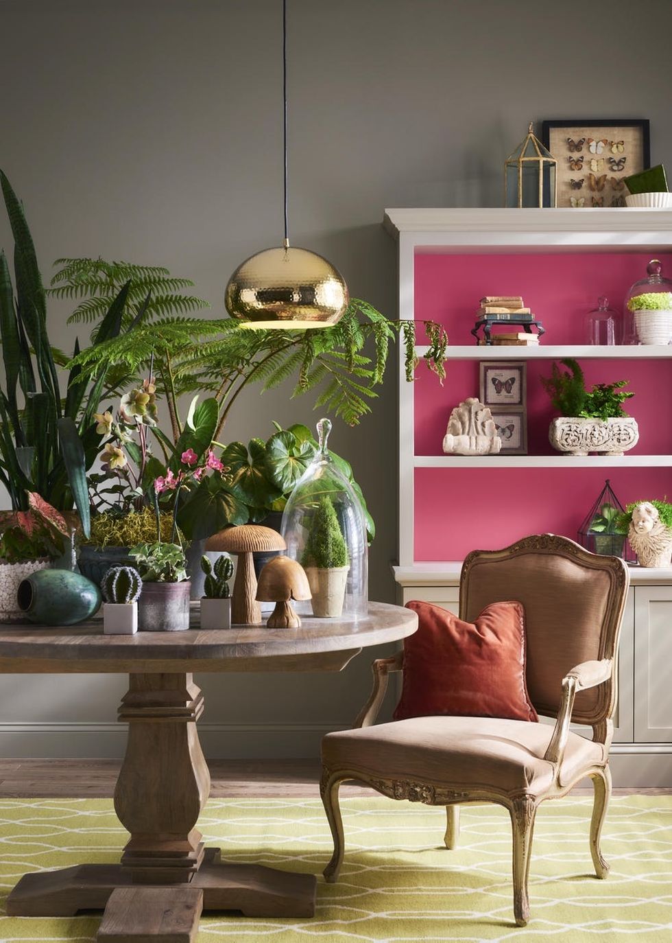
3. Tropical Greens and Pinks: Another score for our ongoing plant obsession! “The Naturalist palette is a posh take on muted and nature-inspired neutrals, with blossoms of floral pinks, yellows, and deep greens,” Wadden tells us. These greenhouse hues and bright hints of exotic pinks make any room feel florid.
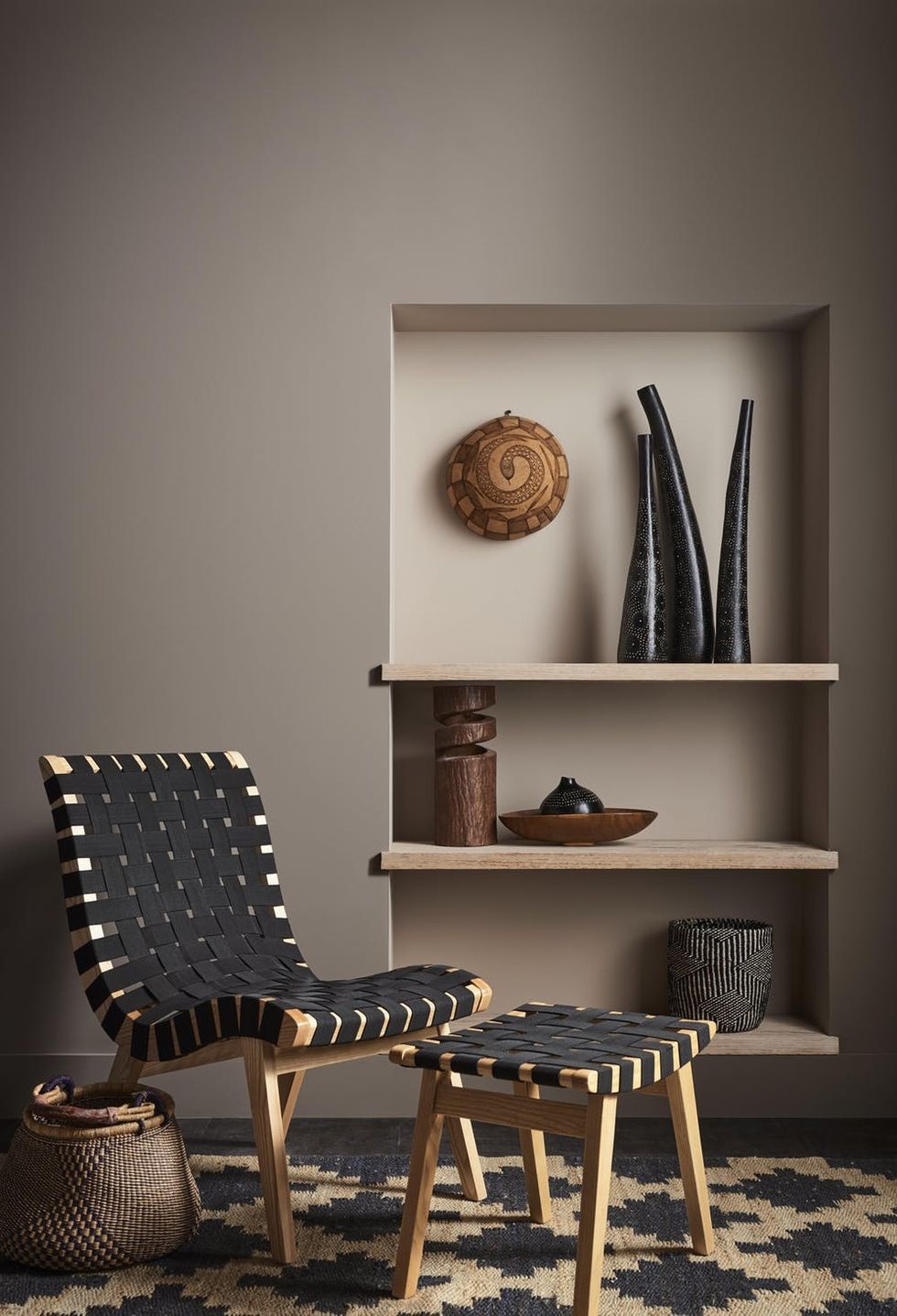
4. Elevated Neutrals With Character: Neutral lovers, rejoice! The latest neutrals reside in the mysteriously murky taupe family, with subtle tinges of purple bringing just the right alluring character to these shades. “The Raconteur palette captures the colors of ancient stories inspired by the richness of Africa,” says Wadden.
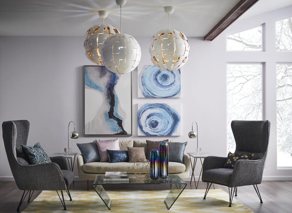
5. Muted-yet-Moody Pastels: Pastels are for grown-ups too. Airy purples and blues stay grounded with the help of some richer hues, lending a glam feel to the entire effect. According to Wadden, “It’s a nod to mid-century style and nostalgia— looking back to look forward.”
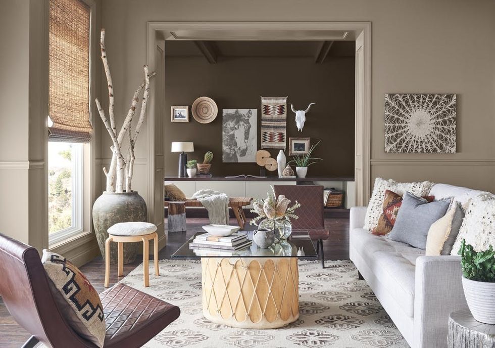
6. Worldly Earth Tones: Eclectic is the name of the game here. Earthy clay tones draw inspiration from handcrafted souvenirs and special travel finds, bringing a rich patina of bohemian spirit to these hues. “This palette of warm earthy hues is inspired by the desire to explore nature, and embrace the modern wild,” Wadden notes.
Which color combo steals your heart? Share with us @BritandCo!
(Images via Sherwin-Williams)

