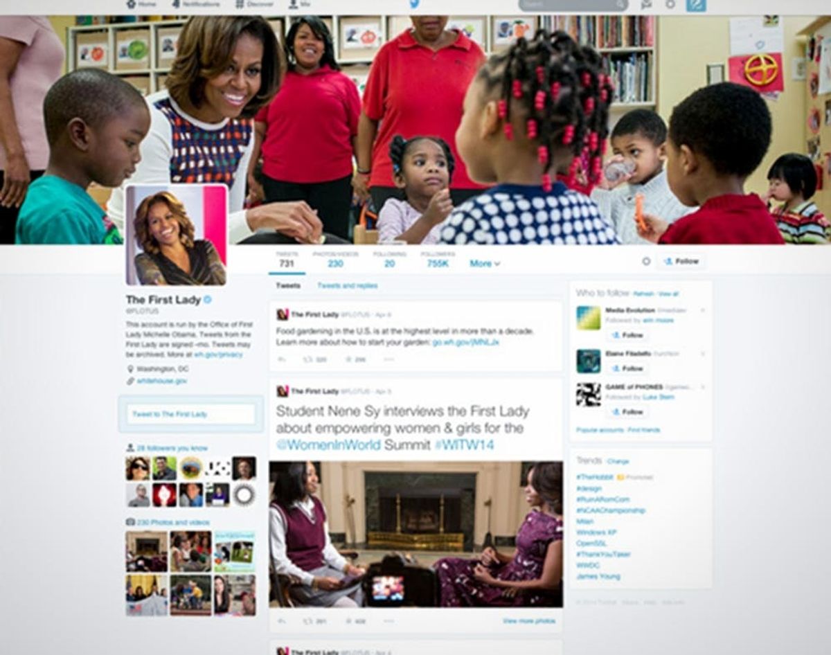
The new Twitter design is rolling out today and although the Bird is getting a revamped look, it’s one we’ve seen before. On Facebook.
Pop Quiz: Is This Facebook or Twitter?

The new Twitter design is rolling out today and although the Bird is getting a revamped look, it’s one we’ve seen before. On Facebook.
Twitter was flirting with a new design in February (the comparison between our old profile and that #NewTwitter above!) and it looks like it’s finally coming to a web browser near you. They want your profile to “show the world who you are,” so they’re updating the way it looks online with a larger header image, Tweets that display more like Facebook posts and amped up visual features overall. At first glance, the new profile looks like a cleaned up Facebook without the excess invitations and ads for things you don’t care about. Let’s take a closer look at what’s up:
Pin Your Tweets: It may seem like it’s sharing language with Pinterest, but being able to pin a particular Tweet to the top of your profile is a h/t to Facebook. This will definitely be a popular feature with brands and celebs promoting something topical.
Okay, But These Kinda Look LikePins: True, if anything about Twitter’s profile redesign is winking at the other other social network, it’s probably the way the new Following tab displays other Twitter users. We like this. Again, it’s more visual and could boost engagement when you’re scrolling through to see who the cool people you’re already following are following. What if we could see their “Best Tweet,” too?Even better. Sidenote: It’s really sweet that Kerry Washington follows @ScandalTrivia <3
Filtered Tweets: It was always an option to select whether you wanted to see someone’s Tweets straight up or look at their Tweets + Replies, but now you can scroll through just Tweets that contain photos and videos. It seems odd to add a visual tab and not something more appropriate for something Twitter does even better, like news — why not a “Tweets With Articles” option? But this combined with Twitter’s new mobile photo options might boost photo sharing on the platform, stealing a little of FB’s Instagram thunder.
Best Tweets: Better start sharpening those 140 character joke skills — your Tweets that have the most engagement will show up bigger when someone’s scrolling through your feed (the “old Twitter” is on the left and the “new Twitter” is on the right). Who doesn’t love a little word cloud? Okay, point: Twitter.
When?! Updated profiles are available to the Twitter elite (Michelle Obama and such) today and will be coming soon to everyone.
They say imitation is the sincerest form of flattery, but this might be pushing it. If Twitter was a girl we were friends with, we would have to delicately tell her that copping our frenemy’s style is a really bad look. Just do you, girl. When we wrote about the last FB-ified Twitter redesign, we assumed that, yes, people more familiar with Zuck’s social network might be more inclined to Tweet if it looks like what they’re used to. But Twitter needs to think about the millions of folks already on their platform… and keep them Tweeting too. What’s next? Referring to Tweeting as “Poking”?! Don’t get any ideas, Tweeps.
What do you think about Twitter’s profile redesign? Are you a Facebook Fan or a loyal Tweeter?


