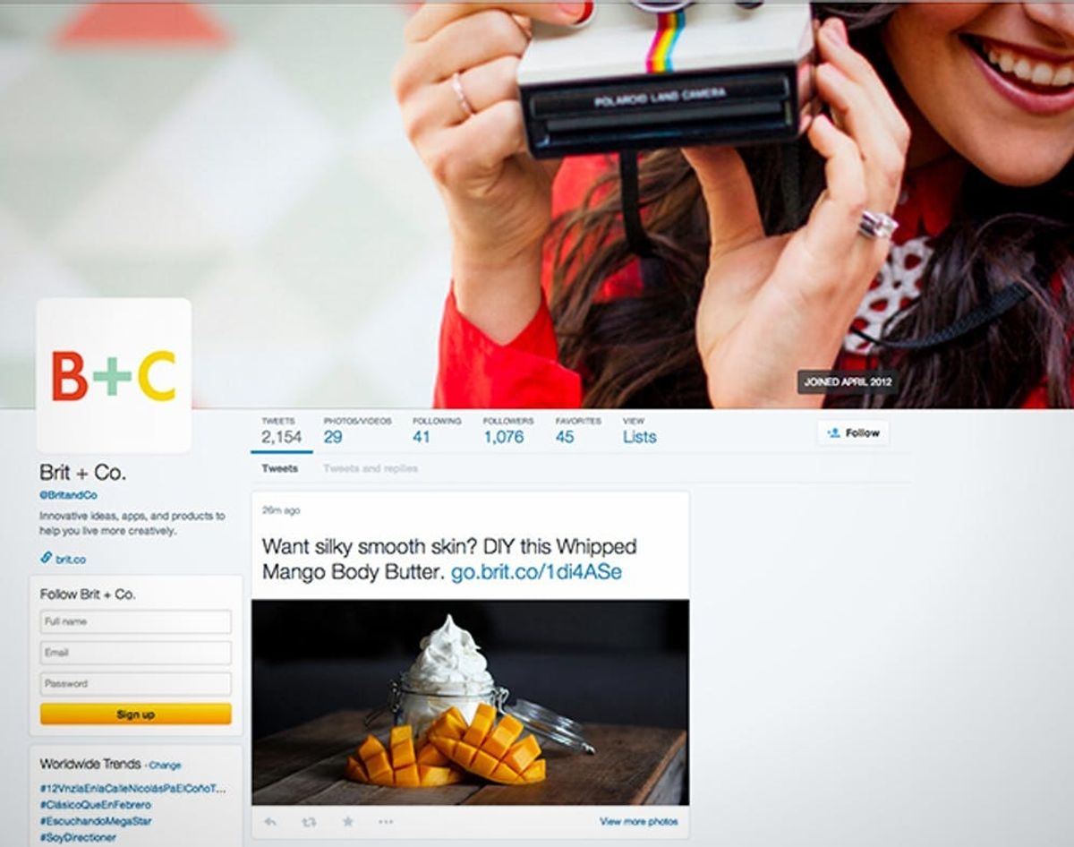
Last week, Facebook tried to get us to take it more seriously as a source of social news with the launch of its Paper app and now this week, Twitter started rolling out a new look that has everyone doing an FB double take. Are our favorite social networks having an identity crisis?!
Your Twitter Profile is Starting to Look More Like Your Facebook Profile

Last week, Facebook tried to get us to take it more seriously as a source of social news with the launch of its Paper app and now this week, Twitter started rolling out a new look that has everyone doing an FB double take. Are our favorite social networks having an identity crisis?!
You’ll know if you have #NewTwitter when you log in on a web browser and visit your profile. Your profile and header photos appear much larger, your name more prominent with all of your personal info placed to the left under your avatar. We dig the new stats under your header — now instead of just numbers for Tweets, Following and Followers, it shouts out your Photos/Videos, Favorites and Lists.
Your tweets appear less like a feed and more like Pins in bigger, different-sized boxes depending on text and photos. This creation of Franken-Social proportions might have the soul of Twitter, but more like the head, neck and shoulders of Facebook, the body of Google+ and the organs of Pinterest. We’re a little scared, but also intrigued. The pic below shows a comparison between old (left) and new (right) with our Twitter profiles.
So why the new look? The social network is struggling with a slump in new user growth, plus back in October, Twitter reported that 75% of Tweeters access the social network from a mobile device. They’re likely hoping that with an updated, Facebook-friendlier profile design, more new users will be encouraged and feel comfortable taking that first trip to Twitter Town.
It hasn’t rolled out to everyone just yet and there’s been no official announcement on Twitter’s blog.
Sound off below: what do you think of the latest #NewTwitter? If you could only use ONE social network, which would you choose?


