Small, but strategic, and very serene.
Create A Tiny, Serene Nursery With These Design Hacks
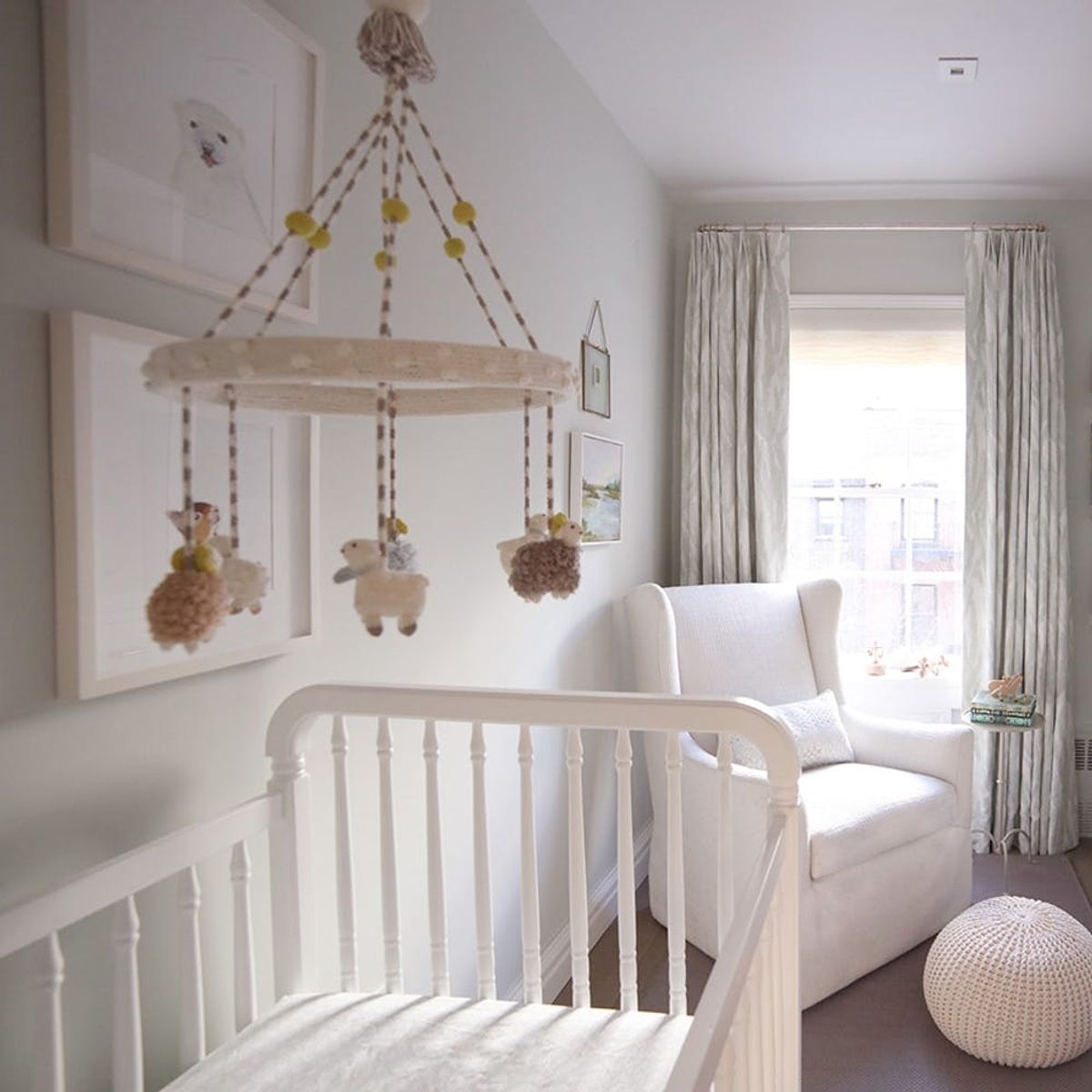
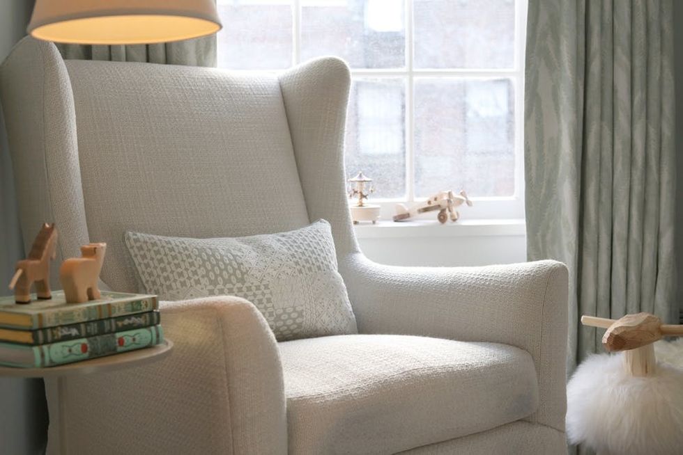
We’re no strangers to small-space living, so the thought of having to accommodate a tiny human in our already petite homes is sometimes a struggle. And space is only half the issue: How does one make a mini-nursery feel relaxing and, well, not like a shoebox for baby? But if anyone can do it, it’s Viyet CEO Elizabeth Brown, as these photos of her brilliant nursery design beautifully prove. In spite of its small size, the resulting space is airy and light-filled, with plenty of storage for all of her little one’s accoutrements. (And if there’s one thing we know, it’s that babies come with a surprising amount of stuff.)
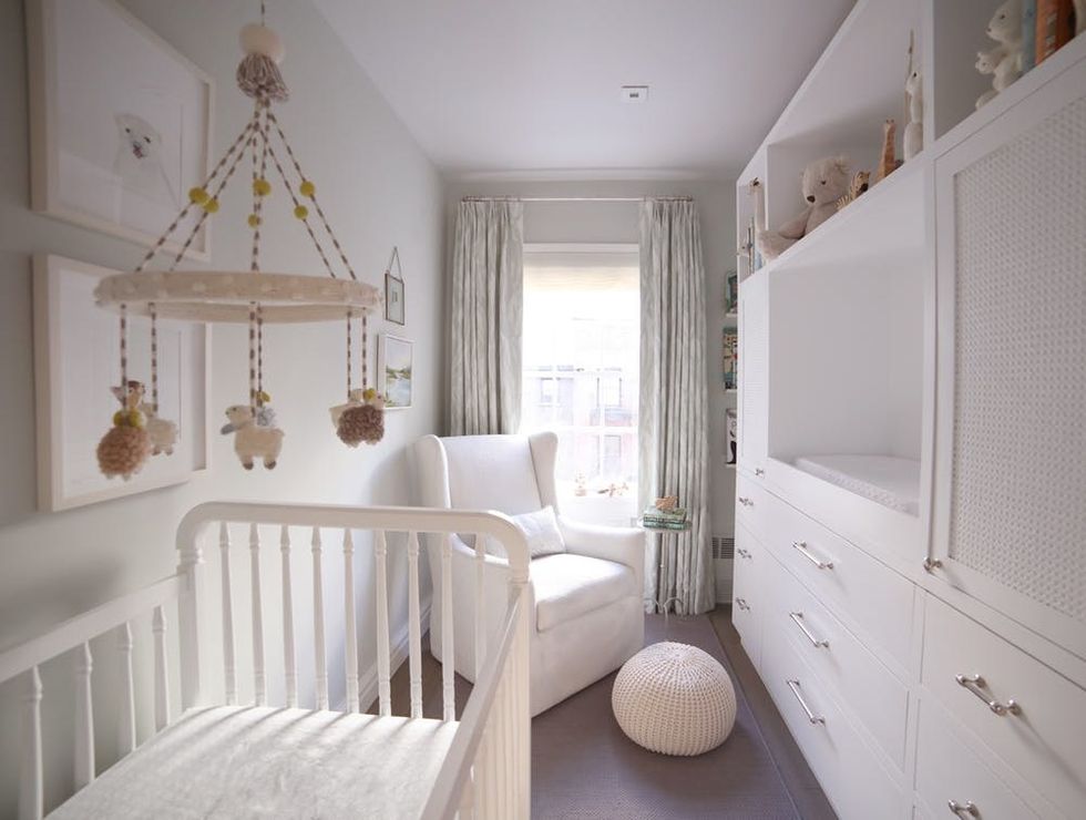
“The room was previously a home office and a dark gray-black color, and we knew we wanted something lighter and brighter,” Brown says. While the conventional wisdom around painting small spaces light colors has been contested in recent years, this is one situation where the old adage really holds true: The room feels bigger and brighter with a new coat of paint (it’s only 7′ x 12!’). “We painted the walls Pale Powder by Farrow and Ball, which is a soft grayish celadon,” she says.
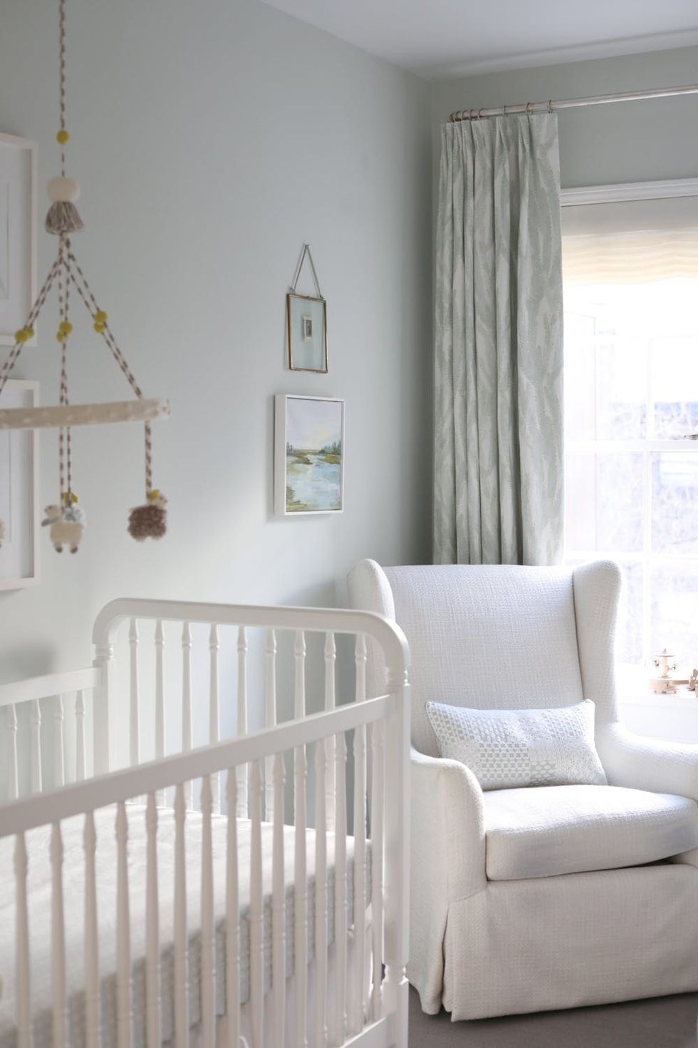
“The small painting above the chair was painted, by my mother, of the marsh view from behind the beach house where I grew up in South Carolina,” Brown explains. “I love that it extends the blues and the greens from the curtains — and that is brings a special sentimental touch.” The curtains were actually the first thing that Brown selected for the room, and they set the tone for the color palette throughout. “For color, we started with the curtain fabric, Nori by Clay McLaurin Studio in Sea Blue, which we found at Studio Four in NYC. I loved the pale green and aqua tones, which felt right but a little less expected for a little boy than blue,” she tells us.
Brown called in reinforcements to get the most out of the space. “It’s a small room, so we also wanted to ensure we had plenty of storage space. Lucky for us, our designer, Maggie of Margaret Ash Design — who was also pregnant with her first child when we started working together! — knew just how much baby gear was about to come our way,” she says. “Because of this, she added in a few thoughtful details from her own experience, such as designated cabinets and drawers to keep eyesores like diaper pails and pumping equipment out of view.” The built-in changing table is particularly genius, in our opinion.

Looking for more baby and nursery inspo? Check us out on Pinterest!
(Images via Robert Malmberg)


