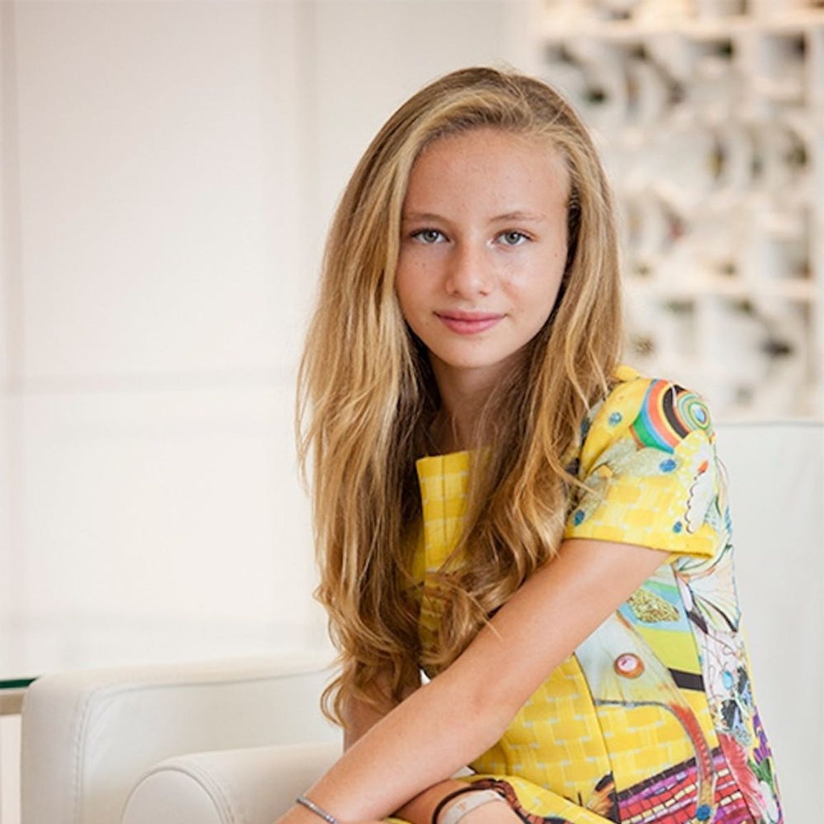
She’s already living her most colorful life.
This Young Designer Will Inspire You With Her Colorful Fashion

Have you ever felt “sad and blue” while being breadcrumbed? Maybe you “saw red” or felt “green with envy” when your BFF quit her job to start her dream company? It’s actually pretty wild to think that we can describe our feelings by referencing specific colors — and it’s awesome that everyone understands exactly what each color means. Colors are hugely powerful and are so much more than just a way to describe our emotions — they can influence how we’re feeling and sway us in specific directions when it comes to how much we like or dislike something. We talked with a prodigal fashion designer — 13-year-old Ariel Weinberg-Swedroe, whose pieces are all about color, combining vibrant hues with patterns from her noted artist/architect grandfather Robert Swedroe. She shared her take on exactly how color influences her designs and her life, as well as to find out how we can incorporate some of the magic into our own lives.
View this post on InstagramA post shared by Swedroe Art to Wear by Ariel (@swedroebyariel) on
B+C: How do you think color can affect someone’s emotions?
Ariel: Color can affect a person’s emotions in many ways, evoking certain feelings. Specifically, they can make us feel happy, sad, or relaxed. I find that warm colors tend to give off a more spirited vibe, while cool tones make us feel relaxed. I love and work with a tropical color palette because it’s full of life and radiates so much energy. Yellow is an especially happy color because it’s influenced by the bright warmth of the sun.
(FWIW, science agrees with Ariel’s thoughtful use of color in her life and designs. According to Smithsonian.com, “People tend to like colors they associate with objects they love or consider to be good things — they like red because it’s the color of strawberries or cherries or red lips. And that can influence a person’s mood or their actions — when it comes to choosing a sweater, what food to eat, or what product to buy.”)
View this post on InstagramA post shared by Swedroe Art to Wear by Ariel (@swedroebyariel) on
B+C: Research suggests that favorite colors might not be innate (or hard-wired into our brains), and that people can change their mind about specific colors over time based on their experiences with them. In fact, Oxford University Professor Charles Spence actually found that people associate red with sweetness — even to the point that people in one of his studies said that salty popcorn tasted sweet after eating it out of a red bowl. Have you found that how you feel about (or how you work with) specific colors has changed over time? Do you think it might?
Ariel: When I first started, I would choose the colors for fabrics based on the collages that I thought were pretty or what spoke to me at the time. Now I have more of a strategy when choosing color schemes and collages to laser-print onto my fabrics based on the season that I’m designing for; it’s not as random anymore. I don’t plan on changing the way I use colors because I never want to lose the connection that I have with my grandfather through his architecture, which is actually reflected on my prints. Nobody has ever seen these fabrics before, so it makes my work one-of-a-kind.
View this post on InstagramA post shared by Swedroe Art to Wear by Ariel (@swedroebyariel) on
B+C: Academic studies in color and branding suggest that it’s more important for your brand’s colors to support the personality you *want* to showcase instead of trying to align with stereotypical color associations. Do you find this applies to your work too?
Ariel: Actually, neither academic study or stereotypical color associations apply to Swedroe by Ariel! In this way, I feel like I stand apart from other fashion designers, not only because of my age but also because I don’t limit myself to using one personality or one print. My grandfather has created over 800 unique works of art, all of which I have at my disposal for my designs. I use his colors to design what I love.
B+C: How do you use color to affect your moods in your own life and channel creativity or specific vibes?
Ariel: In so many ways!
Red: For me, it’s a fierce color; it makes me feel powerful. My grandmother wears it on her lips all the time because she says it brings good luck. I take that and incorporate it into my designs because I believe in the lucky aspect of using red in my work.
Blue: Anytime I want to spend some time relaxing, I go into my backyard (I live on the beach) and look at all the blue: The sky and the rolling waves make me feel instantly calm, no matter what.
Turquoise: My favorite color is turquoise, so I definitely like to use that wherever I can. It makes me feel relaxed like I’m at the beach and looking at the beautiful water and sky. It also makes me feel fortunate and lucky to be making my dreams come true.
Green: I automatically think of nature and the connection that I have with it all because green is also the color of my eyes.
White: My room is my favorite place to hang out; it’s all white — like a base with pops of color. This is very much like the clothes I design, as there’s a base color (the human body) and the pops of color are my bright pieces.
How does color affect your creativity, mood, and life? Tag us in your most vibrant shots on Instagram @BritandCo or tweet us the deets @BritandCo!
(Photos via Ariel Weinberg-Swedroe)


