Take a Tour of Brit Morin’s DIY Baby Nursery!
Hi, I'm Brit, the founder and CEO of Brit + Co. I'm a young mom of two, tech nerd and design-inclined lady who has a zillion hobbies and curious about... just about everything! My mission from the beginning has been to unlock women's creativity and courage to try new things so that they can find the path to their true passions.
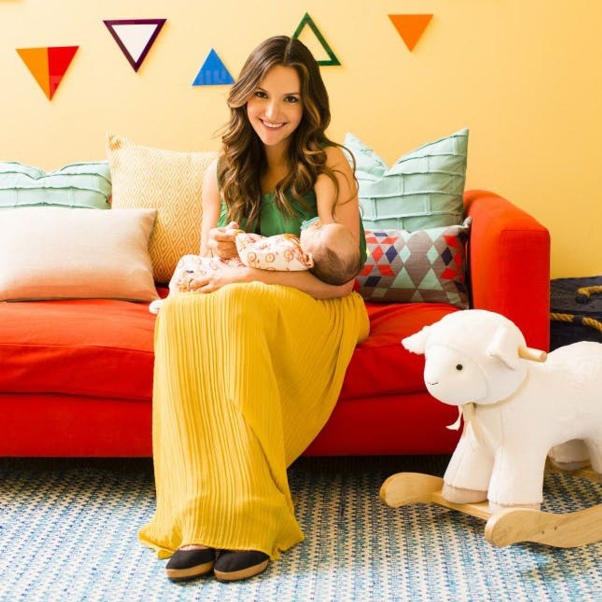
So, it happened. I had a baby. His name is Ansel.
Thank God, too, because I swear I thought I was going to be pregnant forever. It’s all fun and games until someone turns you into a Halloween pumpkin.
But I digress.
Over the next few weeks, I’ll be revealing some trials, tribulations and creative learnings I’ve had throughout my entire pregnancy and new mom process thus far. First up, the nursery reveal!
This nursery was a true labor of love. I searched high and low across the interwebs to get inspired, and naturally started my process with a good old-fashioned Pinterest board. My husband and I were going after a modern-outdoorsy-tribal theme, since a) we love design, b) we love the outdoors and c) I’m part Native American (interesting fact, eh?). Oh, and as with all things I make, I knew this room had to have some serious COLOR. We didn’t find out beforehand whether it was a boy or girl, so I knew going the multi-colored route was a safe bet. Here was one of the original pins that inspired me:
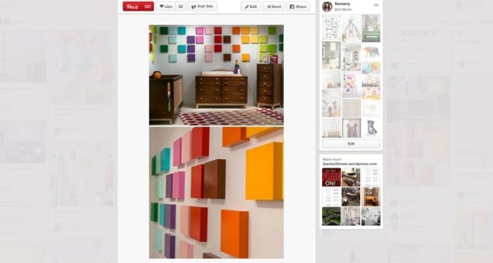
I mean… what’s not to love!? I have to say, it’s difficult to make a colorful nursery without it turning into a bowl of rainbow vomit. I knew I had to tread a fine line here.
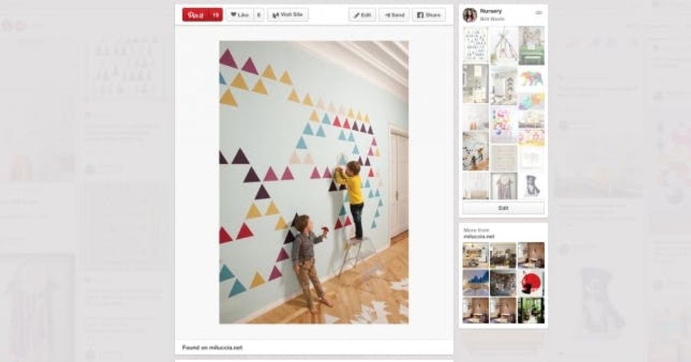
I didn’t really know what modern-outdoorsy-tribal would mean until I started collecting ideas and was immediately drawn to geometric triangle patterns like this.
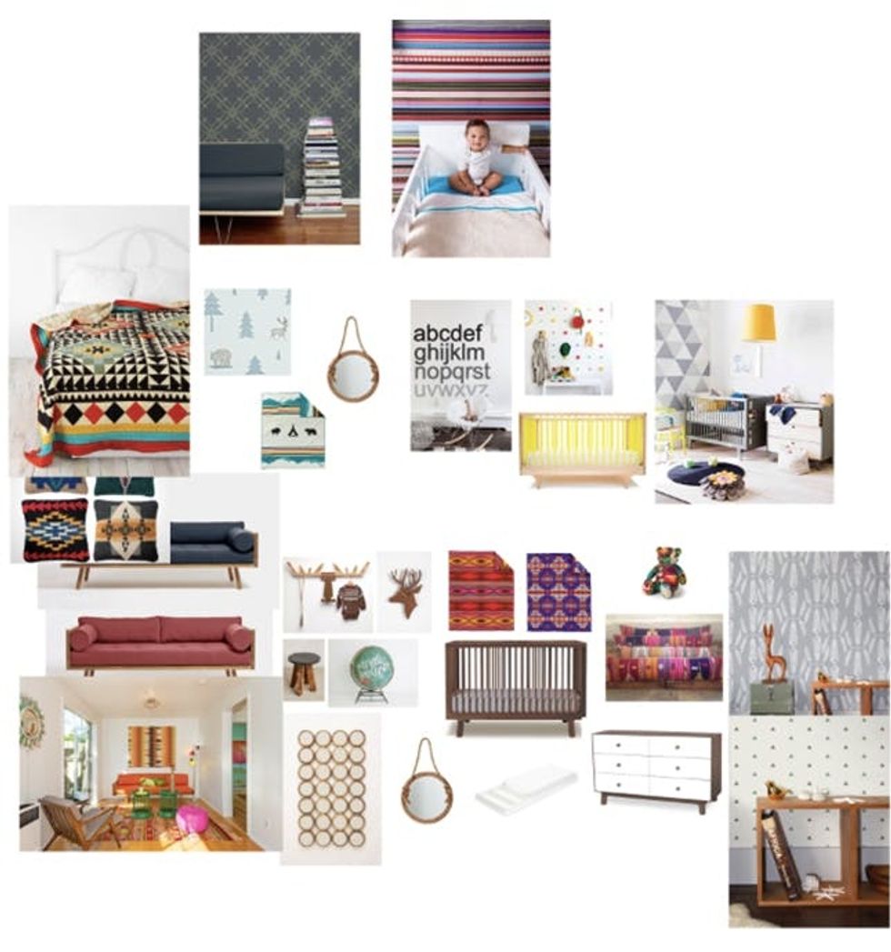
After I racked up a ridiculous number of pins, I decided it was time to finally start narrowing in on some real decisions. So I turned to my trusty friend, Photoshop, to start pulling in images that could coordinate together based on ideas or themes. Here’s what it began to look like next.
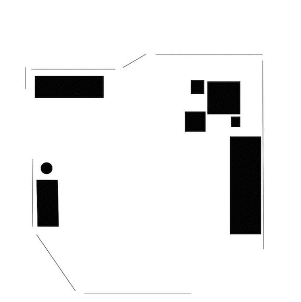
I even used Photoshop to design the layout of the room. Given the fact that I’d never had a baby before, I had no idea if you needed the changing table to be super close to the crib, or if having a couch in a room was even useful. I emailed this around to a few of my girlfriends who were already moms to get their advice. Here’s a near-final layout I ended up with.
Now, it was time to tie all of this together into a Nursery Game Plan. I wanted to make sure that the furniture elements all worked together before I DIYed or bought any accessories, so once again, I made a collage in Photoshop.
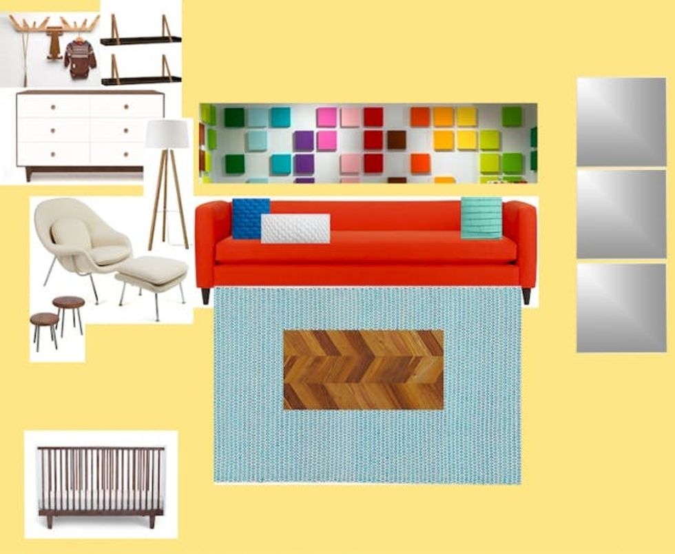
I have to say that, though expensive, Oeuf makes incredibly well-designed nursery furniture. We purchased the crib and matching dresser (below) from them and haven’t been disappointed. The couch and the rug were both scores from CB2 and the womb chair was one we already had in our home. It’s a classic piece from Design Within Reach. Stay tuned for how we hacked it.
Before I get to the final product, let me just warn, yellow paint is scary. You can really go wrong if you get a bad shade. Some are too bright, some are too dull and some look like mustard gone bad. My advice: Try at least five swatches before deciding and make sure to look at them on your wall multiple times during the day, since the natural light will make the color look completely different.
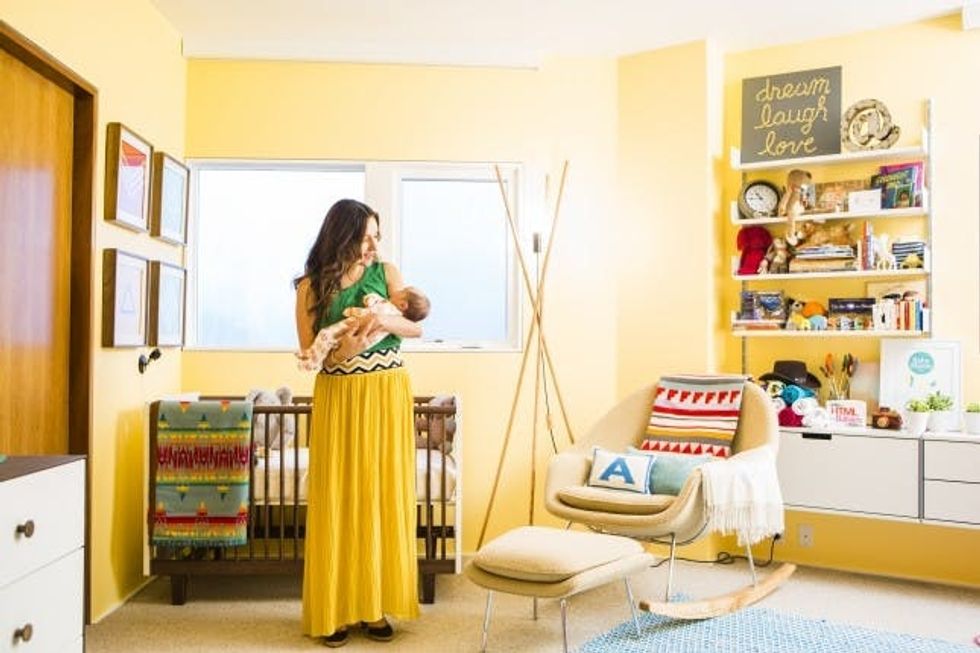
At first, I thought we totally botched it. I was ready to repaint the entire room a soft gray. But once we added in the furniture and accessories, the color finally starting growing on me. Now I love it for the cheerfulness and warmth it brings to the room.
Okay okay, enough of the background plans. Here’s the final result!
Seriously, I could not love it any more. To me, it’s the perfect blend of everything we were attempting to represent. The modern-outdoorsy-tribal theme somehow worked (!), while maintaining a childlike playfulness. Yet it still feels cool enough for an adult… I wouldn’t mind if this were MY bedroom!
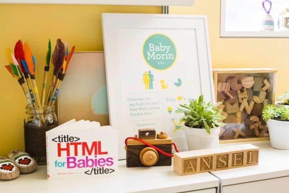
Next to those adorable DIY painted moccasins (given to me by a friend) are DIY feathers.
I purchased a few wooden dowels, spray painted them gold, hot glued some feathers on top, then wrapped with brown twine to conceal the glue marks. Oh, and those are simple strips of washi tape covering the dowels. I didn’t have a container to put them in, so I found a mason jar and wrapped it with brown twine. Ta-da! Katniss would be so proud.
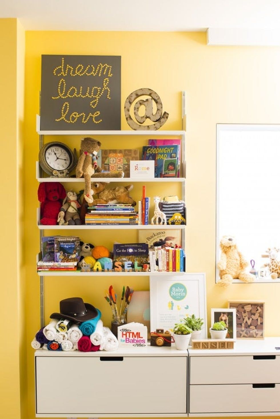
While we’re at it, I have to point out the custom Baby Morin framed infographic art that one of our DIYers, Kelly, made for me. She cataloged all the things about my pregnancy (places I traveled, food cravings, etc) and made it into something I will always treasure.
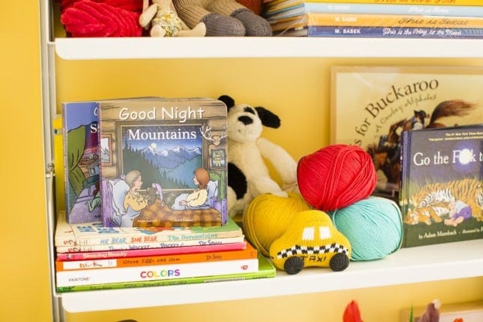
See that wool in our B+C colors? That’s a yet-to-be-made baby blanket that I’m planning to knit, thanks to our friends at Wool in the Gang who recently taught our Knitting For Beginners e-class!
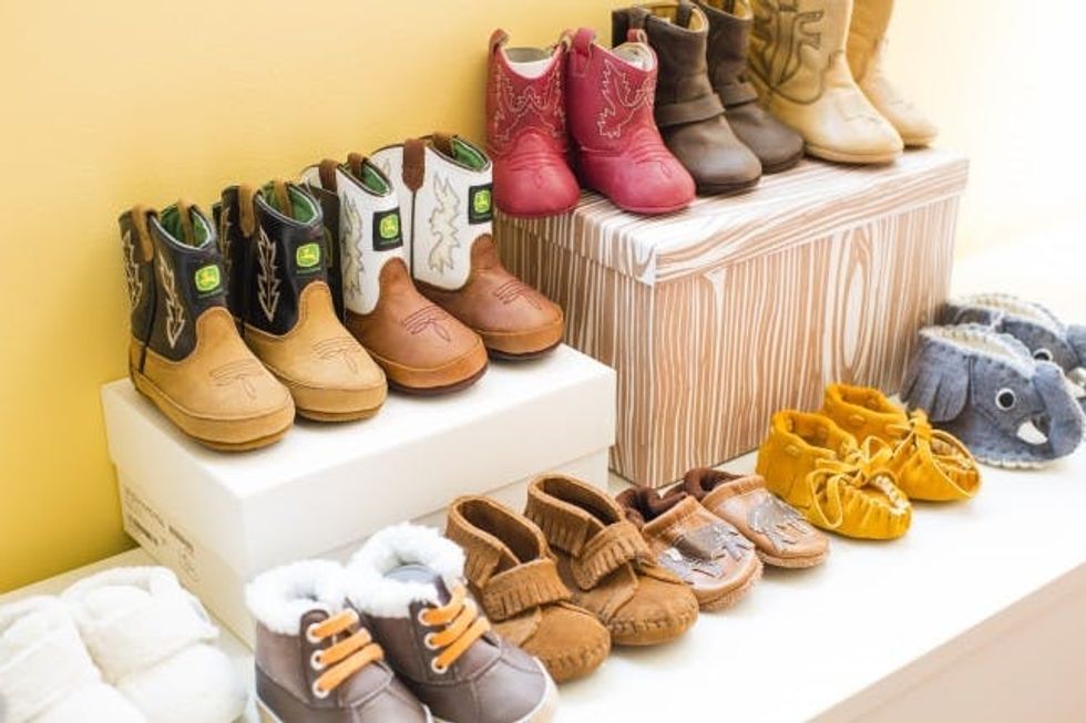
YOU GUYS. THE SHOES!!!
These were all gifts. I’m pretty sure he has more cowboy boots than real cowboys have. And I’m pretty sure I’m A-okay with that. Given my Texas roots and my husband’s Montana roots, this little dude is sure to be rocking boots his whole entire life.
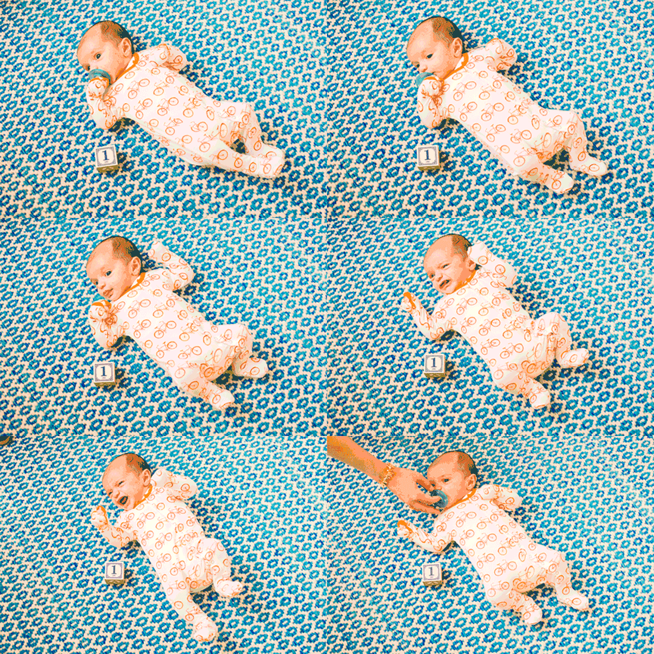
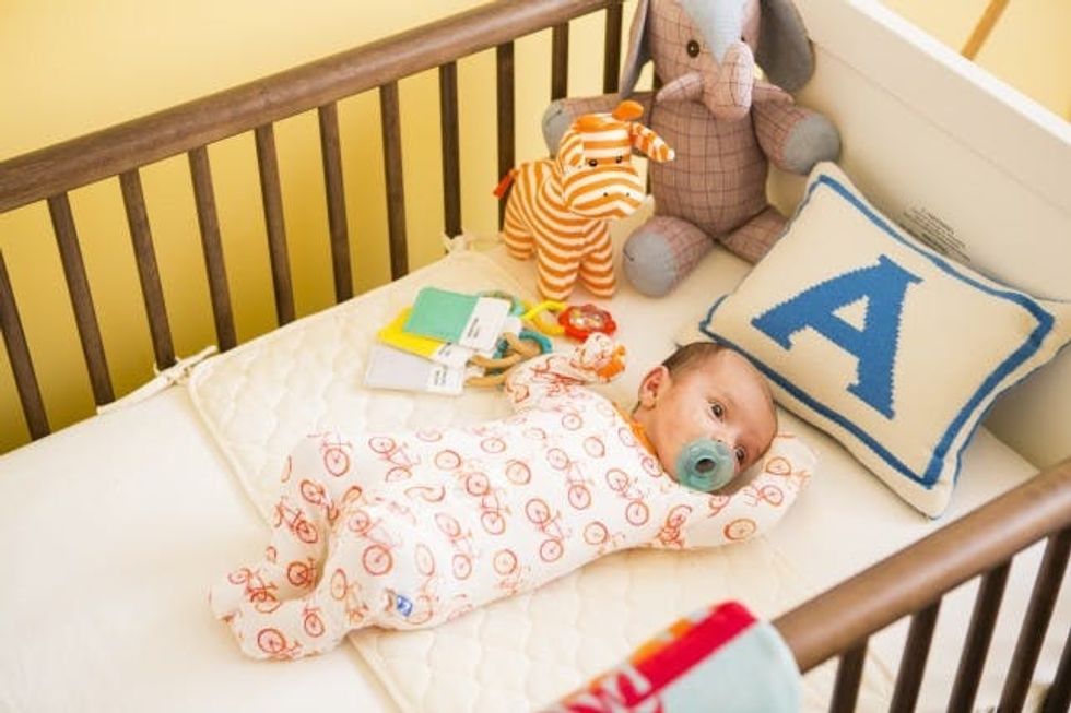
Speaking of that “little dude”… say hello to Ansel!
Aren’t these Pantone toys adorable? He was also gifted tons of Pantone flash cards, books and puzzles. These gift givers know me so well ;)
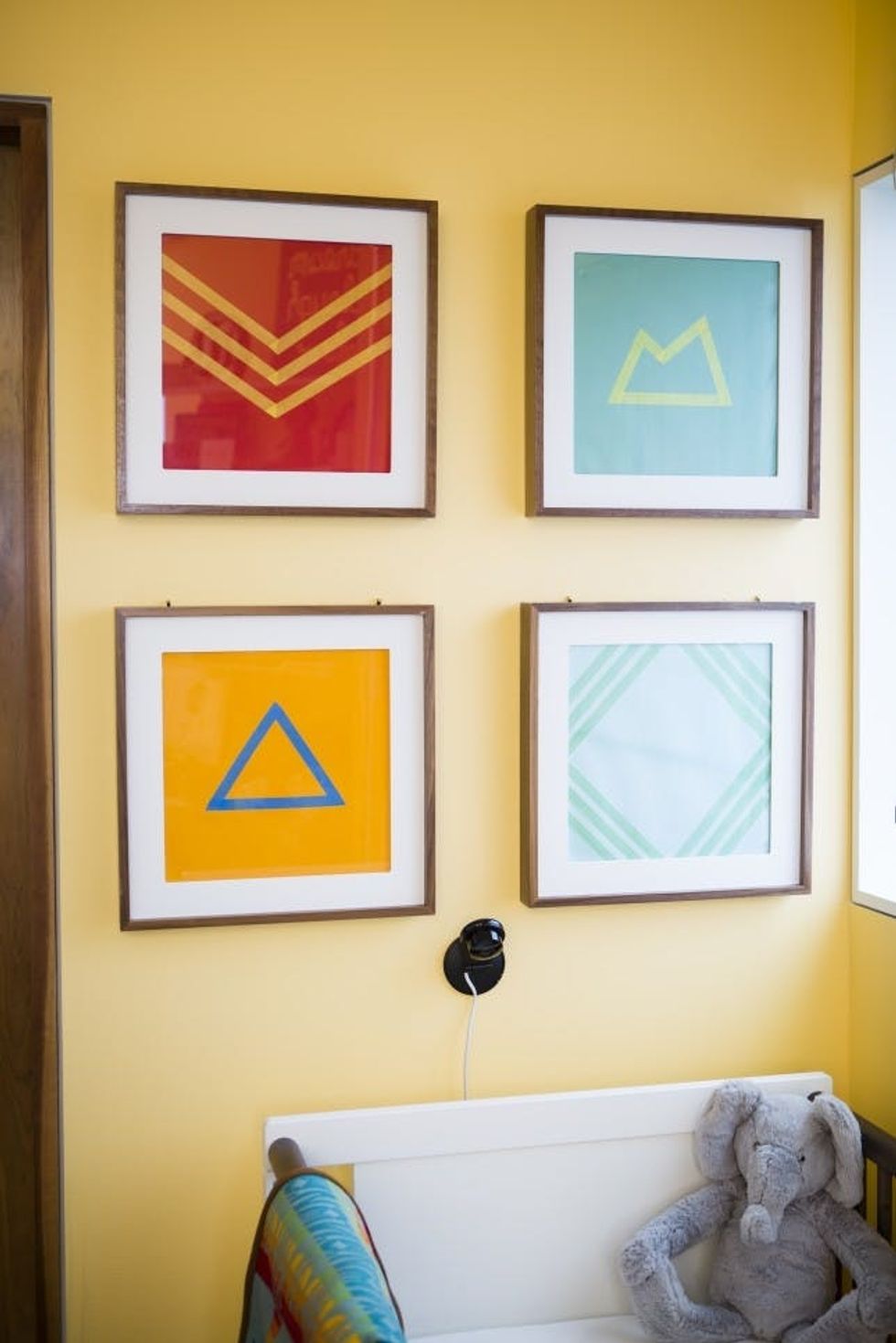
Now back to wall art. Given I hadn’t actually had the baby during the time I was decorating my nursery, I had no photos to frame other than a 3D sonogram. And we all know how creepy those can be. So, I chose to go the DIY route once again, simply purchasing colorful scrapbook paper then using washi tape to create simple designs. I was originally planning to swap these out with some of his newborn photos, but at this point, I’ve gotten used to the colorful art and just might have to keep it around a bit longer!
Oh, and as for baby tech, our “monitor” is a Dropcam. It installs straight into the wall and lets you watch (and talk to!) your baby from the comfort of your phone, no matter where in the world you might be. I polled several sets of parents, and they all agreed this was the way to go.
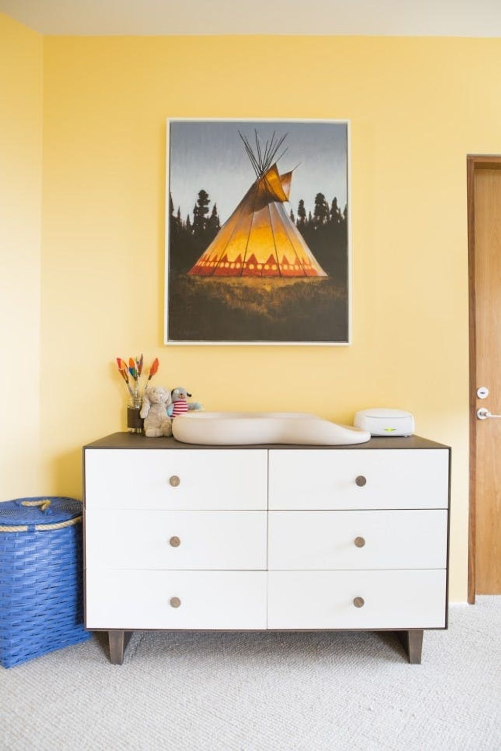
Here’s a quick shot of the changing table. The teepee art is by an artist my husband and I found in Jackson Hole. Jackson also happens to be the place we got married AND Ansel’s middle name. It’s special for many reasons. The Oeuf dresser can hold quite a bit, but for extra storage, we stocked up on these great baskets from Serena & Lily. They work for laundry, toys, blankets and more. I have three!
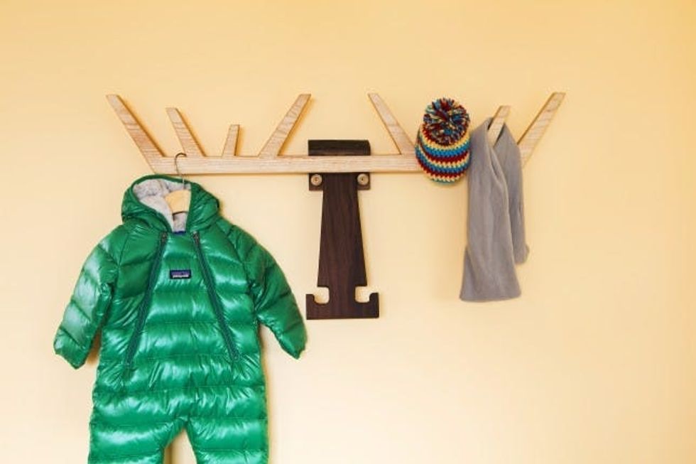
How adorable is this moose? It was custom made by our friends at Anzfer Farms, a woodworking design team in San Francisco. It’s seriously one of my favorite parts about the entire room. They also turned my womb chair into a womb rocker by building some wooden legs (see below). Genius, huh!? These guys are legit talented when it comes to working with wood.
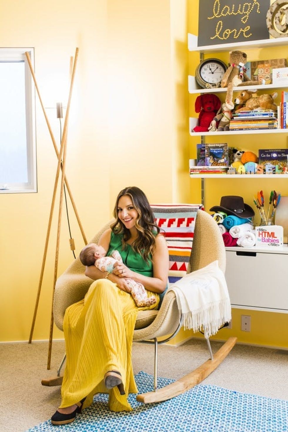
Overall, I’m thrilled with how this room turned out. I just hope little Ansel grows to love it as much as I do. You can’t say we didn’t expose him to a lot of color when he was young! ;)
Hi, I'm Brit, the founder and CEO of Brit + Co. I'm a young mom of two, tech nerd and design-inclined lady who has a zillion hobbies and curious about... just about everything! My mission from the beginning has been to unlock women's creativity and courage to try new things so that they can find the path to their true passions.


